
Reader Jane Finch-Howell writes: “I usually think Before & After designers walk on water. But with your latest Extra [01-06-09], I have to say you took a bit of a splash.” She continues, “The idea of adding a photo for interest behind a boring list is a good one, but your example was poorly chosen. Not only is the photo so brightly colored that it dominates the page, but the font is narrow and reversed out in white. Those three things make that page almost unreadable as designed. How about fading the photo back, or changing the font to something bolder and bigger?”
Jane isn’t the only reader who took exception to our Extra. Said Peter Anderegg, “In your example you’ve dropped a photo behind the already set text with no regard to where on the photo the text lies. As a result, some of the text is difficult to read, as it is white text on a light background. I would suggest that this layout could have benefited from some ‘real designing,’ perhaps creating a semi-transparent box so that the text is highlighted, or resetting the white text so that it falls in the darker parts of the image.”
Chris Purcell added, “The idea is attractively simple, but you should have reminded your readers to place type on areas in the photo with enough contrast to make the type legible. The photo you showed had a large, dark area that the dropped-out type read clearly against. Too many designers use very busy background photos that make it difficult to read overprinted or dropped-out copy.”
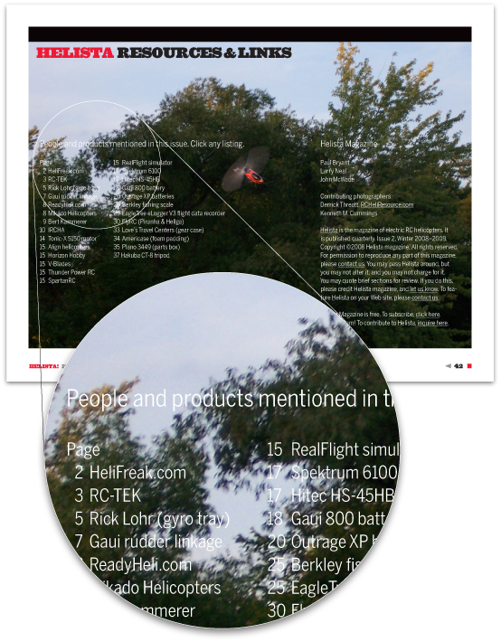
For those of you who didn’t download the Extra, the page at issue is shown below. It is the index of a PDF-format helicopter hobby magazine behind which we added a full-page photo:

The specific contrast problem is in the area spotlighted above.
What we like about our page and your comments are the number of visual cross-currents going on.
Let’s start at the top.
Setting type on a photo has risks. The ideal photo would be smooth and even, and the type would be just the right style and size, just the right boldness and in just the right places for maximum contrast and clarity.
Reality is almost always different. We chose this page because it’s from a real magazine, not one crafted to make a design point. The photo and copy are from the editors, and the typeface and page layout conform to a house style and cannot change, which is typical of most periodicals.
Bolding the typeface or arranging it differently are therefore out of the question. Similarly, choosing a better image is not possible; we can use only what the photographer turns in.
Sound familiar? That’s what makes this a useful example.
Our “no-designing-required” solution has limitations. The photo must be in the ballpark—fairly smooth, fairly even, and at least somewhat interesting. Lacking that, the technique should not be used.
The “narrow, reversed-out” type (Font Bureau’s Benton Sans Condensed Book) that’s hard to read is, in the real magazine, quite clear, a point that’s lost at our reduced size and in low, onscreen resolution (above). We were hoping you’d give us the benefit of the doubt here. Generally speaking, a simple, sans-serif typeface like ours reverses more successfully than serif type, whose micro-details are easy to lose. High-quality PDF will always be clear; high-resolution press printing will be clear except in extreme cases, which consist of unusually small type and/or backgrounds loaded with color. Laser and inkjet printing can be murky. Adjust to suit.
Bolding a typeface to compensate for a background or other element is rarely a good idea, because it changes the voice of the type. We don’t recommend it. If your normal typeface won’t work, you’ll need a different photo.
We’re not fans of “fading a photo back,” either. Ghosting an image washes it out, which pretty much defeats the beauty or visual interest it would bring to the design. There are exceptions, but ghosting is not something we’d do just to make the photo usable. Use photos full strength. If they’re unsuitable for backgrounds, try working them into a more conventional layout. Failing that, edit them out.
Cousin of the ghost is the “semi-transparent box,” typically low-opacity white or black that lightens or darkens the background behind a portion of the type. There are many good uses for it but not here; like a typeface change, a box changes the voice of a page so should not be added only to compensate for a weak background.
As Chris pointed out, there are indeed designers who use too-busy background photos. We assume, however, that you are not one of them. You can tell if a photo’s suitable. For those almost-right shots, we suggest not sweating the small stuff. Few photos are perfect; most will have some too-light or too-dark spots. If they’re otherwise good, use them anyway; sometimes you can lighten or darken a small area without anyone noticing.
To close, reader Suzanne James writes to say that she “took one look at our article and was inspired to design a piece that got raves” at her meeting last night.
Thank you all. We love having your eagle eyes keeping us in line.


