I should start by saying that I love you readers! Bright, perceptive, articulate — you just rock! What a pleasure to have an audience of colleagues!
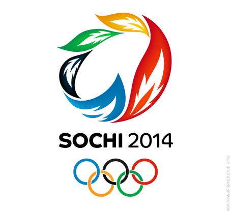
Earlier this month, the day the 2014 Sochi Olympics logo was unveiled, a friend e-mailed me the Transformer Studio Olympic logo, saying that he liked the image and its symbolism, to which I couldn’t help but agree. It’s pretty, full of motion and dance and fire. It works in full color and one color, at all scales and in all media. It satisfies Transformer’s creative brief beautifully. I liked it, too.
At least, I liked it as a classroom assignment, where I’d give it an easy A. But the longer I looked, the less I liked. Out in the real world, to represent the real Russia in the real Olympics, the circle seemed vaguely . . . empty.
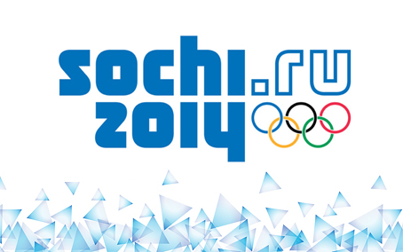
That sent me exploring, where I discovered that this was not the logo of the 2014 Sochi games at all, but merely a runner-up. The official logo is this one, from Interbrand . . .
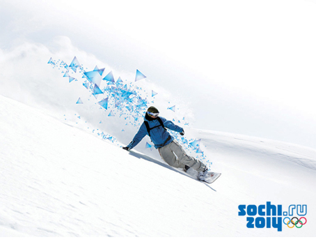
. . . which consists of the logotype and the ice crystals, too.
Both entries were designed in Moscow.
Having seen the firebird first (and perhaps because I’d seen it first), my response to the official logo was like some of yours — meh. But that lasted about 10 seconds, and then I started to like it. And the more I looked, the more I liked. Main reasons? There are three: It’s unmistakably Russia, it’s unmistakably winter, and it’s unmistakably today. In 40 years it will look old, as it should, because in 40 years it will live only in record and memory — “Hey, remember back . . . ?”
The firebird — let’s call it that — doesn’t do that. It feels generic, which means, literally, “stock.” It’s a logo with no name. Cover up Sochi, and you’re left without a single clue where these Olympics will be played. Cleveland? Rangoon? Winter? Summer? It’s clip art.
Beautiful, yes, and to be fair, it is not the first host-nation logo to look generic. The problem, however, is that, without a sense of place, the symbolism of its imagery — which is what makes the firebird work — doesn’t work. The feathers and circle dance have no meaning, if they’re perceived at all. As Orlando Angel commented, “It could be a logo from any year, any place. It seems anonymous . . . lacking a relationship to something outside of itself.”
That’s bad news for any logo, but we’re branding Russia, comrades, not Charmin. The Empire. And it’s not, as Erin put it, the “fairy-tale, fantasy Russia,” for which the firebird may have worked. It’s Mother Russia. Peter the Great, Tolstoy, 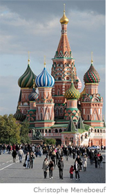 Nicholas and Alexandra, Red Square, Tchaikovsky, Solzhenitsyn. The Bear may be a menacing countenance to those who came of age in the 20th century, but you can’t design him away.
And you shouldn’t, because this is how Russia looks. Said Daria, “I am a designer from Russia, and I can say that it’s quite in our tradition to use heavy brick, cut-out forms (remember Russian avant-garde of the 20th century beginning, our famous posters of the World War time, and socialist realism as the leading trend of design and art).”
Added Paulie, “The [logo] for me says ‘Russia’ — in re-emergence. A nation that respects strength above all. Churchill presented a ceremonial sword to Stalin to honor the ‘steel-hearted citizens of Stalingrad.’ To me, the logo evokes that spirit. The typeface is reminiscent of the Russian revolutionary and wartime posters — a simple, strong, bold appeal to the Russian heart.”
As for the visual details, which to some readers made the logotype “unreadable” and “confusing,” what we have is an English-language logo that hints of Cyrillic lettering (not easy to do), which, to Western eyes, is unreadable. To my eye, the juxtaposition works as both complex and interesting. The “y” in 2014, as Erin pointed out, “looks like the letter for the ‘ch’ sound in Russian, which reflects the ‘ch’ sound in Sochi.” No one gets it at a glance, though. You have to look twice.
You can also see the hint of mountain-sea reflection that represents Sochi, which, the world will learn, is a sub-tropical resort town along the thin strip between the Caucasus mountains and the Black Sea.
The Olympic Games are an ancient event that every two years bring the world’s nations together in a place, in a time. They have a fine and enduring logo. The Sochi 2014 image does what a host-nation logo should do; it puts its stamp on the place and time. These are not the Winter Games of Lake Placid or Lillehammer or Nagano, these are the games of Sochi, and you won’t forget that. In a month, Vancouver will get its turn. Then London. After Sochi, Rio. And so on.
Keep in mind, too, that the block lettering will rarely be seen in isolation; don’t forget those ice crystals — “fresh and tangy,” said Brett — which will be splashed, sprayed, scattered everywhere on venues big and small. You can already download some for yourself.
In the end, the Olympic Games are about the athletes, the competition, the pageantry, the tradition, and never about the logotype. And while, as some of you said, politics and money may have had a hand in making this selection, there is, for me at least, no doubt that they chose the better image.
_______________
For more:
39 Olympic logos from 1924 to 2012. webdesignerdepot.com
Complete, immersive history of the modern Olympics. olympic.org



Well written. As always, you do a great job of presenting something that makes us analyze design from different perspectives. I think like most everyone else, the flame logo grabs you with an aesthetic punch, making it seem like the obvious choice. But then your support of the chosen branding is spot on. My only concern is readability. Not that the characters are hard to read (it’s fun to decipher those), but every time I read it as sochi.ru and then 2014. (I recall that it is supposed to be read as sochi2014.ru). That said, I just entered sochi.ru in my browser, and that takes me where I want to go . . . so all is well after all.
I actually don’t mind the logotype at all; what irks me are those “flakes.” They look to me like cheap, airbrushed t-shirt art. I wish they could have used the flake conceit in a little bit softer way, as a counterpoint to the burly type.
Very interesting article, John. I’m surprised your affection for the Transformer Studio logo waned so quickly. You sounded crushed in the original article when it wasn’t chosen!
Admittedly, I still have an affinity for the it — I wish I could create such beautiful “clip art” — but the reasons you delineated make sense. The symbol has to stand on its own, and it doesn’t when you take away the name of the host city. This one is the name.
However, I would never make an Olympic logo a web site address, but that’s me.
It’s interesting to see that the Sochi Paralympics logo on the top right-hand side of the site replaces the Olympic rings with symbols akin to the blades of people’s ice skates.
I agree with you, John, for the same reasons. This logo represents Russia better than the firebird logo.
One comment about the website aspect of the logo. It could be because I’m used to using only “.com,” but I didn’t read that as a website at first. I read it as more of a postal code.
Sochi, RU
It’s letting people know that these Olympic games will be in Russia, which is a big deal.
Perspicacious as always . . . :-) Of course, I say that at least in part because I agree with the analysis. Like I said originally, the reflection hovers just this side of gimmicky, but it does work. It is definitely Russian, and it just as definitely says where and when and “winter.”
OK, maybe it’s me . . . doesn’t anyone see it?
The letters “hi” in sochi and the numbers “14” are an inverse mirror image of the word “hi.”
like . . . hello.
Hi John,
I like the way you analyze design works. It’s helpful for learners. It shows “how an artist looks at the details in design.” The word “14” lacks balance. The red bird can be more expressive if designer like you have showered artistic touches upon it. Happy holidays !
John, if only the website read easier, I would agree 100%. It violates my #1 rule . . . KISS. My designer eyes wants to swap the .ru with the rings.
I, too, agree with John’s argument. The fire circle logo is too trite and fails to reach out for the younger audience. It is in many ways a thing of the past — stale, conservative, predictable. I quite like the Interbrand logo — it’s modern, fresh, and it will generate the necessary web traffic (advertising). I did check the website — it will be clever to make Sochi.com and Sochi2014.com interlink better and provide the navigation clearly in English, as this is what most of us will expect. I am not that sure about the games’ website as it currently stands — it will need some revamping, as it’s too cluttered at the moment.
Viewers will not analyse it the way that designers do. You can give me all the rational reasons why the sochi logo is the right one, but as I write this, I’m still confused with remembering the name, and it doesn’t “grab” me. Which translates into retention.
It’s the Olympics first, country second. The firebird one has life, and I said “wow” when I first saw it. If I was there as a visitor, I’d want it for a souvenir.
I like it for these reasons. You like the other for your reasons. In other words, either logo “works” for the public. Que sera, sera!
:-)
At a glance, chosen logo remind me USSR’s design. In this way it is associated with Russia now, strong, cold and severe. If designers wanted to reach such a goal, they’ve done it well.
But as for me, present-day designers in Russia and in other countries close to it can’t forget Soviet-design-style and sometimes can’t get rid of it.
Isn’t a logo supposed to grab you like an electric punch? The chosen Sochi logo still doesn’t do a thing for me.
To me the logo must represent, not just grab. The chosen one does represent Russia. The snowflakes, or what I see as ice, represent it well, too. Cold, sharp, edgy, clean, fresh, and new. This IS Russia today. But still keeps its heritage intact.
I like it. Go have a look at past logos.
Pete :-)
I like the one with the leaves.
I liked the first logo at first glance. It looks like an Olympic logo. A generic Olympic logo.
For an Olympic games that are happening in 2014, the second logo does it for me. Granted, I wasn’t excited when I heard that sochi.ru didn’t send you to the Olympic games, but now it does. It feels more current, and if you look at the site with Olympic logo archives, the sochi.ru one fits in with its modern feel. (The London 2012 one is awful. Really bad.)
Also, I’m not a fan of the triangles. I get it . . . they represent snow/ice. But it looks like a Tetris game or 5th-grade geometry homework.
I had a talk about this logo with an older gentleman from Poland. He immediately said, “ah — that — is Russia” to the official logo without me saying which one it was, and he asked if the other one had been for the games in Nagano! Go figure.
There’s something to this logo that will resonate with a vast amount of people.
While the firebird logo is frankly beautiful, it is not strong, and by strong I mean masculine, forceful, cold and bold. And that is what Russia sees itself as and needs to be seen as.
I agree wholeheartedly with your analysis of the Transformer logo, John. However, I feel the official logo fails for similar reasons.
True, it’s Russian, wintry and today . . . but it does nothing to speak to the host city.
According to Wikipedia (’cause hey, what do I know?), Sochi is a popular resort town on the Black Sea near the Caucasus mountains. If it’s not an instantly recognizable city, then shouldn’t that host city logo educate or at least inform a little of its surroundings/history/landmarks/etc.? I’m not suggesting the “low-hanging” fruit version of this logo (mountains and reflection), but when viewing logos from previous host cities (Squaw Valley ’60, Innsbruck ’64, Turin ’06), it seems there is just a bit more thought put into them (see some examples here).
Indeed, it’s a great Russian 2014 winter Olympics logo . . . just a miserable Sochi 2014 winter Olympics logo . . . imo.
When I look at the logo, I feel that the Olympic rings are “falling off” the logo and can not carry the weight of the fat lettering in the final logo.
Very interesting to read John’s critique and the other comments, and, having looked at the link to the previous designs on this page, I believe that the official logo is right on the money.
It has a direct connection to the Internet — .ru really is up to date but still has a retro feel (very up to date?), as it references early Russian revolutionary posters.
What really appeals is that the logo and the place are the same. On all previous designs, the logo had to be enforced with the name and date of the host city. I also like the idea of Sochi and 2014 like it was the mirror image reflected in ice.
When I first saw the accepted design, I did not read the numerals as “2014”. Instead, I saw “zoiY”. Only after reading the article did I see that they were numerals. So I can’t say I’m a fan of the design, purely on legibility grounds.
Yeah, I really like the 2014 logo.
To be frank, the firebird logo didn’t even catch my eye. I had already scrolled down a bit and saw it: “Wow, that’s nice, so where’s this logo?”
After finding out it was the logo, I really like it, great job. I mean, you can read it in many different ways: Sochi.ru2014 Olympics, Sochi 2014, .ru Olympics, sochi Olympics. Ingenious, not forgetting the .ru, reminding us that Russia is truly part of the digital age.
This may be a bit late, but here is a link to a 25-minute interview where the head of the Sochi 2014 Organising Committee discusses everything about the logo including the temporary use of the ice crystals.
It’s in English too.
To me the logo must represent, not just grab. The chosen one does represent Russia. The snowflakes, or what I see as ice, represent it well, too. Cold, sharp, edgy, clean, fresh, and new. This IS Russia today. But still keeps its heritage intact.
I like it. Go have a look at past logos.
Pete :-)