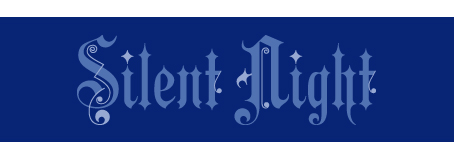
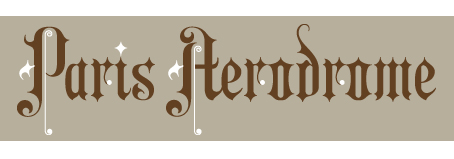
We went looking this year for a Victorian Christmas typeface and found a festive gem in Aeronaut by designer Georg Herold-Wildfellner. Aeronaut is based on a writing style known as textualis, the most calligraphic form of blackletter. Its unusual adornments — pigtails, squiggles, “balloons” and “parachutes” — give it a light, candy-factory look, beautifully 19th-century, without the Gothic heaviness of classic blackletter type.
What we especially like is that Aeronaut comes in two parts — the letters are one part and the squiggles are the other — which means that it can be set (easily) in two colors:

It works like this. Standard Aeronaut has its adornments built in:

So what you do is first set your type in unadorned Aeronaut Base:

Color it, then Copy and Paste the copy directly atop your original:

While it’s in position, select and change its style to Aeronaut Parachute, which is one of its two squiggle fonts, the other being Aeronaut Balloon. I’ve left a ghost of the letters so you can see what’s going on.

What’s interesting is that the squiggles correspond letter for letter to the typeface, so everything shows up in position. If you kern Aeronaut Base for better letterfit, you’ll need to kern Aeronaut Parachute by the same amounts.
To finish, simply color Aeronaut Parachute a deep, Christmas green . . .

. . . and it’s ready for duty at the North Pole. Green and red, of course, are not your only options. Below is a monochromatic rendition; note that its adornments, which look appropriately like twinkling stars, are lighter than the letters:

And once Christmas is over, you have a great, period typeface that’s fun to work with all year:

——————–


I love this face! Remember to add the caveat to Never Use This Smaller Than 24 Point!!
Happy Thanksgiving to all.
Oooh! I love the adornments… lots of fun to be had.
This is one of the most creative new type faces I’ve seen. The two layers of type is a great idea.
Beautiful! Thank you for sharing. As always, Before & After is a real gem! :-)
What a creative way to offer a font. Thanks for sharing! Love the Silent Night monochromatic idea.
Love this font; so creative and the link you provide here to MyFonts has a wonderful gallery showing how diverse it can be — thanks for the heads up and the tut!
I love it! I wish I hadn’t finished all my Christmas design work already. But having this font on hand will help me look forward to the busy Christmas design time next year!
It looks very nice — thanks for sharing the process.
AWESOME!!!! Our company is currently busy doing Christmas gift packets, and I was looking for something different to put on the cards! Thanks for this great idea!!!!
I love fonts that do this. I recently bought Ivory from MyFonts, which does the same thing — a “normal” font, a no-swashes font and a swashes font. And funnily enough, I used that for a number of my Christmas projects too.
. . . and just noticed that it’s by the same designer. Definitely one to watch.
Nice one, John. Also love the idea that the squiggle flourishes are separate from the typeface … such a neat idea for extending ideas and resources to create new looks without having to fidget your own… Thanks!
Happy Thanksgiving.
Very clever; I love the layering.
Very nice. It also reminds me of movie titles for Errol Flynn films. There used to be a free font called “Christmas Card,” which was based on the typeface used in the opening credits of Capra’s “It’s A Wonderful Life.” I see that it’s been expanded and renamed Testimonial and isn’t free.
What do you recommend for Hannukah and Kwanza?
That’s very nice!
Nice composition. You have to be an artist before going to adornment in a particular typeface. It is important to always remember that adornments must be of quality and size that maximizes the actual text legibility.
Great article on a great use of an old font.
I love the flexibility and creative use of the characters in the font.
fun.
I like the font. Thanks for sharing your thoughts!
Thanks ! Fantastic simple tricks……thanks again.
Thanks for sharing . . . love it . . . bought it :-)
Little squiggles, big fun!
Hi John McWade, thanks so much for all your sharing of great ideas.