I really enjoyed the current article, “How to use that typeface.” In fact, I find every article informative and useful. I was wondering, though, what typeface you might recommend for the business in the article — Alamo Flags — and why you would choose that typeface. Thanks. — Laura Jones
Hi Laura,
To recommend a typeface, I’d have to know more about the business.
A couple phone calls told me that Alamo Flags sells flags of the world, buttons, pins, patches and so on. So it’s a gift-quality flag store. Its employees who spoke to me did not know the origin of the name or if it was connected to the real Alamo. For a real project, you’d want to know those things.
So let’s imagine that Alamo Flags wants its sign to convey a fairly authentic image.
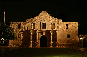
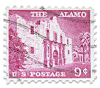
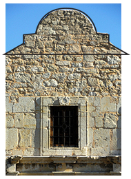
First step would be what we call “World of” research. Ask, what is the Alamo? Where is it? What does it look like? What is its story? What associations does it have? Are there lines, shapes, colors, textures that we might use? And so on.
For a real project, the client would give you most of these answers. For our example, we’ll use Google.
We find that the Alamo is an old Spanish Mission in San Antonio, Texas. Early in 1836, it was site of the most famous fight in Texas’s war for independence from Mexico. The Alamo was overpowered by the forces of Mexican President Santa Anna, and all its defenders were killed. Among the dead were now-legendary Americans Jim Bowie and Davy Crockett. After the defeat, the Texas colonists regrouped, and the term “Remember the Alamo!” became a rallying cry for the remainder of the war.
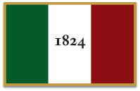
The Alamo has its own flag (although its authenticity is uncertain) with its own colors.


As you can see, even brief research turns up a story, shapes, colors, textures and various visual associations. Actually do the research; don’t just guess.
For a typeface to be authentic, it would have to have been in use in 1836. Usually, you can make do without being so literal. But having an authentic typeface gives you the confidence of knowing—you’re not guessing, or worse—making something up. You may decide to change it, but you’re starting on solid footing.

The original designer was just making something up.
What typefaces were in use in 1836? One of the best was the excellent serif Caslon. Sixty years before—on July 4, 1776—Benjamin Franklin chose Caslon for the first printing of the United States Declaration of Independence. Today, Caslon is available in many styles including several that are aged or distressed and look quite old. Caslon is an excellent text face.
In vogue were “fat” typefaces, some of which had extreme stroke-to-serif differences, like Adobe’s Madrone and Engraver’s LH and Linotype’s Inflex MT. Other fat faces were more slab-sided, like Adobe’s Blackoak.
Also popular were Clarendon-style typefaces, which have slab serifs but most of which are more moderately proportioned. And the calligraphic styles of writing master and engraver George Bickham set the standard for script typefaces.
Although without more research we don’t know what typefaces were present at the Alamo, any of these are entirely plausible and would be suitable on the sign.
So that’s the process. Pick a goal (“authentic” is only one possibility out of countless many), write the creative brief, do your research, then design to it.
Below, two possibilities. (Click for larger versions)
Engraver’s LH
ATOrlando and Bickham Script


