Is it just me, or has time sped up? It’s been a non-stop busy summer, and the time has just evaporated. Could someone please reset the calendar to, oh, mid-March, where my head still is?
Our new book is nearly complete, and we’re liking it. Cathy Lane, editor of LogoLounge, is editing, and Kim Scott of Bumpy Design is assembling it for Peachpit Press. These two did our first two books, so you’ll see a family resemblance. For those who’ve asked whether it’s new material or old, it’s old (published is a better word). Our books are articles from the magazine, collected by topic and reformatted. Subscribers will recognize the material, but the new format and sequence change the perception noticeably.
Thank you very much for your help with the cover. You may remember that we had no time for big revisions, so we incorporated the half-dozen suggestions we heard the most (but which would leave the format intact), and ended up with a stronger design.
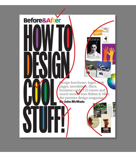
Here’s the “before”:

1) The bold version is better than the light version.
2) You could pilot a steamship down that river of white! The images are too small, too detached, and there are too many of them.
3) Make the logo bigger.
4) Lose the colored fills in the letters.
5) Lose the exclamation point.
6) Write shorter copy.
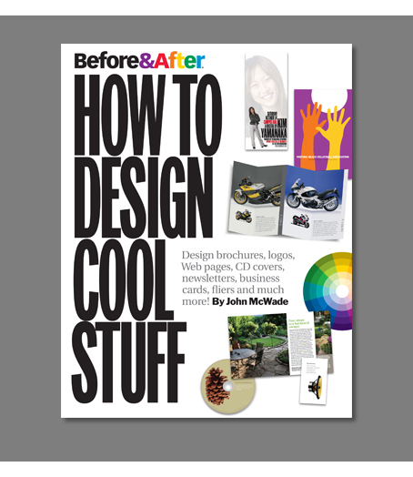
Here’s the “after,” which we sent to Amazon:

Every change improved it.
Still, it’s not final. The cover was designed before the contents were chosen, so some of these images will be replaced.
Won’t it then be different? No. Despite their differences, the “after” above isn’t a true variation of the “before”— the covers are, practically speaking, one design, tweaked. How to tell? Use the two-second-glance rule: Glance for two seconds (only two, which is really brief), look away, then ask, “same or different?” Our design guru Gwen Amos says that she’ll assign students to design “three variations,” and, often as not, they’ll turn in one design plus tweaks.
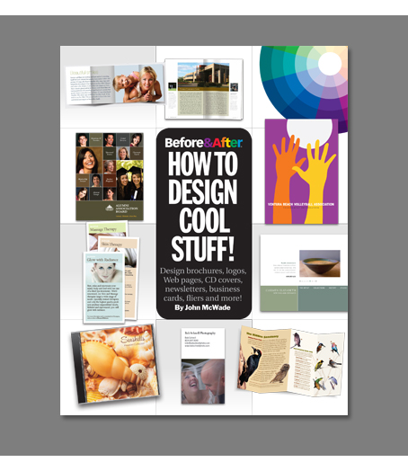
This is a variation . . .

Even here, although it’s different, it’s conceptually similar—tall, uppercase type (Franklin Gothic Condensed) that serves as a focal point (reversed, in this case) and plenty of colorful graphics from the magazine. The Peachpit decision-makers gave this version a quick thumbs-down, not because it’s a poor design but because they loved the other one!
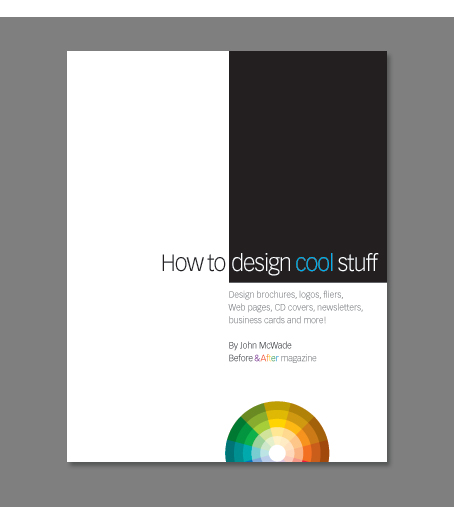
If a client asks you not for variations but for different concepts, then you need to give him something like this . . .

. . . which makes an entirely different impression.
Tweaks. Variations. Concepts.
When your project is in the “how-do-we-present-this?” phase, concepts are better than variations, and variations are better than tweaks.
Remember the differences.


Great explanation. I have to say that the last, entirely different concept is very nice. Makes me want to buy the book, which is vital. The other layouts don’t do that for me.
Understanding this distinction is so important — and not just for graphics but for any design-related field. I’m in the field of Architecture, and I’ve learned that you’ve got to explore a variety of concepts (the “big picture”) if you hope to discover what the building really needs to be. There’s always the danger of coming up with only one design and then spending loads of time generating variations that never quite give you that “Yes!” sensation. Maybe what you really need is to back up and try a different concept. Thanks for so clearly illustrating this important distinction — I think understanding this will help many a designer get to their desired design destination with more speed, confidence and fun.
Interesting . . . but I wonder what it says about me that I like the first one with all the red “river” lines and check-marks best — it simply looks like design in the making. The two middle variations lack the excitement of the first. I also like the “concept” change with its classic simplicity. Unfortunately, it also looks like a textbook — and the “cool stuff” title doesn’t fit the classic feel at all.
It will be fun to see the final cover design on this third book.
At first glance I really like the overall look of the cover that went to Amazon, although I find the number of images and their layout disturbing (they just seem so mishmash to me). I know it is easy to be an armchair critic and I am not sure how I would approach this cover, but I would go with the less-is-more approach. The last cover says it all — simply and elegantly, in my humble opinion.
I also believe that your ability to ask and pay heed to the advice of others shows designer maturity on your part. No designer is an island, and welcoming and incorporating the ideas of others can greatly enhance the final output of a project. I have seen this time and again in many of the projects I have been fortunate enough to be part of.
I like the last one, the “different concept.” That’s the one I would buy.
That last one? Brilliant. Simple is better. Less is more.
The last concept actually makes me want to look further into the book to, gasp, discover what the book is about. Unlike its predecessors, this concept doesn’t overwhelm us with “cool” stuff — an idea that is subjective.
River of white? I thought negative space was a good thing. Is that because the river is a fourth element and thirds are more appealing? I do think the tweak improved the design — just can’t explain why.
Bummer. I wish that last one got picked. To me it’s by far the best out of them all. It looks like a real modern, clean, sophisticated design book. The others seem more elementary and dated.
Anyway, I’m still looking forward to seeing this.
The last, different concept is definitely the best version; it has a clean, simple aesthetic that speaks design. Former versions are in the USA Today infographic “bland gratuitous detail” ballpark.
I’m with Sharon on this. I like the first one. It has life and energy as she says . . . design in the making.
Thanks for reiterating the distinction of tweaks, concepts and variations. So important to remember this when you are stuck and repeating the same concept over and over. It forces you to break out, dig deep and uncover ideas.
I’m excited about the new book!
I agree with the others. The last concept is a lot stronger and more appealing to me . . . by far. It’s more focused, bolder and more sophisticated. It’s also better aligned with my perception of the Before & After brand.
The bigger question is who are you marketing to? I agree with Dirk that the revised version (even the unrevised version) are more elementary and dated, but if you are trying to appeal to secretaries with a clip-art book, I think it works. It is the “safe” design. The last design is more sophisticated and naturally appeals to individuals with more design experience and a designer’s eye. Either way, the inside contents need to match the expectations set by the cover, or there will be a disconnect, and it will be put back on the shelf. Looking forward to seeing the final product!
The last concept is dull and boring to me, which is the exact opposite of the contents. However, I’ll buy any book that has John McWade’s name on the cover, no matter what it looks like.
Yes, less is more. The last one is definitely the most stylish one. Maybe next time you’ll ask us a little earlier and not just two days before the deadline. The last one rocks . . .
I unfortunately have to agree with many of the other posts — the last cover is wonderful. Looking at the first two covers, I almost feel a bit of panic at the amount of information my eyes are taking in (the tweaks in the second cover were definitely an improvement), but that last cover is really a pleasure to look at. Calm, to the point, but really grabbing my attention. I especially liked the “cool” in a cool color that emphasized that word on several different emotional levels — it triggered my “pun” humor reflex in a pleasing way, for some reason.
While the last one seems more classy, it definitely seems more like a textbook, and it’ll draw a different audience. I think the design sent to Amazon is great and appropriate. (It’s funny that a common suggestion was “Make the logo bigger!” A common client default request!)
I’ve looked for a way to describe these different approaches to clients — especially when designing logos.
I tend to create concepts at first, variations next, and do tweaks at the end of the process. But, I used different words to describe the process to clients, like “design direction,” then “concept development,” and finally “design-tweaking.” Your words are simpler.
Thanks.
John, thanks for articulating the differences, great! Creating tweaks and variations seems to be a more straightforward process than creating a new concept. Do you have tips or a thinking process you could share for being able to think outside the box of one favorite concept? In your example, what did you consider that informed the second concept?
Thank you SO MUCH for writing about the distinction, and so clearly.
I am a copywriter, working a lot with graphic artists. And — since the computer arrived on the scene — more and more I have found that what I often get to (supposedly) show a client are, say, three graphic approaches that are different ONLY in that one has an element on the left, in the second it’s on the right, and in the third it’s in the middle. I started calling it “The In-Design Shuffle.” It’s not creativity — that’s for sure.
When did designers stop noodling on paper first? It’s a real loss! Clients much prefer to look at comps to computer-roughs. (And I’m not some ancient grump — I’m only 48.)
Like a lot of people, the last design with the new concept is the one I’m drawn to. In fact it made me sigh, in a happy way.
I like the last one — simple. I don’t know where to look with all the “cool stuff” on the previous ones, but as someone else mentioned, I can see the textbook look. The second one would be my second favorite, but it still seems to be just a little too much. The font is stretched a little too vertical for me.
Thank you for your clarifying observations and solutions. I enjoy the opportunity to speak up.
The first three designs are busy. I am already busy, so I pick the soothing, modern, minimal look of number four.
But first, I would rotate the color wheel so that the blues are pointing toward the blue in “cool.” Then I would make the color wheel bigger, move it diagonally opposite the black box, and wrap it to the back cover . . . for continuity and to guide the reader to more info.
I’m just saying . . .
The last one is the best among the examples. Just like the other comments, that’s going to be the book I would buy if given the chance. Less is more indeed.
The last cover is nice, but we want to learn how to design “cool stuff,” not upper-class, minimalist stuff.
Regarding the book cover, I think those who would post a comment on this site already have fondness for Before & After and probably don’t need to be sold to. We are a built-in audience. We would decide to buy the book based more on our experience with Before & After and if there is new content. I think it’s more important to think about what the uninitiated to Before & After would think about the cover. I do like the last design. But would somebody who hasn’t heard of John and Before & After be drawn to the last design as it is sitting next to other titles? Somewhere in all this great information Before & After provides, I seem to remember the phrase, “Don’t design for yourself.”
I’ve got a feeling John designed that last book cover especially for his audience on this site to create a little stir for the blog.
It’s worked well, as the majority are favouring that design, simply because this is the stage of design we are all at in our thinking and how modern design is done.
Someone earlier on hit the nail on the head by saying this book’s target market is for the masses, people interested in learning to design for maybe the first time, who have very little academic grounding in design.
The first cover meets this target perfectly and invites those unsure of themselves into the book much more easily than the cover designed for us specialists.
Another good lesson by John on designing for your audience’s taste.
Now I’d be super impressed if you could tell me how the hell you get around designing something that your client will like as well as its target market; 90% of the time the client wants something the end user will not like at all!
While I am personally more drawn to the clean aesthetic of the last design, I think the edited version that Amazon accepted is more in keeping with the already established brand of Before & After’s existing publications. While I might flip through and buy the last cover because it looked cool, and be excited later when I realized it was the same author as this wonderful site, the immediate brand recognition I’d have with the other cover would be an insta-sell for my part. I guess I’m a sucker for consistency . . . and if you decide to go with the last one due to popular demand, you might have to consider revamping everything else to match! :-).
Great comments from everyone else about recognizing and appealing to the target audience as well — and the visual explanation of tweaks vs. variations vs. concepts from John was simple and poignant as always! Thanks very much!
P.S. To Rachael — you are so right about the dying art of noodling on paper . . . I’ve recently (re-)taken up the practice, and it’s been so refreshing and inspiring! While I remain a serious InDesign junkie (among many other digital vices), I’m finding that computer technology isn’t always the fastest or best road to innovation or effective and meaningful communication. Thanks for reminding us :-).
John, I agree with many of the commentees. I loved the last one. It had more breathing room! And I liked the first one with the red marker. Now that’s different.
Thx. Giulietta
My feeling about the different designs is that neither the original (which you guys intentionally made weak) nor the final—tweaked—cover look like they were designed by the folks at Before & After. They look kind of junky compared to the gorgeous work traditionally displayed in the mag. I’ve got every issue since the first, and this is the least likeable design I’ve seen yet. Sorry.
I’m going to chime in with what seems the majority here. As I scrolled down and came to that last cover, I actually had an intake of breath and thought, “Wow, now that’s beautiful.” The last cover is elegant, simple, sophisticated, clean. The other two look chaotic to me, although I’d definitely select the second over the original. But either of the first two I’d put back up on the shelf as way too much going on, no thank you.
The last one is eye-catching, which also has simplicity and better impact rather the other versions. I like the concept.
I really enjoyed reading all the comments. It’s amazing how much our tastes vary. I can’t get enough of the Before & After products; I subscribe to the mag and have both books and am impatiently waiting for the next one. I am constantly looking for new design books, and I have to say that I don’t really look at the cover first. I look at the spine to read the title, and then immediately open the book and flick through hoping that it is the kind of design book that I want to buy. If I’m lucky enough to find a good book (we don’t have a great selection in Australia), then I buy it, and then I will examine the cover, but the cover never determines whether I will pick up the book in the first place — it’s always the title that makes my decision. But anything from John McWade I would buy — even if it was bound with brown paper. Hurry up and finish it John! Cheers
It’s all in the eye of the beholder. We have our left- and right-brain people. My wife, a craftsy, far-right-brain person, would choose the first cover. I, a 50/50 brain, prefer the last one, while a far-left would probably choose it for sure.
It would be interesting to see both versions released simultaneously to see which sells best. Then survey the buyers to try and figure out what type of person they are.