
A note arrived Tuesday from a reader who, having heard that I once recommended as a guideline Garamond for book typesetting, asked what other typefaces I would recommend for print books. I sent back a strictly verbal response with no illustrations at all — not my favorite approach but I was out of time — to which my reader replied, “Fantastic! Thank you!”
So with that bit of encouragement, here for you is the bare-bones list. This is for novel-style books that are all text; instructional books with graphics, captions, and headlines have different requirements.
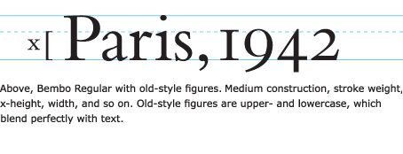
Garamond is by no means a universal choice, but it makes a fine default. It can be excellent in books; it really depends on the vibe you want to convey. Good book faces are generally medium in construction — medium proportions, stroke weight, x-height, set width, counters, descenders. We have a free article about that here.
I still recommend serif type for books, including glass books, which have basically the same form factor as paper books.
Newer (since 1990) type designs are excellent but do not improve upon the look of the classics.
My favorite book text faces, more or less in order:
Bembo
Caslon
Garamond
Minion Pro
Baskerville
Janson
Sabon
Simpler, newer book types include
Utopia (Before & After’s serif typeface)
Stone Serif
There are many others. Miller is a popular Scotch Roman style. Avoid Times (too narrow and spiky) and Palatino (unnecessarily busy). Bookman is heavy and slow; use it only in special instances, if at all.
Century Schoolbook and similar faces are often seen in pulp novels.
Whatever you choose, be sure your type family includes at least regular, italics, and small caps, including semi-bold and bold if you have subheads (although bold subheads in books are rare). If you have notes and indexes you’ll want a set of real superiors. Use old-style numerals in text. Some type families include a “titling” weight, which is lighter and can be used for section and chapter heads if appropriate for your book.
Pay attention to type size and line spacing. They vary with typeface, and each has a best mix. Aim for invisibility. Type that’s too big or too small or too-tightly spaced is unpleasant and distracting.
If you must use sans-serif in a book, I recommend a Gothic such as Trade Gothic, Franklin Gothic, or Benton Sans, all of which project authority. Helvetica (and its derivatives) make poor text type (hard to read), and Myriad, although crystal-clear and readable, has no visual gravitas whatsoever, although it can be a good choice for instructional books.
That’s the short course.


How about whether these or other typefaces transer well to ebooks for tablets, etc. Is that a factor?
Yeah, except with ebooks, like ePubs, the reader usually chooses his favorite font. You may not want to specify a font in an ePub. That’s for free-flowing books; I don’t know if that applied to fixed-placement ebooks.
I have recently been commissioned to design and typeset several books. I thought long and hard about suitability, calling on my favoured faces, which are close to yours (I don’t really have any experience of Janson or Sabon). It took me back to college days, and I eventually settled on the excellent Caslon. It looked classic and it read well, so everyone was very happy.
I still love to use Century for our children’s books — large x height and lovely, round friendliness.
I’m publishing a collection of short essays I’ve written over a 20+ year period and have chose Baskerville as my typeface simply because my blog persona is a dog.
Hounds of the . . . *groan*
Yeah, I know, but my English degree has to be good for a few inside jokes. It was expensive, and I’ll be darned if I don’t wring every bit of value out of it.
It’s good to see that Baskerville made John’s top seven list, but sometimes a typeface is chosen for reasons other than just readability (and yes, it will be expertly set and kerned).
I’d say that a typeface is most often chosen for reasons other than just readability, but your reason is a first!
I’d add not to use ITC versions of the listed typefaces in a long book. They are too “designy.”
Hooray for the classic typefaces! I love the Garamonds, but there are many to choose from. Adobe has supplied us with Adobe Garamond Pro, which I use with ease in with their products. As I was investigating my own Garamond libraries, I found that I have several. ITC Garamond, Adobe Garamond, Garamond Premier, Monotype Garamond by Microsoft and a personal favorite, Stempel Garamond. Looking them over I noticed that the Microsoft version has different numbers (a closed 4, for instance) and the little curve on the R has been forgotten. Just a caveat to the Garamond users out there.
Another beautiful face for text is Californian.
Good morning, John and staff!
I just read your Design Talk, “What’s a good typeface for books?”, and since I have a lot of books from Europe (drawing and animation books), I couldn’t help noticing that they use sans-serif types for books, contrary to your recommendation of using serif types. I read that the serifs make easy on the eyes for long reading, but since they use it, doesn’t it mean that this is more like a cultural trait?
Drawing and animation books fall into the realm of instructional books, where the requirements are different. That said, a preference for sans-serif text is indeed a cultural thing. I recommend using sans-serif in places where it’s the local favorite.
You mention typeface choices and allude to type size and spacing, which I understand varies for the typeface selected. But is there a rule of thumb for size and leading, particularly for a paperback-sized book?
I suggest finding some paperbacks whose type size and spacing feels right to you, and just copy the specs.
John-
Thanks for the list. I was wondering if your “studies” and “observations” would match with mine at all. I did research for a different genre of publishing — newsletters. The most popular font family was Bembo, which is the top of your list. Just some reinforcement that what you have holds up in other areas, too. Most of my favorites are on your list.
Great suggestions on usage.
-Steve
Two other that are favorites with me:
Minion
Adobe Garamond
What is a glass book? I’ve never heard that term used before.
I may have made it up. To my mind and eye, paper books and tablets like the iPad have the same print aesthetic: similar typography, page layout, and so on, on a more or less static page. I think of this as “print” — hence, paper books and “glass” books, or tablets. Print layout is different from the shape-shifting, interactive layout of the Web.
I saw that term and thought it was perfect, then wondered why nobody had thought of it before. I loathe the term “ebook.” “Glass book” should catch on, but I fear it may be relegated to the the Island of Misfit Words and have the last dance with “fetch.”
Let’s keep trying anyway.
The Island of Misfit Words — I like it! I think it’s already on the boat. I’d say that “print” to most people means “printed,” which means ink on paper, in which case “glass” is as ambiguous as ebook.
“instructional books with graphics, captions, and headlines have different requirements”
So the obvious question is, will you do another post for nonfiction? I’m working on some craft and cookbooks . . .
Thanks, John. Your stuff is always so clear and helpful!
— Alina
+1 for the need of an entry about nonfiction/technical books.
Thanks John.
Thanks for this post.
Speaking of books, I ran across this tremendous article on the Canons of page construction on Wikipedia. You might be interested in this. You might feel a brand new blog post coming on!
I’ve used Chaparral Pro for a book because I felt it looks “expensive” and is quite readable on glass. Being a serif font, I think the readability is fine. But maybe I should’ve chosen a font from John’s list?
I’d like to add that book typography is rightly called the most conservative of the graphic arts, and John’s list reflects that. The reasons given for avoiding Times, Palatino, and Bookman are very sound, and the answer to Anne & Bob’s first post might well be Matthew Carter’s Georgia.
Like this one, there are many “newer” choices for text faces including Gerard Unger’s Swift, Robert Slimbach’s Arno Pro, Giovanni Mardersteig’s Dante, and even Eric Gill’s Joanna, but you don’t always get to see them in the available literature on the subject (of which there is plenty!).
John’s advice about “just copy the specs” is also very worthwhile, but these days many people have trouble figuring it out. I analysed a trade leaflet from the ’80s this week and arrived at Monotype Plantin Semibold 8/12 to an 18-pica measure, but I’m sure it was printed letterpress; the spacing with digital types is very different.
Most of the books I’ve typeset have included a lot of scripture, which is italicized. Classical Garamond creates a beautiful layout — it’s very readable and has a graceful italic. An outside writer we contracted with used Zapf Humanist BT, a sans-serif. I thought it would be difficult to read, but readers seemed to like it. The italic looks a little forced, especially in subhead size. Editing a historical novel now in which some of the pages have a four-color border of Hebrew words. I reverted to Classical Garamond for its simplicity and elegance.
I’ve used Goudy Old Style BT for covers before, but never for text. Has anyone else used it?
Great article.
I usually stick to Garamond or Caslon. They’re both easy on the eye. I just did a book for 2nd grade reading level and used Palatino Linotype.
I also just had a client who wanted me to add a space after the paragraphs on a novel because “it wasn’t long enough.” I increased the point size a drop and the leading a little more than that, and we came out with a decent-length book. I always lock my text to a baseline grid, so the spaces between just look huge and very wrong! Anyone else have such an experience?
I was reading a novel recently, and they listed the typeface in one of those first two pages in the book that show copyright information, etc. (I love it when they list the typeface!)
Anyway, the typeface was ITC Golden Cockerel, and I must say it is quite a nice serif font and was originally created by Eric Gill in 1929.