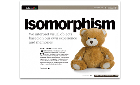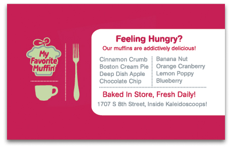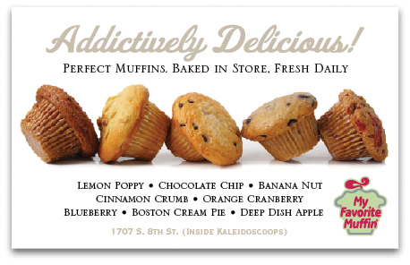
Our current article, Isomorphism, is the third in our Gestalt series. Isomorphism in design means that we humans interpret visual objects based on our own experiences and memories. Too bad it’s such an unintuitive word, because isomorphic correspondence is probably the most intuitive of all design techniques. You’ve probably used it many times. Our makeover illustrates how to use isomorphic correspondence to turn a flat, technical design into a yummy, touchable one.
Do you feel that you understand isomorphism? Did the article answer any questions for you? Did it bring up any questions?
Two points to get started:
Why not the logo, too?
“Beautiful makeover,” said the first letter we got, “but that muffin logo is so ugly and so out of place on the card that perhaps you should have added a page or two on making over the logo, too.”
Pretty is preferable to ugly, but redesigning the logo is not something you can do. A logo must not change — that’s its job — and the designer’s job is to come up with designs that accommodate that.
 Before: (Ab0ve) Jewels did the opposite — she tried making the logo the main thing. The logo is handled in such a way that the design would not work without it.
 After: (Ab0ve) The makeover is designed to work without the logo, then the logo is added as a signature at the end. You might think of it as the artist signing the canvas.
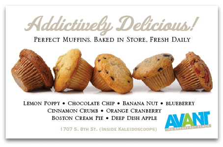
Almost any logo will work this position. Design your piece, then add the logo at the end. Like this . . .

—————
Don’t let the viewer get ahead of you
The most effective way to generate isomorphic correspondence is with a photo, but how do you pick the right one? With some care. Here’s the thing: Most photographic subjects feel so familiar that viewers tend to filter them out. “Oh, a field of dandelions. I’ve seen that. Yawn.” We do this instantly and unconsciously. Key to good visual communication, therefore, is to design around our natural filters.
Here, for example, the designer wanted to use isomorphic correspondence to make the reader feel the allergy . . .

Before: (Above) Showing a field of dandelions was the right idea, but the scene is so familiar that the viewer tunes it out. In this case, the photo has the added disadvantage of being indistinct, without a real focal point.
.
 .After: (Above) Zoning in on a single dandelion changes the cover in several ways. One, it gets you up close and personal with that sneeze-inducing bit of fluff. That’s the isomorphic correspondence part. Two, it makes a powerful focal point by giving the reader only one (BIG) thing to look at, not a field of many. Three, the closeup is an unexpected and less-familiar view. Four, the black background simplifies the design and sets up a high contrast that’s distinct and dramatic.
Your turn.
—————
Notes:
Our original Gestalt series appeared as a series of sidebars in print issues 11–18. Our current series is an elaboration of those basics. Three of the original magazines are out of print, but the full series is available in PDF on our Master Collection DVD.
You can find more examples of isomorphic correspondence in our article Picture your presentation. Picture your presentation illustrates how to use photos on your presentation slides to make an emotional connection with your audience.


The redesign is beautiful! But what would you do if you’re limited to designing with the colors in the logo? Most of the business cards I’ve created were limited to two colors.
Regarding isomorphism, I wasn’t even familiar with the word! But the examples are great! Especially the closeup on the dandelion.
Thanks, Phyllis
Hmmmm. Hard to imagine a scenario where one would be required to design using only the two colors in a logo, especially in this era of cheap, short-run, full-color printing. That said, if your whole card has to be flat red and green, you’ll need a different technique.
Think conservative cheap trade association. :-) That’s my design niche, and the business cards are always 2-color to match the 2-color stationery. If I make something else, they’ll thank me for my creative effort and then tell me that they really need it to be 2-color as before. . . . But I love your redesign, and the isomorphism information is great!
I agree that design that sells emotion is powerful, but be sure the feeling it invokes in you is shared by your audience — they may perceive things much differently due to cultural, ethnic or other societal or personal biases.
On a strictly design note, like your first letter’s author I also thought the logo clashed with the design. However, instead of dismissing the problem, I would have solved it by making “Addictively Delicious!” in the logo green color, and another line (perhaps the subhead but more likely the address line) in the logo red. There, now the whole thing is tied together! I feel that sometimes sampling all the accent colors from the photo makes the whole piece look muted and even monochromatic.
. . . which would make the card look like this. This works in two ways: It’s a nice-looking solution, and it gives more attention to the logo. The question to answer is, is more attention to the logo what you want? And also, can you sustain it? Not all designs can be tied together successfully — what then?
As for sampled colors from the photo looking muted or monochromatic, yes, in some cases this is exactly what happens. The solution is to find colors — analogous, complementary, etc. — that go with the sampled colors. We cover this in our free article, How to find the perfect color. Check it out.
You always manage to help your readers apply different strategies to their designs — thank you!
I think the landscape card with the multiple muffins is the only that works without changing the logo. The vertical card with the single muffin is so “bistro-elegant” that it cries out for a logo change. Without a logo change in that case, I think the customer gets a mixed message — the photo tells the viewer: “here’s this tempting muffin made by a pastry chef.” However, the logo has the opposite message; it makes the viewer think “young girls in the back using packaged mix.” If the client picked the vertical card, I hope the designer was able to make the case for a branding change for the logo!
Aha! The same conundrum facing McDonald’s in marketing its high-end coffee. But can you imagine McDonald’s redesigning its logo to accommodate a few new products?
Instead of changing the logo, design your piece to present your product — in their case, coffee — in its best light, then put your logo on it. The two things do different jobs. One sells the product, the other sells the brand.
John,
In redesigns or new designs, I agree, you are stuck with a companies logo. My thought was, “why not soften the logo?” With the white background, you could reduce the opacity to 75% or lower. It’s clear. It’s still there. Now, the eye is not tempted to anchor on the logo.
It would indeed soften it, which is something you must never do. A logo is sacrosanct. It is more important than a transitory design. Leave it alone. No tints, no color changes, no tilting or skewing, no outlines, on and on. We have a great, short article on this exact topic. Check out Simple, Uniform, Repetitive.
After designing for food processing business ads and catalogs for 23 years, it quickly became apparent you don’t use certain colors. Purple and mold green are two of them. They are unappetizing and even imply danger. Poisonous. Those logo colors have to go for this audience!
The headline “Isomorphism” just is an off-putting headline with no cues as to the benefits of reading the article. It might as well have been code or “Lorum Ipsum.” Cerebral or aloof?
I’m a fan of your stuff (I vote with my dollars!) For some reason, this article could have connected the dots better. The fact you felt the need to explain it more here on this webpage is an indicator that perhaps you felt that, too.
I don’t think the article was “bad.” Were you under a tight deadline?
Keep teaching us. We all need it.
No question that isomorphism is a weird word, but it’s the correct Gestalt term, so for this series we’re stuck with it. I thought we clarified it in the deckhead — “We interpret visual objects based on our own experience and memories.” — but maybe not.
As for explaining it on this site, that’s not my purpose here. My wish for a long time has been for Before & After to have a give-and-take, classroom-style, academic vibe, where teacher and students interact, and this is a first baby step. The format isn’t quite right, I don’t know if anyone wants it, and I don’t know if it’s sustainable. But it’s a shot. We want to stick to published articles, not blog posts, specifically to benefit subscribers (you who vote with your dollars!), not the general public.
Great article! I love the direct connection between the design and the viewer!
Isomorphism is a powerful tool in design . . . and also in sales and marketing.
Great design is about creating something that looks good and invokes an emotional response, but in practical business it is also about creating a piece that gets results for your customer. It needs to sell, inform, attract, generate responses and more.
By understanding your target audience (who are we speaking to?) and their needs, you can focus your attention on design features that relate to very particular areas. Discovering vertical and horizontal markets and exploring their profiles can be a great way to tune into different customer demographics. By tying together isomorphic design and a similar marketing strategy, you end up with a very powerful approach to designing commercial materials.
The redesigned card is aesthetically pleasing, but I think it introduces ambiguity as to what the business name is. That would be a problem for the client.
The card reads as if it represents a muffin shop called “Addictively Delicious” and the line of text underneath reinforces the idea that the main heading is the logo because it looks like a tagline. The actual logo is so small and badge-like that it looks like it’s there because the business has won the “My Favorite Muffin” award or something like that.
Interesting point of view. Does anyone else see it this way?
No. I’m very used to the logo or the name of the company being in the lower right corner, along with the contact information. That’s the last place you look on the page (here in the West, where we read from left to right and from top to bottom), and it’s where you look to figure out what action to take next.
I think it’s a good point — in the article you don’t see it that way because it’s constructed step-by-step, and you are already familiar with the logo, but I think if I just saw the card I might interpret it as Robin mentioned.
Yes, I agree. I thought the shop was called Addictively Delicious . . .
Maybe the headline could just literally be “My Favourite Muffin,” which is its name and then ties in with the logo.
At the risk of beating my own drum, I think the redesign I proposed — and that John graciously mocked up — helps solve that problem. The address line set in the logo color tells you that the store name and address are linked to the logo. That logo can’t be changed or dismissed unless the store is willing to do a complete rebranding, including menus, signage, trucks, uniforms, etc.! Sorry, designers, we’re stuck with it — so make it work.
I have to agree on this, and I think Bronwyn’s solution is good. I also think David’s idea of tying the headline color together with the logo helps, too.
My first thought on reading “Isomorphism” was similar to David Kunkel’s: An image may not evoke the same feelings in the audience that it evokes in the client. I work at a university, and it’s commonplace to use building photos as imagery. Some of the buildings are beautiful, and they undoubtedly awaken memories in the alumni. But to prospective students, the building photos may seem impersonal and institutional.
The question would be, what correspondence do you want to evoke? The buildings will get one kind of response. What will move the students?
I agree that in theory a logo should be immutable. However, one of the functions of a logo is to reflect the values and the “feel” of a company. So, when you change directions shoudn’t the logo at least adapt to it? In my opinion, even McDonald’s should ask themselves this question, especially concerning their color palette. I don’t know about the US, but here in France they’ve had to change their colors in some places to conform to local environment laws, and you still recognize the brand.
In my very limited experience, I’ve noticed that even when a client is dead set against a logo refresh, if you present them in the context of a coherent design they often reconsider. But I agree that it’s a big responsability for the designer, even a gamble.
There comes a time when it’s time to change, or at least refresh, a logo, usually when a company changes direction or products or management, or when the market evolves. But these are big, long-term events, and the logo change is a big, long-term commitment. What I want to get across is that the time to never, ever, ever touch the logo is to accommodate a transitory design like this one, which is here today, gone tomorrow.
In the case of My Favorite Muffin, its official logo is not green but white. Some designer on some earlier project decided that green would “go better” with his design and changed it, obviously for the worse.
In the case of McDonald’s, environment laws may force local changes (not sure how logo colors affect the environment, unless we’re talking about the visual environment), which is certainly an exception to the rule. Good thing is that McDonald’s logo is simple enough (and ubiquitous enough) that a color change does not affect it.
John, you said, “My wish for a long time has been for Before & After to have a give-and-take, classroom-style, academic vibe, where teacher and students interact, and this is a first baby step. The format isn’t quite right, I don’t know if anyone wants it, and I don’t know if it’s sustainable. But it’s a shot. We want to stick to published articles, not blog posts, specifically to benefit subscribers (you who vote with your dollars!), not the general public.”
I think that’s a GREAT idea! I’m retired, and although I’ve done a bit of graphic design in the past, I’m an amateur. Since retiring, I’ve designed only my own projects just for fun. Recently, though, I was asked to design a variety of documents for a small, local arts council … as a volunteer. So far, they’ve liked what I’ve done (well, if they can’t pay, they really can’t complain). (I use InDesign, Photoshop and Acrobat, all self-taught.)
As a long-time Before & After subscriber (print first, then PDFs), I’ve learned a LOT about design and am putting that knowledge to good use in my new “job.” But I still have a lot to learn, and your “virtual classroom” would be so helpful. So I hope you’ll continue to push in that direction. P.S. I enjoy your videos, too.