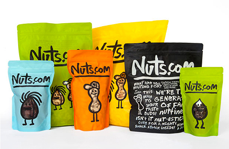
Indeed it is! When the Newark Nut Company changed its name from NutsOnline.com to Nuts.com, it tapped Michael Bierut of New York design firm Pentagram to give it a new look. Pentagram is an agency better known by its elegant work for highbrow clients like Tiffany & Co., the Guggenheim, the New York Philharmonic Orchestra, The Metropolitan Opera, Saks Fifth Avenue, and countless others from its offices in New York, London, San Francisco, Berlin and Austin, Tex.
So what’s it doing with bags of nuts? As it turns out, plenty.
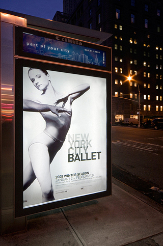
The New York City Ballet
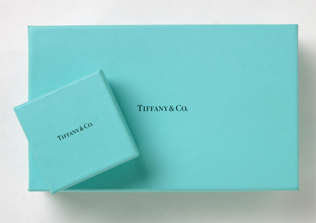
Tiffany & Co.
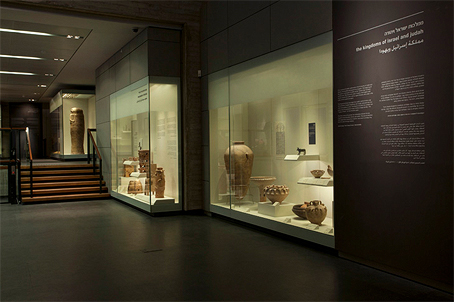
The Israel Museum
United Airlines

Saks Fifth Avenue
The Metropolitan Opera
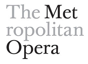
Let me first draw your attention to how effortless Pentagram’s designs appear. No borders, bevels, drop shadows, clever-but-forced mixes of text and graphics, none of that. Instead, clear, simple typefaces, clean lines, unadorned surfaces, understatement. No shouting, no look-at-me gimmicks. The Metropolitan Opera, for example, is three words simply (and carefully) set in Baskerville type, black and gray on white. Would you even dare show this to a client and call it design? You’re getting paid to come up with coolness! Yet the results stand, pure, clear, perfectly appropriate, exactly correct, as though they’d been there forever — just like the Met. That’s what design does.
You’ve heard me say this before. Design is not about making things up. Correct design is a portrayal of reality, a form clearly and exactly expressing a function. Understand the reality, and you’ll understand how to design for it.
So here we have Nuts.com. They used to look like this . . .
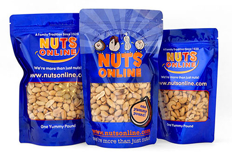
. . . which is what I mean by made up design — there’s no connection between the product and the packaging. Why, for example, the royal blue? The rectangular window? The straight lines of type? All are artificial and mechanical, more suitable for manufactured products like buffing pads. The clip-arty drawings are an effort to inject some fun into the design, but they’re too small, too tepid, overwhelmed by the blue.
Nuts are warm, natural, organic. And nutty! The company has always had a playful streak. With those uncomplicated realities in mind, Bierut got out his felt pen and went to work, which, in this case, could be mistaken for play.
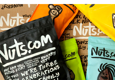
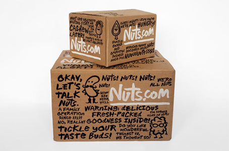
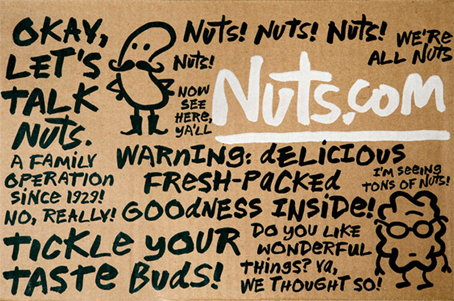
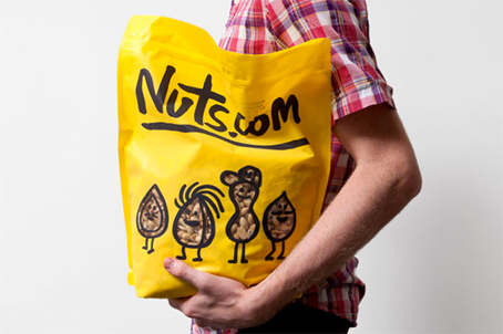
Illustrator Christoph Niemann revamped the mascots, and Bierut himself created a hand-drawn alphabet, complete with variations.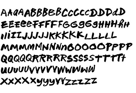 Nuts.com couldn’t be more different from Pentagram’s other work. That’s because the best branding comes from following the story; it doesn’t fall back on a house style, no matter how well established or desirable that style may be.
Could you do this? According to Fast Company, Nuts.com had a 32% increase in organic traffic and a 65% increase in revenue from direct traffic in its first 90 days with the new look and name. But never mind that; that’s seeing its success in hindsight. Like the simply set Metropolitan Opera, would you ever, in your wildest imagination, be brave enough to pull this off — to even show this design to a client or your boss or that committee?
What would be the objections? It’s not “designed” enough (or at all). It hasn’t been polished. It’s too risky. Whatever. And yet, Nuts.com is exactly right — bold, startling, goofy, instantly engaging, want-able, a clear, accurate expression of the reality.
That’s design!
—————
For more on designing to reality: Before & After print issues 30 and 38 are classroom-depth studies; both are out of print but are included on our Master Collection DVD. For briefer lessons, see Before & After articles 0614, 0616, 0617, 0622, and 0644, shown above. Also see article 0680, “Design from a creative brief,” one of our most popular articles. For a very useful how-to on setting a text-only logotype, see article 0660.


Huge improvement in the new design! Simple beauty. Great example of how good design impacts sale conversions.
I love this new look for Nuts.com and have since it was announced a few weeks/months ago. Your point about having the courage to pitch something this simple is well made. The time I can most clearly remember thinking that same thing was when I first saw the cover of The Beatles White Album. I distinctly remember feeling like even if I’d come up with that design, I’d have scrapped it and come up with something more ornate.
I love the design, clear, organic, and simple. The only one I am not sure about is the light blue; it seems incongruous with the others, not “earthy” at all. I would love to know the thinking behind the color choice.
I would find it hard to justify the Metropolitan Opera logo. It is has almost zero appeal visually. The typeface is nondescript, not classic or elegant they way opera should be.
Maybe in its colorless generality, the design is saying: We don’t need to prove anything with our logo. You know who the Met is. You know that we are one of the top opera companies in the world. It is our performances that stand on their own. But since we do need to have our name on them, we will do the minimal graphics necessary and at least be consistent. And you all call us the “Met” anyway, so we will make those letters stand out. Just so you know it is okay to call us that. In fact we like it.
That’s what that design is saying to me.
If you’ve lived in NYC, you know this logo stands out from the neon noise of Broadway and glitz of Park Avenue like a breath of fresh air at the end of an aria. Brilliant acknowledgment to the culture and cultured of NY.
I agree. Well put.
I realize that my comment my have led you to think that I don’t like the Met Opera logo. I do. Clearly a lot of thinking went into it, and it does what it needs to do admirably. Less is definitely more in this case.
What a great post. Thanks for highlighting the Nuts design. I went to their web site and was very disappointed . . . they seem to have lost the bold, goofy look. There are a few signs of it in the name and in a few other spots, but it really lacks the personality of the packaging. I hope they are now updating the site. It would be a shame to waste such a great design.
I think that when it comes to presenting work like this, it helps to be Pentagram. Just by looking at their body of work, I as a client would have more confidence that they know what they’re doing.
@elmas, I was going to post the exact same comment. Pentagram has an established portfolio that adds instant credibility to their work.
But I think there are many designers who could produce better work if they fought with their clients (in a respectful way) over the design. Too often, designers seem to deliver work that caters to the client’s personal preferences instead of the needs of the product or company. Sometimes there’s no way around that, but I think it’s our job as designers to explain and support our design decisions, educating the client as to why things are done a specific way. I’m guessing Pentagram does that.
Isn’t Saks Fifth Avenue elegant and yet so simple? The white space (typography) breaks through the black box so it does not appear to be a black square. It carves through it, giving it a wonderful sense of dynamic and flow. It’s amazing how much white space can become so meaningful to a design. It probably doesn’t impress you as much since you are professional designers, but I wanted share some of my thoughts.
Great before-and-after comparison. I’m not sure if the domain change and redesign happened a the same time. Yet, as you might guess, there is much more to the story of rebranding. The domain nuts.com alone costs “hundreds of thousands of dollars” in the secondary market, and being on a new domain cost findability for a long period of time.
http://www.nytimes.com/2012/04/26/business/smallbusiness/newark-nut-company-buys-a-perfect-domain-name-yet-sales-suffer.html
More follow-up:
http://boss.blogs.nytimes.com/2012/05/01/debating-the-right-way-to-change-a-domain-name-and-brand-a-nut-retailer
Paula Scher talks about times when her design has been work, and when it’s been play. She’s really referring to times when she got to originate an entirely new style (play) and then keep it going for the next several years (work). In this case, it was definitely play.
As far as the Met design . . . it makes me wince. The kerning of “ropolitan” is off just enough to be uncomfortable, not enough to have personality.
I love getting your emails! You are a breath of fresh air as well as a wealth of information. Whenever one of your emails comes in, I stop what I am doing to simply enjoy the moment. I always learn something new in design. And I totally love the videos. Thank you for sharing.
Your comments echo my sentiments exactly. Love, love, love getting the emails and find they really inspire me, and I get so much out of them.
Keep up the great work. Especially loved this before and after design example as it works so well by keeping things simple.
Before I read the “answer” in the email, I said aloud to myself, “it ABSOLUTELY is design, and adorable at that!” Great work.
Another wonderful example where simplicity make the story visible and desirable! No wonder that with beautiful and eye-catching packages like these, the “nuts” are jumping off the shelf! If I may say, it reminds me of the simple design for froosh smoothie bottles (maybe not so known in the U.S.).
Thanks for pointing this out!
Like Suki before, I noticed the light blue package — though it is a warmed blue; it seems to be the same nuance as the one used on the Tiffany package.
But most of all, I love the hand-drawn alphabet — it gives such a feeling of school-like quick note :-) ). Wonderful!
Nice example that good design doesn’t shout. Though, as in the case of Nuts.com, it might chortle.
For designers it is sometimes hard to let go of ownership on a design, and just let it be the silent vehicle that brings the product onstage for the audience. There is a slight nudge in many of us to want recognition, kudos, validation, one suspects. At those moments it is hard to let go and let simplicity rule. I have no problems with any of the logos shown; must agree, though, that an established firm with well-regarded clout will have a better chance of convincing the nervous client that less is more.
Pingback: Is this design? | Before & After | Design Talk | Smart Websites and Graphic Design | Scoop.it
Can’t be too fast to criticise the former, though. Who knew the budget, time, constaints, client demands, designer experience, etc.?
Hi Mr. McWade,
I have just read your “Design Talk: Is This Design?” and have some comments. I feel that if the Nuts.com packaging had not been designed by Pentagram, you would have written an article commenting on its confused, complicated design. In my opinion, the Nuts.com packaging looks amateur. It doesn’t have the polish of Tiffany or the Metropolitan Opera, of course. It doesn’t have to — it’s a different product entirely. But it does have to have a clarity of vision that this design does not have. I think goofy is fun, but this is just confused.
I enjoy your publication, by the way!
My two cents,
Alexandra
Nice redesign for sure, but I suspect they may get a call from the lawyers of Pie Face who have only just launched in the last few months in NYC, but have had the same branding in Australia for years.
http://pieface.com.au
I understand your comment, but Pie Face is different enough. And, there are other brands also doing fun and friendly design. See Chipotle — especially their cups.
Interestingly for the “redesign” of the “nuts” side of the business that it wasn’t encouraged (by the designer) to encompass their whole range of products (as the web site seems to sell more than just nuts).
I agree with the comment that the style hasn’t seemed to reach the web site effectively — maybe because they have so many other products?
I love the design. It’s immediately endearing. The clear, bright, friendly, and natural colours complement perfectly the little hand-drawn mascots. I know that when my daughters see these packets on the store shelves, they would immediately reach for them :-)
But I would not say the same about the website. The site hardly reflects the “nutty” character they have brought into the packaging and the logo. Wish they would consider a complete overhaul of the website as well.
Thanks for writing about this.
Kavitha
I agree that the website doesn’t carry the look. I think that’s their next step, to shore up the brand as a whole. I like the look of the packaging, as it’s bright, refreshing and memorable.
Different/new look . . . but I don’t know about a better design.
To me, the old design looks more professional — like an established brand; slick bags say clean and air-tight.
The new look definitely looks like it was “designed” (ooo-laa-laa), but I don’t know if it is exactly an improved design.
Do you think the old packaging looks like an established brand because the design looks outdated (and tacky IMO), as if they created it back in 1990 and never bothered to refresh it, thus giving it the appearance of an established brand?
I think designs run the risk of having work viewed as “unprofessional” if they step outside the norms of the tried and true font face world, perfect alignment or justification, etc.
When reaching for a bag of nuts, are you more likely to grab the packaging that looks like it’s established-looking or fun? Established can equate to old. Fun can equate to fresh/new. I know I wouldn’t want an old bag of nuts! Add to the mix a nutty, yet simple, design, and that’s eye-candy!
Pingback: Pick-n-Mix #007 | HEY NATASHA
The question of whether one would have the courage to present this as a finished campaign can be answered by changing the name of the designer from Michael Bierut to Manny Berman and the agency name from Pentagram to Fast Signs. It would be very hard for anyone without the kind of star power Bierut has to bring this forward without having to go to the mat for it — and probably lose. I agree with Alexandra above: This would have been given a much less cordial reception under those circumstances.
Is it fun? Whimsical, yes — but I think this type of design gets very old very quickly. I can see a kind of light informality being useful, but when you’re a company of this size — and not a storefront in a Bohemian neighborhood — I think a less playful look would have been more appropriate.
I would not have chosen this treatment. It looks like a candidate for a refresh a lot sooner than they expect, I would guess.
One look.
And then another . . . and another.
I’m wanting nuts, that’s all I know.
Is there too much writing on the packaging? Maybe a little. But that name NUTS.com. It’s just screaming out through the rest of the noise.
Then there are the colors — why so many of them? One possible problem is that with a generic-sounding name like NUTS.com, it could seem like a dead end to only one choice of product. Well. I’ve worked in food retail enough to know that if you want the customer to know you’re offering them a nice line of choices, then color variations on your labeling is a really good idea. The color variety frees me from thinking of nuts as one kind of nut. With the name nuts.com, I found myself at first thinking of little packages of airline peanuts (yawn) until I’m looking at their packaging, and then the experience becomes something very interesting. Fun, even.
I love this new design! Simple beauty.
Pingback: Is this design? | Before & After | Design Talk | Small Business Marketing Strategies & Solutions | Scoop.it
Pingback: Is this design? - ANX Blog | ANX Blog