I love typography. The shapes and textures and wordplay of type are what drew me into graphic design and held me here. And I miss it. I miss getting my hands on it. Not the solid, practical, repeatable kind of type that we do at Before & After, but those unique projects, the one-offs, the type-as-art that lives in the moment, beyond teaching, and endows regular work with power that moves the soul.
So what I’d like to do now and then is pitch this kind of type your way, stuff a little off of our normal. And if it’s not useful, at least you’ll know what I’m looking at and thinking about.
With that in mind, I’d like to direct your attention to Yves Peters, my favorite type commentator, whose work I read at the Font Feed and Unzipped, both owned by FontShop.
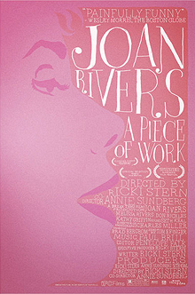
 Mr. Peters teaches me how to see better. His commentary is perceptive, lucid, unpretentious, and entertaining, especially his analyses of current movie-poster designs, which open my eyes to things I would otherwise overlook.
FontFeed is not a teaching site, quite, and your type antennae need to be pretty well dialed in, because this is not beginner’s material. But the subject matter is familiar, and you’ll learn a lot if mainly by osmosis.
While you’re at Unzipped, check out the article Fonts for Forms, which is a little bit about forms (a thankless but essential design task) and a lot about forms fonts, with plenty of links links links. Have a look at Comb, which Unzipped calls the ultimate monospace (that’s what you want) type family for forms.
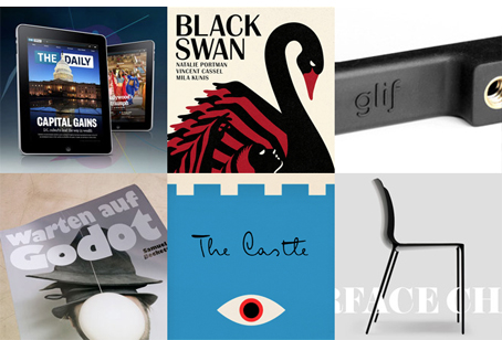
Also check out Fonts In Use (below), a new site headed by FontBureau’s Sam Berlow. Fonts In Use looks at fonts currently at work, with visuals and commentary. As with FontFeed, it’s not a teaching site, but you’ll pick up a lot by listening in.


My takeaway from this is that I consider John McWade to be the very definition of a graphic designer’s eye. Nobody does it better than he, and I find it refreshing and a bit humbling when he admits that even he can be taught to see things better. When do we become experts? I guess none of us ever do, but when we admit to knowing everything, it’s a sure bet we’ve quit seeing things. Thanks for the reminder to stay inquisitive and humble. And the links to some great type sites.
I agree with Gerald.
And with John.
I, too, started with a love of type.
My dad was in the printing biz, so I saw a lot of type as a kid.
I still have his “Dayton Typographic Service Type Book” that he bought sometime in the 1950s for $8.50 — a huge sum back then. That’s where I first learned about and fell in love with the Futura family. And Garamond. And Gothic No. 13.
And the difference between hand-set and machine-set type.
And I still love type.
Thanks, John, for a good brain shake.
Thank you John. I’ve learned a lot from you and Before & After. I’m not as grounded as I should be in typography, so thank you for the links and for the inspiration to learn to “see better” too.
I don’t think I’ve ever shown you a word that you didn’t nudge. You taught me to love the lines, shapes, and directions of letter forms. And, finally, I can see for myself the values of the open spaces in counters for style and mood. Thank you for not keeping your “secret love” a secret!
Oh, I how wished you lived closer to me; we could become good friends.
I have watched your website over the months (or is it years?) with interest. I am way way past retirement age, but I am still working, doing the odd design job for family and friends. I was trained at St. Martins’s School of Art in London. Before the days of “Letraset.” Worked for McCanns in my early years. Then emigrated with my young family to NZ in ’66.
Enough about me.
What I want to tell you is that you are among the very few people who inspire me. One of the old-school who really get a kick out of good design and understands typography and probably is an admirer of Eric Gill. Keep it up; there are not many of us left.
Dear John McWade,
I take the opportunity here to thank you for your excellent work. I receive some newsletters, but yours is always the first I look at! BA Magazine contains so much inspirations and good, practical advices.
I am with you since years and will be in the future. Thank you!
Kind regards from Switzerland
My love for typography and graphic design started when I was about 12 years old. I’m almost 50. My father was a draftsman and a sign painter in the Washington DC area for over 45 years. I used to love watching him hand paint letters in his own style(s) on different mediums like glass windows, wood doors, paper signs, fiberglass boats, and metal vehicles. When he was hired to create political signage, he would resort to using his handmade screenprint system for “mass” production. To make his stencils to print from, I would help him by pressing letters side by side onto transparency film from sheets of press-on letters and numbers. I fell in love with Helvetica, Copperplate, Bookman, and Commercial Script. Using his projector, he “shined” the art we built together onto the wall in our living room to make his stencil from. Leaping forward many years, Before & After has been a true inspiration to my life as a graphic designer. It’s been my “mistress” that’s lit many fires under me — one of my secret loves. Thank you!
BRAVO!
I work for a college, and I work with the school newspaper. Every new editor comes in and wants to put his mark on the paper — so every summer I start off with, “adjust your kerning, here’s how to use leading, this font gives a feeling of . . .” and every time, it’s wonderful to see the light come on and watch them use type to convey something besides just words on a page.
I love fonts! My first experience was hand setting type for a introductory graphic arts class I took in college. I’m so happy to know of the resources that you cite in your article.
I’ve loved graphic design for years and have dabbled in everything from print to web to video. I’m in my 50s, and I’m back in school in hopes of becoming more knowledgeable and proficient in the world of media.
We are currently working on text effects in Photoshop. It’s great fun, and your resources will be an incredible source of information for me.
Thanks for what you do.
I heart all of these sites and have them in my rss feed. I am especially happy for the new Fonts In Use blog, which definitely brings something new and needed to the world of type blogs. Another couple of great ones out there are Typedia (check out their weekly Type News), and I Love Typography, one of the first out there (and still one of the best resources). Also, check out the new 8 Faces magazine; issue number 3 is on its way!
Thank you, John, for promoting these. The world of type could always use more love.
Hi. My name is Scott and I, too, am a type-aholic. (Pardon the AA metaphor there, although it does seem like an addiction sometimes.) I cut my teeth in this industry ingesting Herb Lubalin’s work and miss that time in history when type was purposeful and in many cases, the art. I used to wait in angst for my U&lc magazine, published by International Typeface Corporation, to arrive to absorb the letterforms. No longer published, you may find old editions online to peruse. Well worth it for those who haven’t been exposed to it.