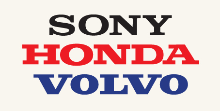
I was in traffic at a stoplight yesterday behind a Volvo and realized that its logotype reminded me of Honda’s, which reminded me of Sony’s. You can see why . . .

They are, for all practical purposes, identical. Egyptian-style slab serif faces, medium-ish weight, all uppercase. Honda and Volvo even have the same number of letters.
Not sure if there’s a lesson in this, other than you don’t need something fancy — or even different — for differentiation.
How can this be? That’s not what we’re taught. Yet the evidence is pretty clear.
Consider these titans . . .

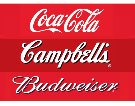
How alike can you be without being the same? Well, you can be this alike (above). Eight- and nine-letter names in white script (including two voluptuous Spencerians) on red, two with shadows. Coke used to have a shadow. All three are foods or beverages that come in small cans, yet note this: No one mistakes one for the other. None of us brings home a can of Chicken Noodle when we went for a Coke.
We accept these similarities without blinking, without even thinking, yet we’ll slave for hours, days, weeks to make our logotype “unique” or “uniquely expressive” or “awesome” or whatever.
Are we misguided? We may be.
It’s nice to have an attractive logo, which it’s our job to design. Now and then a logo can rise to the level of art and all by itself set a tone and standard for an entire enterprise. But that’s rare, and, while desirable, never necessary.
Our sense of a company or brand comes not primarily from its logotype but from its unique products and culture and vibe. Among just car companies, the differences can be vast. Each has thousands, even millions, of touchpoints that are distinctive, from dashboard design to service uniforms to the way our email gets answered. Even locale is a factor; we feel different about wintery Sweden (Volvo) than we do about cosmopolitan Japan (Honda). And so on. Because of this, we also experience their logos differently, despite their visual similarities. We assign the value, not vice-versa.
What does this mean for us designers?
One, it means chill; you’re not responsible for the success of the enterprise. Two, let your clients know; they have many fuzzy ideas about what a logo is for. Three, keep your designs simple, bold, and direct; subtlety will be lost. Think of this as equivalent to writing with simple, common words. It helps people, especially semi-attentive ones, get it. And four, don’t over-worry about being unique. Don’t copy or be obviously derivative, but if an Egyptian-style slab serif works for you, use it, even though Honda uses it, too.
We won’t mistake you for them.


It’s like Paul Rand said . . . don’t try to be original, just try to be good. I designed a logo for a coffee company that they thought was too close to the logo of another coffee company (and it was surprisingly similar, though entirely unintentional . . . I had never seen it), but I explained to them how my design was still uniquely theirs and why they would never be confused for the other guy, and now that the client changed their perception, they love it!
Great article, John! I often find that people (designers and clients) get too hung up on the minutiae of logo design and lose sight of the big picture. The “perfect” logo is a great thing to strive for, but as designers we have to keep it in perspective with all the other aspects of the client’s real-world circumstances. Many less-than-perfect logos continue to work superbly for brands that have become household names. Simplicity and consistency are paramount.
Thank you for this. I recently presented a logo that, while seen favorably overall, was said be similar to two logos from another industry. I explained that a logo must convey a certain idea in a clean, concise manner. If it is also completely unique, all the better, but with millions of logos already out there, that’s a tall order. While that satisfied the concerns, I wish I had this post during that presentation to drive home the point.
Another brilliant post, John. Twenty years and counting. Thank you.
Simple words. Simple message. A lifetime of complexity distilled.
“Cool Stuff” indeed.
This is a brilliant point. Thank you for posting. Do you mind if I re-post on my blog? (http://elisabethonearthblog.com/)
Hi Elisabeth, thanks for asking. Please feel free to repost it.