
The job of a logo is to identify, not sell or explain. That’s for marketing.
Any simple image that does this will usually work. It helps if it’s attractive.
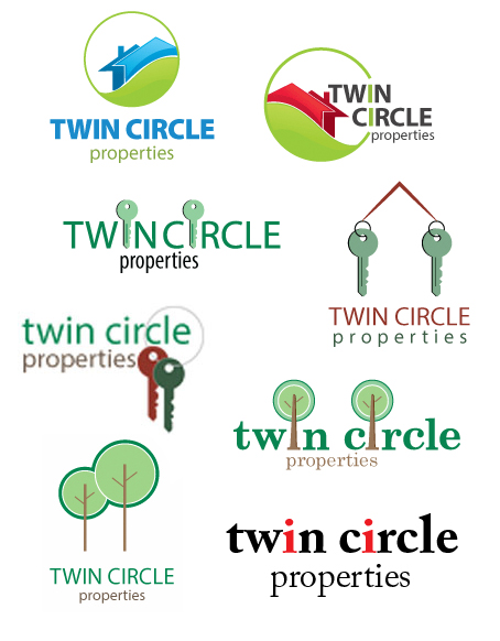
Kim’s job was to design a logo for Twin Circle Properties. “Twin” was for the owner’s twin girls, and “Circle” was never explained. Many of the best company names are similarly personal (not derived from marketing).
Thinking “real estate,” she tried houses, keys, trees. All were complicated and cliché . . .
There’s a better approach. Instead of thinking literally, or trying to draw a little picture, think back to the era of open-range cattle ranching, where modern branding originated. You’ll recall that brands were simple icons, easy to apply to livestock and see from a distance, by which one could easily identify the ranch. That’s all a good logo should be, plus beautiful.
The other day, I ran across this logo for Simon Malls . . .
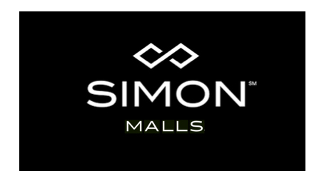
I don’t know what the mark represents, if anything. Perhaps engineering, perhaps diamonds, maybe a stylized infinity loop. Whatever the case, it doesn’t seem to matter; the abstract shape is clear and classy, and it didn’t take me long to associate it with Simon Malls. I remember it.
Note how simple it is. Note that the mark is physically separate from the words. The connection comes from shared clean lines in a single weight.
What might this approach look like for Twin Circle Properties?
How about a logo made of two circles . . .
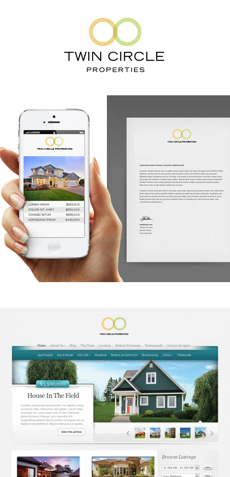
Simple image, simple setting, always centered, always in open space. The circles will work with the words or without . . .

. . . in other colors, and in grays.
Is it too simple? No such thing. It’s classy, and it looks like what the name says. It’s easy to design, easy to adapt to other formats, and easy to remember.
When you show your client your work, remember to show it in context. In doing so, he can see that it’s more than two circles (“Two circles?! I could have drawn those!”) (No, he couldn’t.) — it’s a real brand. It’s a necessary exercise for you, too, because you’ll have to think through the look (and function) of the whole program.
Remember: You’re only creating an identifier, not summing up the entire enterprise. Keep it simple.


Great stuff! Simple is complicated and hard to pull off.
These days, also think square and round. Every app and avatar now in social media needs a logo that fits into a square and circle. Back in 1995, I created my logo when these things did not exist. To this day, I have struggled with how to fit the shark fin into a square and logo. Nothing has worked so far, but in the interim, I resorted to what you see on @rivershark
We used to start with the business card; now we start with mobile.
I immediately saw a sideways S for Simon Malls (the Falling S Ranch? ;-) ).
Great reminder John. Two recent projects came together for me when I stopped trying to overthink things. Keep it simple, stupid!
Great advice (as usual), John. Looking forward to using this article to scaffold my students’ logo/branding projects in the fall.
Have also shared the idea with other educators: http://edex.adobe.com/resource/-ddb7b2f/
Thanks!
Since it’s twin circles should they be the same color? I know, boring but they are twins.
Twins may look alike but don’t always dress alike. To me the two colors evoke a sun and a tree, nice associations for a place to live. And the two colors plus the third where they intersect give the logo depth, not simply two flat circles.
I start with a browser tab (16×16 square) and a crowded Mac dock (many competing logos, cluttered background). If it can be distinctive, findable, and legible in those conditions, it’s a good start.
You are not only a brilliant designer but also a great teacher and writer. I love your articles — concise, easy to follow (even for a non-native speaker) and funny. And I almost always agree. ;-)
Interesting article in the “Feast” section of this week’s Sunday Sacramento Bee featuring 8 local brewery logis with explanations by the owners (link below). It helped clear my head a bit and think about better questions to ask clients before trying to come up with initial logo designs.
http://tinyurl.com/p64clcq
Anne