A bit of followup from Wednesday . . .
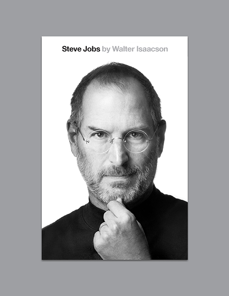
One popular suggestion was to make Mr. Jobs’ photo slightly smaller, thereby adding white space around the title. Like this . . .

To my eye, this is a good, if modest, change. The added white space, which appears mostly on the sides, strengthens the small type and imparts that quiet, Apple Zen feel, which the original doesn’t quite achieve. It also solves the severe cropping across his hand. In exchange, it sacrifices intensity. The result is an excellent cover with a different Gestalt. Which is better? Which will be better in a year?
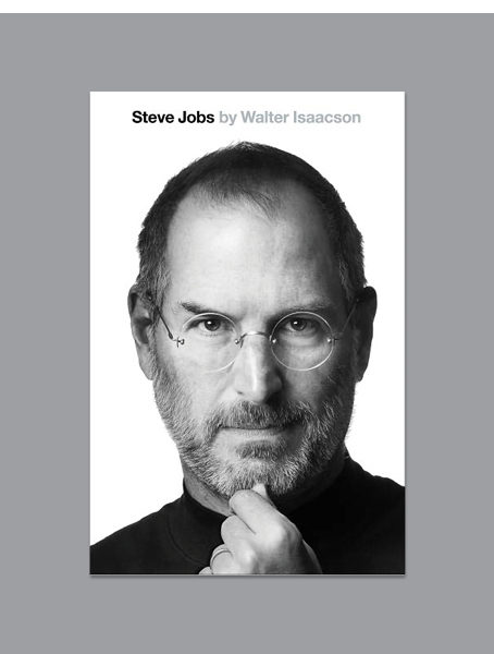
The book as published . . .
Other notes:
Apple’s typeface is a variant of Myriad Pro, which is similar to Frutiger. The two are easily confused.
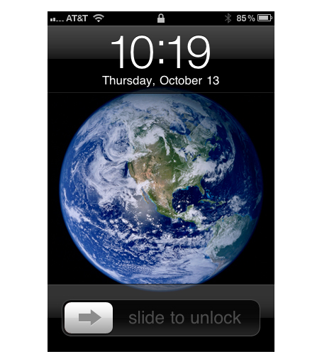
The use of Helvetica type for the title is valid. Apple uses Helvetica and Helvetica Neue on all of its mobile devices and parts of its Lion OS. My iPhone:

A favorite suggestion was to run the photo without a printed title. But, as Edward hinted, this would cause confusion. Not everyone is as familiar with Jobs as we are, and there are other Jobs books out there. An Amazon search turns up a wordless cover, and you’re thinking, is this the right one? Remember, too, that a title confined to the spine works only for printed books, not ebooks. Similarly, while a blind emboss could be beautiful (and certainly Apple minimalist), it, too, would be invisible in e-formats.
Suggestions to make the byline smaller than the title, or of a different weight or gray value or case — or stacked or repositioned — open a heaping, five-pound can of typographic worms that we’ll need a longer article to address. Sufficient for now is to say that simple is best, and the single-font, single-line setting is the simplest possible.
Finally, Diana is surely correct in saying that opinions are being colored by Mr. Jobs’ recent passing. We in the design community, especially, feel the loss, so Mr. Isaacson’s book is serving, at least in the short term, as our memorial. This cover will look different to us a year from now.


Your design is indeed more elegant, but the impact of the larger image of Steve Jobs, who has been a hero to so many, made that design more powerful. It was about Steve Jobs, and who cared who wrote it at that point?
Must add that Before & After has been my favorite publication since day one!
As a bearded man myself, the photo made me wonder if Jobs always stroked/tugged his beard when thinking. If so, then the photo makes better sense to me. It did make me remember the times I have been told that it is distracting for people when I do it . . . even been told it appeared to be a distancing technique.
You’re right, Jobs does seem more distant in the remake, although the increased breathing room at the top is nice. Now it doesn’t seem as if the type is balancing on his head.
The original is in your face, staring AT you. It’s a little disconcerting, actually, but didn’t he have that effect on people? There are interesting components in both designs.
The limitations inherent to e-books that you list partly explain why I’ll always buy some books in a paper format : spine, effects on a cover, the ability to browse it to check what it’s about and have a feel of the quality of the paper…
As for the cover, on reflection it actually feels more cold and remote than truly Zen, and I think it’s because of the portrait. It is a bit generic, bordering on corporate. Maybe it’s meant to illustrate the thesis of the book, which I haven’t read.
I was looking at the cover design, and I can’t help but feel that it is too much of a memorial piece to do Steve Jobs justice.
Anyway, a nice idea that embodies the Mac-Steve Jobs connection would be a full-body shot on a white-gray gradient with a wet floor. It is the style that has defined everything Mac for over a decade.
This is a man who deserves a highlight of his life instead of a somber memorial.
I love well-used white space, but that wonderful photo of this extraordinary man is so eye-catching that I feel it loses a bit of the intended impact with the smaller-photo version. I can’t stop looking at his eyes! I am amazed at all he accomplished in his short life, and I am very intrigued by the photo itself. What is he thinking about? It makes me want to buy the book. I do prefer the slightly larger title text version, but I wouldn’t mess with that powerful photo.
I viewed the original cover with a positive note. Although, my first thought was to make the image a bit smaller, not as much as published in this forum, but nevertheless a tad smaller. The type I thought was of the right proportion in the original version. Extending it wider created unnecessary tension and distracted from Jobs’ image, which is what the book is all about.
As far as the portrait itself, having never met the man, from all accounts I’ve read of Steve Jobs, he was an intense individual who commanded his team to dig deeper into themselves for the best solution they faced, and then he pushed them further. The portrait reflects that intensity.
The original book cover is still stronger. A previous commenter said that it is because Steve Jobs was soo important to us, and therefore he should be larger, but I disagree. I think that the reason that this design works better is because of the way it makes your eye move through the graphic design.
Your eye begins at the bottom left corner of the page, then lifts up and to the right, following the line of his finger to his chin. Then your eye continues from the chin, around the curve of the side of his face to the top of his head. This is where your eye jumps from his head to the text.
In your design, the jump happens from Steve Job’s ear, then connects at the author’s name. In the original design, it jumps from the middle, topmost part of his head, then curves past the author’s name to “Steve Jobs.” This aspect, when combined with the light gray used for the author’s name, does exactly what the design is meant to do: It highlights Steve Jobs . . . and only Steve Jobs. It does not highlight the entire block of text at the top of the page, because the entire block is not relevant.
Also, because the original design pulls your eye past the author’s name directly to “Steve Jobs,” it connects the black of the text (“Steve Jobs”) with the black in his shirt. This link helps to ground the image. It works like vertical bookends.
In your design, because of the layout, the gray draws attention to the gray tones in Steve Jobs’ face, which actually detracts from the more-interesting dark tones in that picture.
Here’s the front, back and spine:
http://tech.fortune.cnn.com/2011/08/16/a-peek-at-steve-jobs-book-jacket-front-and-back/
Some more thoughts on the original cover:
The space either side of Steve Jobs’ head creates two vertical white columns. These are honoured by the title in the original design.
The cropped hand could almost suggest “look what I’m about to show you.” even though that wasn’t the intention of the original portrait.
Also, I find the sloping right shoulder in the zoomed-out photo is somehow distracting. It leads down and makes me want to see a complete portrait rather than a cropped photo.
I do not like the cover photo at all. The hand on the chin is distracting, while Steve’s expression is determined yet with a hint of anger. Maybe this photo captures him perfectly — I don’t know, since I never knew the man — but based upon looks alone, I think a more compelling image could have been used.
Although I don’t really like the photo (it looks deliberately and artificially posed), and I do love the way the extra white space flows and draws attention to the contours of his head and shoulders, I have to say I think the larger image is more effective. It rivets the viewer face-to-face with Jobs. The hand is distracting, but if it must be there, the cropped version turns it into more of a graphic element, carrying the centered layout clear through to the bottom of the page.
I have a different view than many, as I knew nothing about Steve Jobs beyond having heard the name in connection with Apple prior to his death. I found the first image too dominating, and I agree with the last comment that he looks angry.
Now that I have heard so much about him following his death, I would be interested in reading more. This cover would put me off. Do I want to know more about a man who looks so unpleasant? (Please understand that I am not saying Steve Jobs is unpleasant; it’s just a reaction to this cover.)
The smaller image is a definite improvement, as it creates a less-confrontational cover. Seeing the whole hand puts the action in context and, overall, he looks a bit more approachable and the book more inviting.
However, I think a completely different image would be better still.
Well, the new comp with the smaller image looks like the perfect poster! You know, they may have chosen the larger image because it will be seen, most often, in thumbnail size on an iPhone or iPad.
The original cover that started this discussion was very impressive. The portrait almost overwhelmed the title and author, and one could not help but look at the portrait. A bold and very focused person, deep in thought behind powerful eyes strengthened by the hand to the beard. A look of determination with just a touch of knowing of something new or a significant change — almost a very slight smile, enough to intrigue.
I was amazed at the result of the slight change in the title size. The cover with more white space significantly reduced the dynamics of the portrait.
If this was my work I’d have suggested to the publisher that they use two covers over time, the original one for the first printing and the one with the larger title for the second printing and after.
To me, the cover with the larger photo is better. It is more intimate and more powerful than the other one; it is captivating.
Anyway . . . interesting how such seemingly small changes make such a big difference in overall look and feel!
It’s all about his eyes, to me. The photographer lit his subject specifically to call attention to the eyes. At first glance, everything else falls away.
The looser crop makes more sense, mainly because the hand is now a hand and not an extension of the beard.
I know this isn’t part of the discussion, but the type is simply in the wrong place, unless the subliminal suggestion is that Steve Jobs has a halo (or a mortar board, or a seesaw) on top of his head. It should be at the bottom, and just as minimalist, IMVHO.
I like the final cover a lot, and I’m taking note of all the discussion and thought that goes into a minimalist, “Zen” design. I’m sure my boss (an attorney) would think that this cover took less than an hour and would want to pay the designer and photographer accordingly.
Small change, big difference. The change in head size makes a difference between humanized and aggrandized; between warm and cold. I see his smile on the smaller head, but the eyes overwhelm it on the larger one. And the hand on the smaller one centers your eye on his wedding ring — again, a humanizing touch. So the question is: Is this book about Steve the man, or Steve the icon?
As it seems Steve Jobs was “larger than life,” it seems appropriate to use the photo in the large size. As for the simplicity of the title and byline, everything Apple has produced strives for (if not always attains) simplicity. The original cover seems the more-appropriate in this regard, as Steve Jobs’ intensity was certainly monumental.
I like the larger photo. When comparing the two, I keep finding my eyes drawn to his hand in the one that’s not cropped. I like the zoomed-in, cropped look. It focuses me on his face — and specifically his eyes.
I liked the bigger photo.
And, wow, all of this commentary over two or three elements in a “design.” Is this even design? (Seems a little too basic . . . I’d probably even be a bit hesitant in billing somebody for this.)
From what I heard from the author, Mr. Jobs asked to design the cover.
I don’t know that I’d second-guess it.
I approach this from a background in photography, and I tend to experience a kind of “visual music” when I look at designs. I don’t literally hear things, but I have a sense of dissonance or harmony, higher and lower notes, that kind of thing.
To me the tighter cropping has a higher tone on my visual scale, the looser cropping is slightly lower pitched and more restful. The looser cropping allows the line of the shoulders to do more, and avoids the odd feeling that the hand is something hanging off the beard rather than sticking up from an unseen arm.
I’ve probably spent too much time in the darkroom!
I liked when 60 Minutes put a subtle Apple logo into Jobs’ eye. It was perfect and very simple.
mj
A powerful, engaging photograph that communicates a wealth of information? Yes. A great book cover design? Er, no. The cover intentionally lacks design.
The picture is fine, but I think that Steve’s name should be larger than the author’s.
The original cover is perfect.
I agree with those who feel the cover as published is better. It is more engaging. Design-wise, it works better because the dark shape is more clearly dominant than the background white shape.