I’m working on a new video for lynda.com, this one about creative photo cropping, which is one of those activities we all do but are often only vaguely aware of it.
Generally we crop to either fit a space or get rid of dead spots. We’re usually less aware of the way we use cropping to create. Changing the proportions of a canvas can draw attention, dramatize a point, convey a sense of realism, and so on, especially when the cropped image interacts with type or other elements.
With that in mind, here’s a look at the seven kinds of crop that we’ll be dealing with in the video:
The original image . . .
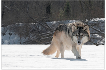
The hard crop. This is (by far) the most common. It changes the proportions of the image by cutting one or more sides . . .
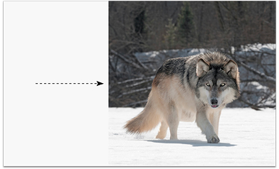
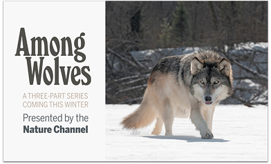
. . . often to make room for words . . .
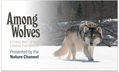
The soft crop. This also changes the proportions but does so by feathering an edge . . .
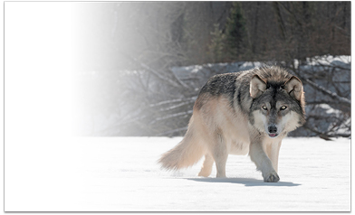
The soft crop mimics how we naturally see; a scene in real life doesn’t have edges but just fades off in our peripheral vision . . .
The split crop. This removes a section from the interior rather than from the sides . . .
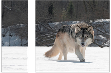
The image can (in this case) then be spread apart . . .
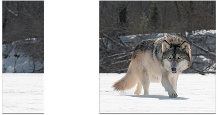
. . . and copy inserted. The spread step isn’t always necessary. Not all photos lend themselves so well to this technique . . .
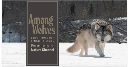
The stickout crop. Similar to the hard crop but leaves a bit of the image sticking out. Easier to do with hard-edged objects than with fur like this . . .
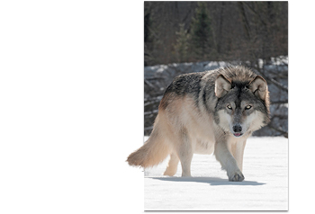
The stickout creates dimensional interaction with the page . . .
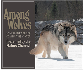
The knockout crop. Same as the stickout except the entire background is removed . . .
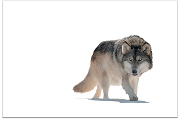
. . . which frees the image to interact with the page in many different ways. Here, the panel is behind the wolf and the words on top, which is dimensional and in this case unrealistic. It would be very effective in other scenarios . . .
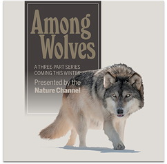
Very easy to recolor the background . . .
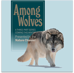
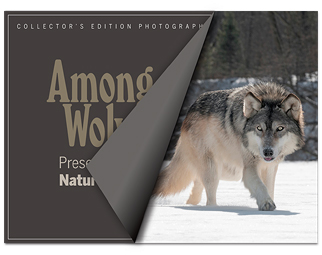
The false crop covers rather than cuts the image . . .
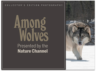
. . . as you’d want, for example, on a cover . . .
Last, the shape crop. The wolf image works naturally in a circle. Other kinds of images can require some creative gymnastics.
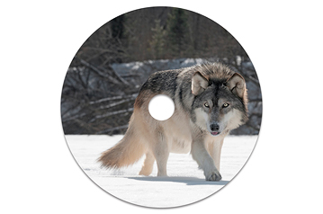
Paired with a soft crop . . .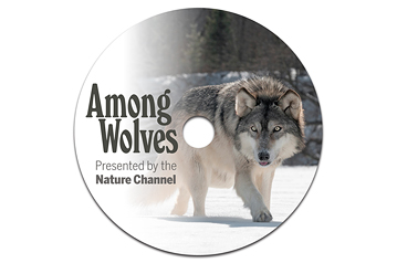
And a hard crop . . .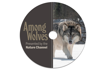
The video will detail each of these seven, with lots of other examples. I’ll let you know when it releases.


Helpful and concise!
Hey, John,
Great demo. What’s that font in the Among Wolves head? I love the slanted counter space in the lower case “o”.
Same thing stood out for me (other than, of course, all the crop work). Great typeface.
It’s Windsor Elongated. Buy it here. Read about it here.
John, I must hand it to you. These examples have just broadened my horizon even though I do a significant amount of cropping for our print/design shop. Of course, the image you chose lends itself to your samples; I am usually not so lucky! I will keep this Design Talk page handy. Thanks!
Beautifully explained and demonstrated — but then I have come to expect no less since the author of this article is John McWade.
@Dyann, I think the font is Windsor Pro.
Nice summary, John.
Mike
How fun to see all of these in one place — such great examples and a great way to teach them. I’m so glad I have a Lynda.com account — I look forward to watching the class. Thank you!
Brilliant article, not many experts have given cropping techniques the attention it deserves. Thank you, John.
Thank you for this, John; it’s a very useful discussion. I appreciate it!
When I read the announcment about “cropping” I thought: what could one say about a subject like this. Now I know there’s indeed a lot more to it. Thank you for broadening my horizon and the inspiring examples.
The best cropping education ever is working at a newspaper. A photo is not just a photo or “embellishment;” it tells a story where facts really, really matter. And editors/readers care if you get them right; e.g., #Fergusonphotos
Is mugshot cropping going to be included? I can’t recall the issue of B&A it was covered in, but that changed everything for me about newsletter, article, website cuts. I no longer dread the “call for photos.” Line up the eyes in layers using onionskin, if one is grayscale, they all are, balance the grays/levels, crop. Quick, easy…
Thanks for sharing the terminology! I’m somewhat newer in my field, professional experience of 3+ years so I’ve always called these crops “effects” like the gradient and knockout. I’m actually really happy I learned these terms. It’s always best to be as accurate and technical as possible when speaking about photo treatments.
So much creativity for Monday morning. Thank you for sharing.
Brilliant demo, thank you for this, John!
Nice! Thank you.