Dear readers: Every design for a client starts with a creative brief. You can read about that here, but do it later; the short version is something like this:
Rule #1: Listen.
Rule #2: Understand and embrace the client’s vision.
Rule #3: Write it down. You and the client sign it.
Rule #4: Design that. Don’t design something else.
The process of making the brief can sometimes be shortcut but usually not. For time’s sake, I usually try. It rarely works.
The following will be an audience-participation project. It begins as a conversation between Gayle Heatherington — executive director of the Ars Viva Symphony Orchestra — and me. I publish it because I want you to hear the question-answer process that leads up to the creative brief. Keep in mind that we’re corresponding long distance — she in Illinois and I in California — which requires questions that an on-site meeting may not. At the end, I’ll ask for volunteers to work on a design solution.
Gayle begins: I love your discussions of logos and wonder if you (and your readers) would be interested in commenting on ours. Our name is actually our logo. It is made up of two fonts: Linotext Std and Van Dijk Std.

The name of the orchestra is Ars Viva, which means “living art.” Our concerts often juxtapose beloved masterworks with less-familiar repertoire. Hence, the current logo has Ars in an old-style font and Viva in a modern, forward-looking font with an exclamation mark. This is to represent the old and the new. Trite?
I would be interested in investigating whether a change would helps us brand our image better. Also, the name itself is a challenge for most people, and they don’t know what it means. I have wondered if an actual logo in addition to the name might help make us more easily recognizable.
The orchestra was founded by our music director (my husband!) 15 years ago. One of its distinctives is that he gives friendly, informative remarks to the audience from the stage that provide context for the music and establish a welcoming atmosphere at each concert. Also, the orchestra is comprised of many of the finest musicians in Chicago, including members of the world-renowned Chicago Symphony Orchestra. Therefore, the quality is extremely high, yet not “stuffy” and unapproachable.
In case you wish to take this project on, you can find more information about the orchestra at our web site: www.arsviva.org. [Readers: While you’re there, don’t miss this essay.]
I would appreciate any comments you may have about our current logo and any thoughts you and your readers may have about alternative logos.
—————
.
Hi Gayle,
Thank you for your great story.
Questions:
When you say your name is a “challenge for most people,” is the challenge . . .
1) that they have trouble pronouncing it?
2) that they don’t know what it means?
3) that they can’t position it in their minds? (i.e.: I understand what the Chicago Symphony Orchestra is, but what’s the Ars Viva Symphony Orchestra? Public? Private? Big? Small? Professional? Amateur? And so on.)
4) Other?
When you wonder if a change “would help us brand our image better,” it sounds like you’re referring to #3 above.

When you wonder about an “actual logo,” I presume you have in mind a mark like the Chicago Symphony Orchestra’s, in addition to your name. Yes? No?
Is Ars Viva something like the Boston Pops?
John
—————
.
Dear John,
Here are the answers to your questions.
When you say your name is a “challenge for most people,” is the challenge
1) that they have trouble pronouncing it?
Yes, a lot of people don’t realize it is two Latin words, and they think the first word is simply three letters, and they call us A-R-S Viva, which, of course, means nothing.
2) that they don’t know what it means?
Yes, we have often been asked by patrons what the name means. This gives us a chance to explain the “old and new” music concept, but only to those who ask!
3) that they can’t position it in their minds? (i.e., I understand what the Chicago Symphony Orchestra is, but what’s the Ars Viva Symphony Orchestra? Public? Private? Big? Small? Professional? Amateur? And so on.)
Correct here, too.
When you wonder if a change “would help us brand our image better,” it sounds like you’re referring to number 3 above.
Really all three. But number 3 is much more challenging. We don’t have a location to call home: Chicago Symphony, Elgin Symphony, Rockford Symphony, St. Paul Chamber Orchestra, etc. We perform in Skokie, Illinois, but we are a regional orchestra, and Skokie is not really our home town. Skokie already has an amateur orchestra (Skokie Valley Symphony), and we don’t want to be confused with them.
An organization like Music of the Baroque has a name that clearly explains what you can expect when you attend one of their concerts, and it was a very good name for building this organization. But we don’t perform just one style of music — in fact, quite the opposite!
When you wonder about an “actual logo,” I presume you have in mind a mark like the Chicago Symphony Orchestra’s, in addition to your name. Yes? No?
Yes. Maybe if the name is confusing, at least people can get used to seeing the logo and recognize us that way.
Is Ars Viva something like the Boston Pops?
Well, if you mean performing pops repertoire, then no. In the sense that we have a lot of the same players as the CSO, then yes. But the Boston Pops is run by the Boston Symphony, and we are a completely independent organization. We are more like the St. Paul Chamber Orchestra. We are a chamber-size orchestra (though we have not called ourselves that), and we perform in a smaller space than the CSO — more intimate — and the rapport with the audience when my husband talks to them is relaxed, entertaining and informative. But the music is serious, not pops. We offer people in the suburbs the opportunity to hear a world-class orchestra close to home. The commute to Chicago is daunting for many! Even if they are subscribers to the CSO, they can see many of the same players on our stage and hear interesting music that they don’t often play downtown.
Gayle
—————
.
Hi Gayle,
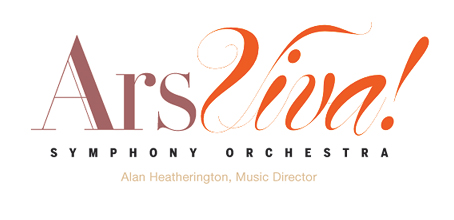
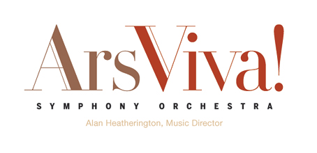
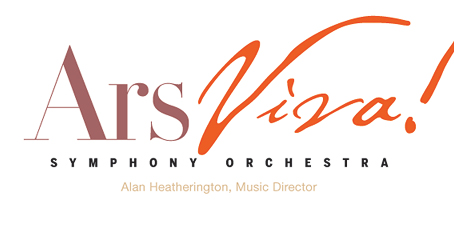
Your current logo is built on an interesting typographic concept [old and new], but its rendering is rough. Easiest place to start is to polish your idea to see if better typography will help. Attached are three possibilities, all similar. The colors are derived from your Web site. It may take some time for my fantasy to catch up to your reality. Just give me a reaction.
John
—————
.
Dear John,
Of the three examples, I like #3 best. #1 — the Viva is too hard to read. It could look like Ars Uiua. #2 is okay but doesn’t jump out at me. I like the Viva font in #3.
Reduced to the size they would be on a letterhead, return envelope, small print ad, etc., I suspect that there would be a real problem reading Alan’s name. Also, the very thin lines of the typeface for the “Ars” would disappear in printing. I often print our logo reversed on a black background, and the very thin lines would be swallowed up with black ink.
Because Alan is the founding music director of our orchestra, his name should be more prominent. He is actually part of our image. He is very well known in the Chicago area, and so his name actually is pretty important. His name could even be on top of the logo! :+)
Ideally, I would like a logo that can be reduced, stacked, printed in color, black or white. The design restrictions for multicolor logos present too many problems. The man who designed our logo originally had the Viva! in a rainbow of colors — like your “After.” I liked it but quickly had to drop it for practical reasons.
We also used to have a byline that we often printed near our logo that read Making music come to life. Much like your How to design cool stuff. It was printed under a treble clef that had a leaf growing out of it. I don’t know if this helped explain the name or not. The treble clef was actually an S in some font turned around! See below.
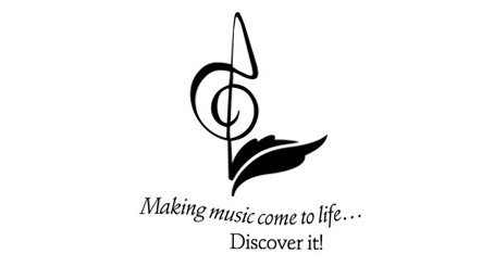
We used different words underneath: Discover it! Share it! Experience it! But soon just dropped that part.
Gayle
———-
.
Hi Gayle,
Thanks for the helpful feedback.
I should have been clearer. My interest at this early stage is only in the form factor, that is, what the typefaces alone convey. Color, size, usability — that will come later. Same for Alan’s name.
The final logo will be usable in all sizes, colors, resolutions, etc. In this case, the fonts have heavier-line versions for reproduction under more difficult conditions.
I like the Viva font in #3.
That’s the one we did first. Do you like your original concept of a two-typeface logo? If so, our job will be to find the right two typefaces. Or are you hoping for a new direction?
We also used to have a byline that we often printed near our logo that read “Making music come to life.”
I like this image and the byline. It doesn’t explain your name, but it gives me a sense of what you’re about.
I understand your name. That’s because you told me up front that it means living art. You also explained the kind of music you play, and your husband’s role not only as founder and director but as something of a curator for the audience.
The impression I’ve formed, therefore, is of a warm, rich, light, comfortable, educational, music experience — very appealing. Your Web site conveys this.
You have two sets of goals. One is to have a logo. The other is to tell your story in its various ways. The logo can tell the story but doesn’t have to.
Tell me more.
John
—————
[Dear readers: In trying to shortcut this process, I omitted several developmental steps and assumed, without thinking, that Gayle could read my mind, which, of course, she couldn’t. Her first impression, therefore, was formed like yours — she saw what’s on the page, accurately, and responded to it. First impressions are strong. Her sense that this logotype has problems — observed from experience, obviously — taints it. Now, elements that should have been presented up front — black & white, robust type, etc. — may be seen as “corrections” rather than integral parts of the image. That’s an uphill road that neither you nor the client should have to climb. Beginner’s mistake.]
—————
.
John,
I should have been clearer. My interest at this early stage is only in the form factor; that is, what the typefaces alone convey. Color, size, usability — those will come later. Same for Alan’s name.
Tell me more.
Well, I’ll try. It is hard for me not to look at something as a finished product, having never been through this process before! I got one response from a friend that the “Ars” font impressed her as Art Deco, which would not really work for us.
Do you like your original concept of a two-typeface logo? If so, our job will be to find the right two typefaces. Or are you hoping for a new direction?
Your probing questions have caused us to think about what we really want our name to convey. The consensus is that the concept of “old and new” (types of music we perform) is not as important as conveying excellence, energy, intimacy, excitement, newness, variety, freshness and a sense of “classiness but not stuffiness.” So, to answer your question, two typefaces are not necessary.
The impression I’ve formed, therefore, is of a warm, rich, light, comfortable, educational music experience — very appealing.
These words are all very good at describing the Ars Viva experience! You have captured the essence of what we are about. I might only add that the performers are world-class musicians who perform at a very high artistic level. Ars Viva gives you great music and musicians who are accessible.
Gayle
—————
.
Hi Gayle,
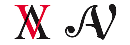
Before I lose this iteration entirely, here’s a modified version. For now, we’re looking only at the signature. This one’s minus the color, it has a clearer V, and the hint of Art Deco is gone. The Ars typeface is classic Garamond, which was in use in the 18th and 19th centuries and probably advertised some of these original performances!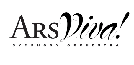 Moving on, the logo below on the left is for an upcoming Before & After project that has the same initials as Ars Viva. You’d need different colors, but does the form factor appeal to you? If so, can you picture it as the basis of a logo for the orchestra? The image below on the right is a pure ligature — a more organic image that takes advantage of the natural fit of your two letters.
John
—————
.
Dear John,
I like it and can picture it, an offhand impression. My husband thinks it is harsh and angular and doesn’t represent Ars Viva. Alan says the one on the right is going in the right direction — “it has flow and looks musical.”
Gayle
—————
.
Hi Gayle,
“It has flow and looks musical.” That’s a clue.
Let’s return to the beginning. I’ve attached our article “Design from a creative brief.” Please read it, especially pages 3 and 4, then with your husband and whoever else you’d like, do your best to describe your logo project and its goals, and get back to me.
Thank you!
John
—————
.
Hi John,
While “Design from a creative brief” seems to start with an image (dragonfly) and go from there, I have tried to use its format here:
Audience: Mostly over 50. Affluent.
Core target: Empty-nesters who have disposable time and income. Many of them played a musical instrument or sang when they were young.
Secondary target: Parents of young children (we have a special Music for Life program that targets 4- to 11-year-olds and brings in 20 or so young families to each concert.)
Tertiary targets: Corporations and foundations (especially important when applying for a grant)
Goals/Project Objectives:
Attract interest and respect and a sense of uniqueness.
Make the name more understandable (if possible) and readable.
Message:
“Approachable Excellence.” This is the phrase we came up with to describe Ars Viva in a nutshell.
Other words:
Professional, world-class, exciting, lively, fresh, new, elegant, classical, unique
We want to convey to the typical classical music concert-goer that we stand for the quality they expect from the Chicago Symphony; i.e., professionalism, trust, credibility.
However, we want to convey that their experience will be more personal, immediate, “up close,” and that the music and the musicians are approachable. The conductor speaks to the audience from the stage (often with humorous comments) and makes the whole experience terribly enjoyable. The music is enjoyed more because it has been “unwrapped” for the audience before they hear it. But I digress . . .
We want to convey that our music performances are fresh and new — living and relevant (not to be confused with “contemporary” and “far out.” At Ars Viva, you might hear a symphony that you’ve heard all of your life, but it will feel like a new experience. There is a lot of energy and excitement at our performances.
Approaches:
Ars Viva Symphony Orchestra
Ars Viva Symphony
AVSO
AVS
All of these are okay. The only requirement is that the name must include: “Alan Heatherington, Music Director.”
If you work on a logo (separate from the name), you could use a musical symbol (baton, treble clef, bass clef, violin, etc. Other symbols would also be fine — a leaf or vine or tree or bird — something from nature that conveys the “living” aspect.
We would like the logo to be used in color and black & white. As a practical matter, I would prefer only one or two colors. When I asked the board what color they thought AV represented, I got “blue” and “green” or “teal.” But this is open to any suggestion of yours.
The following is from an earlier email, and I liked it, so I have copied it again here:
The consensus is that the concept of “old and new” (types of music we perform) is not as important as conveying excellence, energy, intimacy, excitement, newness, variety, freshness and a sense of “classiness but not stuffiness.” So, to answer your question, two typefaces are not necessary.
The impression I’ve formed, therefore, is of a warm, rich, light, comfortable, educational, music experience — very appealing.
These words are all very good at describing the Ars Viva experience! You have captured the essence of what we are about. I might only add that the performers are world-class musicians who perform at a very high artistic level. Ars Viva gives you great music and musicians who are accessible.
Okay, that is what we have so far. If you need more information, please let me know.
Gayle
—————
.
Dear readers: There you have it. Although there’s no substitute for meeting the principals face to face and (in this case) experiencing a live performance — we have a good creative brief. Gayle’s patient descriptions, plus her Web site, provide a clear look at the goals ahead. Feel free to comment on what you’ve just read. Feel free to submit your own creative brief questions. And feel free to try your hand designing a new logotype for the symphony. Do this only if you’re serious. If you have questions or want clarifications, ask. Send your work directly to me. We’ll select several for critique.
.



John, this is outstanding. I not only can’t wait to see what people come up with, I can’t wait to use this entire experience as a teaching tool. Lastly, I wish I lived much closer to Chicago, or that something like Ars Viva was available here in Seattle. I will put my mind to it (not sure what will come out of it), but it is a superb example of how the process is supposed to work. As you walked through it, I found myself nodding and agreeing with you and understanding the process, having lived through it before.
It is interesting that even you fine folks at Before & After did what I have done a hundred times — jumped ahead of the client in the design process and had to backtrack after “poisoning” their minds with some great work. I laughed out loud, having made that same mistake more times than I can count. Good lesson learned there.
Can’t wait to see what happens. Please keep us updated on this one, and send out an e-mail when additions are made and a final product developed.
Thank you very much for sharing the steps. This is very interesting for me to follow! I can’t wait to see what Before & After readers will come up with!
Excellent stuff, and have forwarded the essay link on the Ars Viva website to some friends.
As soon as I saw the original logo, the brain said “update the Ars to a simple classic serif font, put symphony orchestra below in all caps . . . maybe Mistral for the ‘Viva’ as long as it doesn’t look too exuberant . . .” and then bingo! There it was right below.
It is a simple enough matter to put Mr. Heatherington’s name right below ‘symphony orchestra’ in all caps, in perhaps 85% black to soften it but retain its importance.
The ligature mark was a neat touch, with room for exploration, especially as the first part of the A resembles the f-hole on a violin. Nice.
How to convey ‘warm, rich, light, intimate and accessible’ in typefaces is sending me back to my type manual. My first guess is that use of different screens of black will be part of the solution to the need for warmth and intimacy. Though ‘intimate’ was not one of the terms used, given the size of the group and the immediacy of the experience, it suggested itself.
Credit also needs to go to Mrs. H who, having read the article on the brief, gave excellent, articulate responses. Obviously, giving the client the right cues helps them improve their own thoughts and responses.
Come to think of it, P-22 Cezanne would be a good stand-in for Mistral. I would shy away from organic images such as leaves, however, because this is not a nursery. If imagery is required, notes would convey a sense of liveliness and movement, especially if they are sixteenth notes.
And yes, we have all jumped ahead of the client rather than leading them step by step to where they can drink deeply.
Fine article.
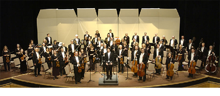
Sure wish we could get them a real orchestra shell while we’re at it! Players that good deserve something much better to bounce off.
John:
Great post — thought provoking.
I have absolute faith that you can dramatically improve Gayle’s logo (in fact, I loved the ones you came up with). Yet, that may not be the main issue. It seems to me that they need a new name.
When you read Gayle’s e-mails, it sounds like she is looking for someone to tell her it would be okay to consider that. To wit:
• . . . they think the first word is simply three letters, and they call us A-R-S Viva, which, of course, means nothing.
• Maybe if the name is confusing, at least people can get used to seeing the logo and recognize us that way.
And, finally, and most importantly:
• Your probing questions have caused us to think about what we really want our name to convey. The consensus is that the concept of “old and new” (types of music we perform) is not as important as conveying excellence, energy, intimacy, excitement, newness, variety, freshness and a sense of “classiness but not stuffiness.”
Many of her issues have to do with the mismatch between the name and the “story.” She and her husband know their story . . . they have lived it for 15 years. They named it presumably at the start, and as such, the name was a “guess” of what they thought the symphony would eventually stand for. But a brand is owned by the customer, and now that they have lived with their customers for 15 years they “know” what their brand is. They now know what their story is.
They just cannot articulate it perfectly (yet).
My suggestion would be the following:
1) Develop their messaging DNA. By this I mean their story, but I like to call it DNA for the following reason: Everyone understands that DNA is not the actual “thing,” but rather the seeds from which you can grow the “thing.” Messaging DNA is therefore the story from which you can grow all else — when people understand that they are less concerned about the precise words, and more concerned about the meaning. Which is what matters for messaging.
2) Use the messaging DNA to find a better name. One that doesn’t need to be explained, that isn’t hard to pronounce, that isn’t confusing. A name that communicates their story.
3) Then . . . design a logo that supports the name visually. Not necessarily literally, but in some sense works in concert with the name to help communicate their story.
In my opinion that approach would have a better chance of meeting her challenge.
Interesting look at the design process here.
My two cents at this point:
Not to get too specific on the revised logo as it stands now, but given the comment about “Ars” being confused as “A.R.S.,” I’d suggest moving away from the small-caps treatment and use upper- and lower-case on that part of the logo, regardless of the final typeface. And while the script style of the “Viva” helps to convey the playfulness that the discussion suggests, it may still be a tad too thick/thin to render well at small sizes — the same problem the Bodoni-style type in the earlier iteration faced.
For including the conductor’s name in the final version, what about using some sort of handwritten-looking script face for the name itself — or even his actual signature, if Mr. Heatherington’s penmanship is legible enough?
I think this is a classic case of trying to make the logo say too much!
My first problem is the separation of the Ars from the Viva in any form. It is a hard name to grasp (not being English), and this only adds to it. I understand that it has a meaning, but it’s not performing the task intended.
I also worry about using a word like ‘Ars.’ I’m not being childish, but unless the two words blend together, you might as well call it ArsGrabba! Fair enough if they are firm on the old and the new, but they have also softened on this. ARSVIVA (without separation) is the solution, but like I said originally, it’s not quite the word I’d use to draw crowds. Why not use the Latin word for music? (Musica)
If you render the whole phrase ‘Viva Musica!’ as an energetic and warm, inspiring script font (complete with exclamation!), I think that would be a great solution. It is musical, lyrical and promises a lot of spectacular music. (Even if you don’t speak Latin!)
I also prefer the byline from the website ‘Get close to the music.’ It hints at intimacy, knowledge and interaction. Mind you, I’m not a fan of rigidly hooking a byline to a logo, especially not in this case, when ‘Symphony Orchestra’ absolutely needs to convey what they do.
Hilarious! Thanks for being so real. I feel so “normal” for having slipped into this same situation too many times . . . Fantastic reminder that I can hopefully remember! Thank YOU.
First, thank you for all that you’ve taught and inspired. After a 45-year career in marketing communications, I am still learning from your example.
About the creative brief presentation. I was first introduced to the creative brief process in the mid-1980s while a corporate client of a major San Francisco advertising agency. Recognizing its benefits in the too-subjective creative process, I immediately incorporated the creative brief (which I call a Communications Platform) into all of my projects. Life is too short not to use it.
While reading through the professional-client conversation, everything I have learned in 25 years using a creative brief screamed out, “No! No! No! Don’t offer a solution until you have a thorough understanding of the client, their situation, audience, competition, objectives, messages, etc.!” And as the conversation showed, once the client saw the first concept logo the process became circular. The designer had to back up, explain; the client had to adjust, clarify, re-evaluate, and round and round. Confusing and inefficient.
Had the designer first gathered all of the information that the client eventually provided, the resulting well-informed creative process would have been more on target from the start. The finished design would have been completed in less time. And for all of us trying daily to stay competitive, our client’s cost would have been lower.
I am so impressed with Gayle’s ability to answer your questions — she is very clear, and her answers are complete. I bet that she would be a pleasure to work with.
One of the most difficult things I find in the design process is getting some clients to state clearly what they require. Sometimes they are not sure what they want, and other times they can’t articulate their desires in a manner that I can understand. I have found that I occasionally have to “read the client’s mind” in order to move forward. Doing so has usually proven effective. Even if I don’t get it quite right at first, we at least have a point to move on from.
I think there is a balance between asking a client too many questions (and coming across as incompetent) and just moving ahead with what information they are capable of supplying. I have often found that clients don’t want to answer a long list of questions (questionnaires), or simply don’t have the time to do so, so it is occasionally necessary to blindly move forward. Thank goodness it works out most of the time. From my experience, busy firms hire designers to take the task from their busy hands. They expect you to know what to supply as a professional and only want to suggest tweaks once they have had a look at the preliminary work.
It would be a real treat to be able to follow a well-thought-out pre-design plan with a questionnaire and time to ponder. However, it is rarely like that in the real world, where comments like, “I need that before five o’clock today” are the norm. If you want the work, you have to play along — at least, that is my take on it.
_____
A great article, John. Thanks for taking time to share it with us and allowing us to participate.
Hopefully this isn’t too pedantic; “Living Art” is “Ars Vivens.” “Viva” is not a Latin word; it can be Spanish or Italian, but it’s not Latin. Perhaps this will make it easier to change the name.
Wow, what a relief to know that so many of us are guilty of skipping steps and doing things “out of order.” Similar to Don Cheke’s comments, I often find myself in this situation because of an assumption (or an indication from the client) that they simply don’t have the patience or don’t really understand “why all these questions.” In their mind, the idea of designing a logo is simple.
I guess that’s understandable — logos are often graphically simple (it’s what makes them effective and memorable), so it’s hard to blame a client for thinking they’re simple to design. I think what most clients don’t realize is that capturing the essence of the brand in that single, memorable graphic can be quite complex, and that a wrong logo can do more harm than good.
Anyway, I’m really enjoying this article and all the comments. It’s definitely going to be a treat to see the end result.
Looking forward to see how this plays out. Thanks for taking the time to share this (warts and all), so we can all learn and grow in the before and after process!
The disconnect between the audience and the current logo is the language barrier, not the message. Everything the client says — on their website, in their logo, and in their taglines — conveys the same message in different ways. I’m thinking that “Ars viva!” is like “Ars gratia artis” on the MGM logo. It’s the tagline. You and the AVSO need to translate the core message of their mission — interactive, accessible music experience — into a new brand, one that speaks — in English — to the audience they want to reach.
This was spectacular — it has me thinking in different was to engage my old and future clients.
Thank you so much for this.
The essence that is striking to me is “. . . closer to the music.” Another striking image to me is Alan Heatherington, Music Director — could be signed as Your Personal Music Director.
An image comes to mind that he offers a gift box, partially unwrapped, to the audience, still holding the baton in his hand.
This looks like a job for Robin Williams. She gives many useful tips about font usage and mixing the different classes. My first impression was — too many typefaces that didn’t follow the rules. I am currently a technical writer and am not an expert at typography, but Robin’s book, The Non-Designer’s Design Book, has an excellent section to help with this project.
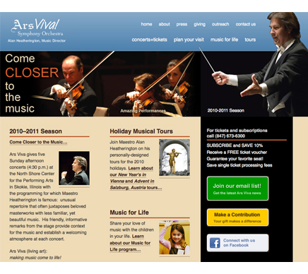
As far as the web site is concerned, I see a lack of hierarchy and conflicting focal points. Maybe the conductor should be on the left, facing right, next to the “Come closer to the music” phrase and the violinist, to make it all one, dominant unit.
I know they didn’t request any work on the website, and you wouldn’t want to do any work on it if the work was not requested, but the site seems to need some fine tuning.
I’ll be interested to see what a professional such as yourself will do to the Logo.
God bless and do well,
Mark
Another excellent article, thank you.
I just wanted to ask all graphic designers to remember that logos, tag lines, slogans and the like are also rendered in the physical world as embellished products. A beautiful font such as the one in some of the examples would work well on a website and in print — even screen printed or etched. But just try to have those extra-skinny strokes embroidered, and you are asking for a less-than-perfect outcome. In the very least, you don’t get much thread in some areas, leading to poor visibility or quick wear and tear.
When questioning your client, ask them all the ways they plan to render the logo, and how. A client such as this surely sells promotional products, and you wouldn’t want to limit their options for product sales. If you aren’t familiar with the promotional world, take some time to interview someone in the business; they should be glad to be of help.
Hi John,
As a beginner in the field of graphic design, I found this whole discussion fascinating. I am comfortable with software, but learning and understanding the design thought process is a different task entirely. Thanks so much for sharing this with your readers.
I love the ligature that you used. It does remind me of f holes on a violin, and it has the “feel” of a cello in there as well.
I can’t wait to see what you come up with.
Regards,
Mark
A couple of notes on this reading. Great information. I loved how the back-and-forth conversation went. Sometimes you need to show the client how you interpreted what they said, for both sides to clarify and realign the direction they are going. I do not see anything wrong with showing the client something in order to get feedback and ensure you are going in the right direction. And as mentioned, the client doesn’t always know exactly what information to give you up front. And the designer may not know that the information they are getting from the client isn’t exactly what the client wants.
As for the recommendation to use Viva Musica, it is already similarly used in a Chicago suburb musical group as — Musica Viva.
I agree with the need for a name change. If the old one does not demonstrate the soul of the orchestra, then why keep it? It may have worked in the beginning, but it sounds like they have evolved from their origins. If you’re going to make a change with fonts and logos now, then this is the time to make all the updates necessary. Go for the Gold! I love the idea that the director is well known and they want to use his name. Why not use his name? Viva Heatherington! (Look up Viva — it includes acclaim or living voice.) The problem with using Latin, though, is that not everyone knows Latin, especially in a modern Chicago. Perhaps something like ‘Heatherington Symphony.’ For a logo, use a feather pen, rhymes with Heatherington. And use a font that looks like musical notes similar to the #1. If the V looks like a U, then manipulate it. That’s what typographers do; create your own font.
Personally, I think including the director’s name in the logo is a big mistake. That’s something to be left to a letterhead or business card. A logo represents your company. If Microsoft had Bill Gates in script underneath, if every company had their director/CEO/president’s name, the world would be a very cluttered place. Logos need to be simple, effective, eye catching, and not complicated enough to make people work to look at it.
Perhaps one typeface in two weights. And treble clefs — clichéd. Beautiful, but clichéd.
Excellent design brief!
Well, Keith commented here that the word Viva! is not in Latin, and he is right! But remember the song Viva Las Vegas! It sounds more logical to everyone. I guess the problem here is centered not in the name but in the concept.
When Gayle says they need a nature-based image, she is asking for a sensitive experience, as music is. I think that a focused approach to this concept is to apply some natural ornaments — not much — to the name. Or, maybe, changing the name for this:
Vivars!
It could solve many problems about the meaning of the “art” word — Latin or Italian or Spanish — and is a creative way to gather both words. For example, when a new car model arrives to the market, do you really consider criticism of its name: Stratus, Astra, Corolla, Camry, Platina. We must get out of the box to what it is exactly that Viva Ars Orchestra does actually!
Well, this is just a rough to start the creation process in our creative benches. Best.
Awesome article! Of course, I find pretty much everything Before & After offers insightful and well done.
How awesome to have such an articulate client as well! Working with Gayle would certainly be a pleasure, I think.
I also believe that a name change may be in store, as it would address some of the issues that they currently feel they need to overcome. I do love layered meaning and hidden meanings a great deal, but I believe they can reach their ideal market with the crafting of a new name and look to truly convey more of the story. Not the entire story (too much for any logo!) but something that gives a brilliant hint of what to expect.
Their story is fantastic, and I would love to see them in person after reading it.
I have just one question, and I’m guessing many here know the answer: What is the font used for “Viva” in the first rendition of the revised logo? I am in love with it! So fluid and I adore how it shifts its weight. Beautiful.
So, can someone shed some light on this for me?
—————
[Jennifer, the typeface is Mommie, by Hubert Jocham. It comes in three stroke weights for use in large, medium and small sizes. — John M.]
I have noticed that there has been much talk of a name change, even by Gayle in the original article. I would be very hesitant about changing the name, as it has existed for 15 years already. It has a following, and its following identifies it largely based on that name. Can you imagine if Pepsi or McDonald’s decided to change their name what chaos it would produce? They would be starting from square one to redefine who they are and what they do. When Pepsi changed their logo recently, look at the stir it caused. People balked at the change, but they still knew it was still Pepsi. Perhaps a logo change is a good move now and again, as long as it is not so outrageous that it redefines, but instead keeps one current with the times. Had Pepsi changed their logo and their name, people would have mourned the loss of a company that, in part, defines the western world.
At one point it was suggested that I change my business name, and I chose not to because I already had a huge visitor base with links from numerous followers. On top of that, I had (have) all kinds of printed materials that would require a costly change. In my opinion, growth and change don’t require a name change, but it probably wouldn’t hurt to have a History tab on one’s web site or within one’s portfolio, so that those interested can read about it and become even more involved on a more personal level -– growing and changing with you.
Sorry guys, but there is nothing wrong with the orchestra’s name, as viva has been perfectly correct Latin for over 2,000 years, the feminine form of “vivus” — alive, fresh, etc. Let’s stay on topic :-)
Very interesting article and it applies to so many areas of design. I work with web clients who seem to think they know what they want. The client here seems to know, yet the trouble is conveying the information first to the designer and then to the listener.
What I really think the company should be called is “Alan Heatherington, Music Director.” Re-read the emails. Once he’s gone, what remains? The orchestra should be the legacy that lives on, acknowledges his commitment, but at the end of the day they have a life of their own and need to work towards a future.
I’m surprised no one has commented on the “ars” meaning something different to most non-Latin speakers. Trying to design around that is the unstated challenge!
Really there’s only one thing to do: start afresh.
Find a way to encompass the past and push towards a new future with an easier-to-understand name and logo that borrows from the past. Incorporate the Musical Director’s name, knowing that at some stage (hopefully a while off!) this will change.
Alan Heatherington, Music Director presents . . . Viva!
My 2¢ worth :-)
Hi John!
What a great example. As my “design” philosophy centers primarily around branding, I start each and every project by going through a “Brand Personality Process.” It’s a standard, three-page, in-depth questionnaire that I send to every client, followed by extensive conversation, and culminating in a one-page “brand personality brief,” which seems simple at a glance — but it’s the result of a great deal of research and conversation about the client, industry, and project at hand. This serves as the foundation for everything — and its value is incalculable, if you ask me. By the end of this process, the client and I are always on the same page, and completing the project becomes much easier. Usually I’ve gathered enough information that we hit the nail on the head with the first or second design idea — since I already have such a good idea of what they’re looking for. Often, the process also serves as a catalyst for the design ideas themselves — greatly simplifying my design process.
I’m surprised that you didn’t seem to have a standard process for gathering this information to begin with. You spent a lot of time asking somewhat unrelated questions before you really cracked the nut by having her read that article, where she was able to respond to a specific set of questions that painted a complete picture. (And you were lucky — most clients aren’t that thoughtful in their responses and wouldn’t have thought to “mirror” the article). Start with the process, and then let it develop into the type of conversation you had — you’ll get more out of it. (Okay, not that I’m advising you here, but since this is your example . . . )
Looking back on the days when I tried to cut corners and shoot from the hip, I cringe a bit — skipping this essential step is the #1 cause of issues I’ve seen myself, and with other designers. Since implementing this process, I’ve had nothing but thrilled clients and great results — and much less stress throughout the design process.
I also set the tone for very open, honest communication — so the client is comfortable communicating about problems when they occur. That can be difficult to do; probably the #1 issue I have is clients who sheepishly tell me they like things that they really don’t. Part of our job is making them comfortable enough to communicate, and then helping them figure out what they really want — frustrating as it is, many clients don’t really know until they see it!
Love the first 4 rules . . . rules to live by with your client so everybody is happy with the result.
Do we get to see the final logo?