
Nothing works better as a visualizing tool than a mockup of a real object. Second-best is a photograph of one. But a real-looking, well-photographed mockup is difficult to make! On Before & After’s Grid forum, resource maven Robert Williams has compiled almost two dozen links to free(!) templates into which you drop your artwork, and almost like magic your two-dimensional design becomes a convincing, real-world image:
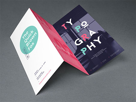
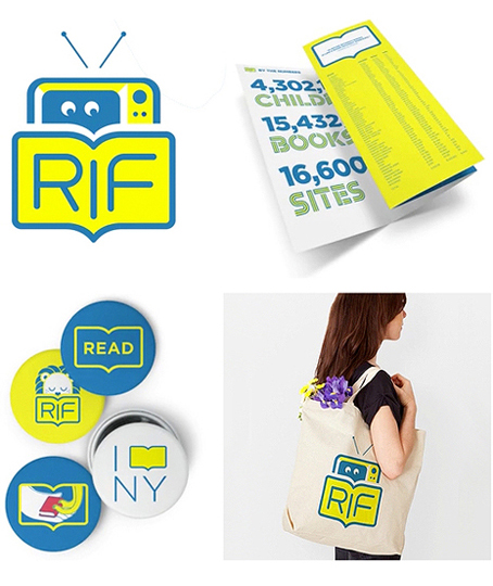
In my experience, people — including, to some extent, us designers — are terrible visualizers, so it’s no big surprise when one person’s vision doesn’t match another’s, at which point a project starts getting micromanaged. Now imagine showing your client the images below instead of just the naked logo. What a difference. Now he can see it and get it, and that’s how to build excitement and buy-in. I’ll almost never show a client a design without context. Put it on a box, a book, a t-shirt, a wallboard, whatever’s appropriate. Make it real.
Christian Cervantes, remarking on LiveSurface’s Context layered-image templates, put it this way:
“In sketch form, how I see something versus somebody else — we all seem to think we’re seeing the same thing, but we’re usually not. Once you put it into Context, people all sort of rally around this thing, and they understand it, and it’s like this uniform vision of, ‘Oh, okay, that’s what we’re doing!’ ”
Below are Robert’s links and comments . . .
“I did my best to keep overlap between sites to a minimum. A side discovery seems to be that if you’re looking for a specific item (such as the new Nokia Lumina phone) or version (the black iPad 2), there’s probably one available for free. This could certainly come in handy in those situations where details like that could make the difference (i.e., mocking up a design using the same phone and version that you know your client uses.)
“Quality offerings from Graphic Burger
“9 pages of freebies from Pixeden
“95+ free PSD mockups, linked from Designrazzi
“147 free PSD mockups (plus lots more) at Freebiesburg
“40+ free PSD and PS action mockups linked from Webdesignerdepot
“50 free PSD mockups linked from Pencilscoop
“PSD Covers is great for books, magazines, and product packaging. Rather than a PSD file with Smart Object implementation, these are Photoshop action sets that create the blank product, then your art is mapped onto them.
“Some diverse apparel PS templates courtesy of The Apparel Guy on Deviantart
“PSD Folder Web elements + a few mockups
“Freegraphicdesign.net Textures, mockups, vector illustrations, web elements
“Inspiration Hut Textures, PS brushes, unique fonts, mockups, themes, web elements
“Media Loot Patterns, mockups, icons (including iOS 7 App Icon Kit), themes, web elements
“PixelPixelPixel ‘Jet Packs for Designers’ Mockups, vector web elements, fonts, textures, Dreamweaver elements
“Design Kindle Website templates, web elements, icons, vectors, textures, PS text styles, seamless patterns
“PSD Freemium Website templates, mockups, PSD elements, icons
“Blugraphic Vector & PS freebies: templates, mock-ups, websites, icons
“FreebiesXpress Hand picked and high quality
“Original Mockups A small but growing quality collection
“Designify A variety of free offerings
And if you don’t mind browsing to find the freebies:
“PSD Mockups Some really good ones here.”


Wow, thanks for sharing my post with a wider audience, John. Free access to The Grid forum (included with a subscription) has quickly elevated itself to my most treasured design resource (I think of it as an interactive version of Before & After magazine). I wouldn’t trade this design community for all of the design books in the world.
Here’s to making better designers of us all!
Excellent! Thank you! (Almost too many, though!)
Thank you so much for sharing these links! Saves me a lot of time searching for them in the future…
Thanks for mentioning us in your post John! Though I should let you know that we’ve changed our name and domain to FreebiesXpress.com :-)
Thanks for the heads-up. Change made.
Thanks so much for sharing all of this! It took a lot of work, and it’s much appreciated.
Can you give your thoughts about this?
On single columns it works, but with websites having 2 or more columns, different media, graphics, videos. How to effectively set the correct type and line heights for maximum readability without burning eyes?!
I agree with the commenters that 16 px is arbitrary and not necessarily right. Type size should be a function of context and media. Line length, line height, and surrounding white space are major factors. The text you’re reading now is Georgia 15/22, roughly 55 characters per line, which I find very readable from a distance of two feet, even with aging eyes. To my eye, the New York Times is a fine role model, with an excellent combination of readability, clarity and beauty — lots of white space, custom typefaces, good type size, length, and spacing, and yet the page includes plenty of small details (including small gray serif type) and other accents.