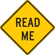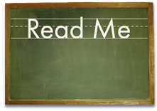
The headline above looks like it belongs on a movie screen, doesn’t it? Or carved in stone. What gives it its monumental presence? Is it the large size? Yes. Its capital letters? Yes. Its position on the page? Yes. Those are properties the designer controls. Its presence is also in the drawing itself — the lines, shapes, proportions and idiosyncrasies of its pieces and parts.
 Type well drawn and correctly set reveals the author’s world and invites you in. This is high art.
Take the road sign here. Clear as a bell. That’s its world. A road sign is about visibility, directness, utility. It must have no gratuities, nothing to distract the eye.
And the chalkboard. That type is there to teach. Its simple shapes and lines are easy to see, grasp and follow. The letters are rounded, small, vulnerable. It’s for children. That’s its world.
 What’s fun for me — and what you don’t notice — is that in all three examples I set the type. I chose the style, the size, the spacing. The result is an illusion strong enough to convince you that these things are real, which, of course, they are not.
How does this work? Good type is based on the physical world, specifically the mechanics and proportions of the human body. That’s why it remains powerful over time. Trajan, the typeface at the top, is a digital rendition of a 2,000-year-old font from Emperor Trajan’s Column in ancient Rome.
This power of type is in your hands. It’s a big gun. But you must know it and control it. A few tips:
1) Choose type for its voice, not your taste. Sometimes the two are the same, but not always.
2) Don’t add meaningless stuff — outlines, bevels, shadows, flames. Look again at these examples. Their purity is their power.
3) Space carefully and evenly. Letters are not naturally uniform; the spaces between them are as important as the letters.
Type is the most influential tool to which the designer has everyday access. It is also the most mishandled. Typography is not the same as typing. Typing is e-mail. Typography is architecture, structure, theater, motion, art, life. Type has a voice. Take it seriously.
—————
This article was originally published in Before & After issue 41.


Right away, I looked at the first example and thought: Romanesque, this would be an example of something used in a Roman history movie, or embedded on a collegial building or office of law. I believe the backgrounds have as much to do with the message as the font itself. I wonder if these words would express as much meaning without the backgrounds. This is not to argue the fact that fonts need to be selected for their characteristics to assist in the message, as I believe this to be true. But I can’t help absorbing the background to help convey a distinct message. Perhaps it’d be interesting to see an exercise in removing the background, perhaps switching them around to prove this point.
“2) Don’t add meaningless stuff — outlines, bevels . . .”
Doesn’t the lead graphic use BEVELS? hahaha.
Not saying it doesn’t look good, just that the “rule” got broken in the article teaching people the rules.
Anyway, I always enjoy your stuff ;-)
Cheers,
Wayne
I caught that too, but realized the bevel in the first one is meaningful, because it enforces the carved-in-stone idea. But we all see design where the use of those effects has no context to the message or mood the designer was trying to convey. It’s as if the designer either wants to show off their knowledge of the software or lacks confidence in their basic design.
Thanks for this post, John.
I think about type too much to be healthy, and my son has also caught the bug. And it’s not just us. Interest in type is exploding, and I think I am starting to understand why.
As Roy Williams says, “Words are the most powerful force there has ever been. Only words can “illuminate the mind, win the heart, inspire the public and change the world.”
That words are the most powerful force there has ever been is the reason type is high art. If anything, we are only just beginning to give type its due as the courier of ideas.
No pun intended.