After reading last week’s post about British Airways and how the right design might not be right, Leslie writes:
“Hi, I’m just finishing up a project (for the second time), and your post made me think about it. I was offended at first, then perplexed, then maybe the ‘I guess I can be wrong when everything I did was right’ scenario rang in my ears! Funny to see your article about the exact same thing. In my case, I am designing a book jacket for a young-adult paranormal fiction book.
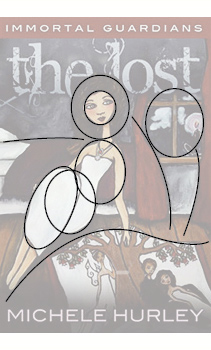
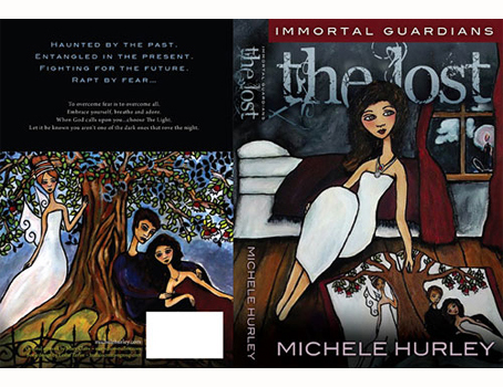
“The first design [above] uses an illustration. (It was my suggestion to hire this illustrator, because I love her style!) I thought it would give the characters a distinct, otherworldly feel, and not tie them to recognizable ‘people.’ Instead of having this effect, I think to a younger audience the illustrations just come off as childlike, and they are not connecting. And they are not sexy enough. And in this case, I suppose, due to the nature of the book, you have to acknowledge your audience’s tastes before going full steam ahead.
“I have already designed her Web site, web banner ads, and book trailer using the illustration style. But now, it looks like everything may have to change! And, it will probably be better for sales . . . and that is the point for an author trying to get her book noticed!
“Any thoughts you have would be appreciated. Sometimes I am still doubting what is working better.”
Thanks so much,
Leslie Taylor
—————
To which I reply:
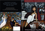 I like the feel of your first cover. Great illustrations, I agree. I’d have guessed the audience to be 10-14-year-old girls, but I get no sense that it’s about paranormal phenomena or anything frightening. Except for the title typeface, it looks pleasant, engaging, inviting. Maybe a romance, or an adventure, or both (romance is automatically both). But that’s looking, not reading. When I read — lost, haunted, entangled, fear, etc. — the words don’t fit the images.
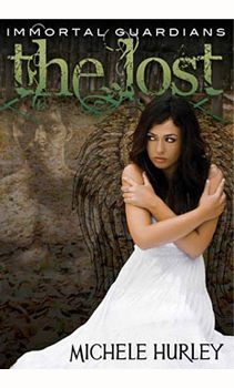
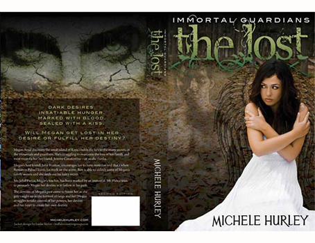
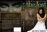 Cover two is darker, kinda scary, heavily textured, ghostly apparitions, all that, except for the girl, who looks posed and unconvincing. She’s too neat. Dark desires, insatiable hunger, marked with blood, sealed with a kiss — she doesn’t embody any of these; she’s just kinda standing there having her picture taken. Pretty but not sexy, which requires heat. It doesn’t help that she looks cold. I’d say its audience is older, maybe 15-19, and may get some guys — except the girl messes it up, at least for me. Too ordinary, like Megan who sits across the aisle in math class.
That said, I may be looking at this through too-adult eyes. For a 16-year-old girl, perhaps this image has an appropriate safeness — more the tingle of danger, not truly dark, not truly haunting, not overtly sexy — to be just right. Maybe Megan the classmate is the one she can relate to!
—————
Dexter, our senior designer, adds some deconstructive analysis. Says he, “The book, whether online or on a store shelf, will be presented only with the front cover. That’s what I need to look at:
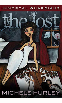
“The dark, desaturated colors definitely have negative connotations, which, in this case, are what you want. But her light skin tone and her friendly facial features counteract that.

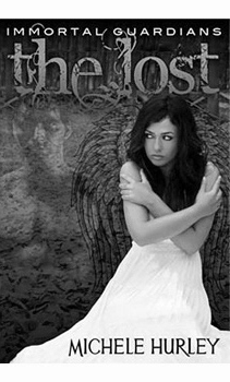
“Would turning the illustration black & white make the scene darker?
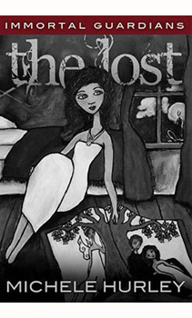
“No, because the problem is not just color. Lines and shapes have meaning. Curves and circles are soft, friendly, approachable — and this cover has quite a few:
“Second book, isolating the front cover helps; it brings the ghostly character more present — same size, same eye level, it’s easier to see their interaction. But she still looks impassive (and chilly!) . . .
“Even in black & white, I sense no darkness, no hunger, no blood . . .
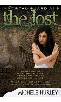
“The white dress isn’t helping. It’s too clean, too virginal, too much. What if we take the descriptive copy from the back . . .
Dark desires
Insatiable hunger
Marked with blood
Sealed with a kiss
Will Megan get lost in her desire or fulfill her destiny?
. . . and move it to the front (roughly done below), which minimizes the dress and helps me make some sense of the girl and the background images?”
—————



First of all, the first version is really busy, and I don’t see what it means.
For the Lost cover, in both the illustration and the photo, that white dress has no unity, and no place. It dominates, but it has nothing to add or match with the mood or look of the rest of the cover. The girl’s face in the illustration looks like a teen beach romance story. The girl’s face in the photo is better because the face is less dreamy, and the eyes are expressive.
So the third version, with the dress obscured with copy, is the best of the three. In fact, the cut-off dress fragment works just fine to present the author’s name.
For me, the second cover works better, however the green text has to go. Red would seem to be fitting. Perhaps changing the text and dress color to red and the rest in black & white would look good and carry the right feeling. Just an idea.
I like that idea. Red will bring out the scary, bloody feel, especially if it is a deep blood red, not bright cheery red. And I agree with the black & white background with the dress, text, and maybe her lips red — but I like the basic idea; seems more mysterious.
All things considered, I am drawn to the stone face with the haunting eyes on the second back cover. Creepy, suggestive, mystical — sort of how the book is being marketed.
I agree, I really wanted to see those close-up, scary eyes on the front page, using the second theme with the colour scheme from the original cover. I find that the green title reminds me of a jungle adventure — searching for lost Mayan gold or something similar — rather than paranormal romance (and I am guilty of reading a few of them).
I think John is right on the mark with his comments. The second one goes in the right direction but she is too pristine. What if you grunged her up? A Photoshop treatment, perhaps, where she becomes a little less real-looking? Maybe a deep shadow around the right side and bottom and the left side emerges into the light?
Sometimes you have to just walk away, twice. Neither cover works, the first for the reasons already mentioned, and the second — in either form — because the girl just looks cold. A different color dress won’t help, either. Personally, I think the best image you have now is on the back cover: the couple leaning against the tree. I don’t like the figure in white in the left half, but cropping her out makes something interesting and a bit dark. You could replace the white figure with some sort of vague glow, which alludes to the guardians less literally. Also, if you went this way, you could resurrect the rest of the work you’ve done for the author, which you seem satisfied with.
Like the last cover. It conveys everything I think the book is about. Getting rid of the white dress helped.
I was going between the many reasonings, and then I saw the video clip, and it seemed fine for the illustrated version. I liked that it looked innocent, and her being white and clean is okay, as the story sounds like she is, until she discovers the mysteries that await. But . . . then I went to Amazon and read the reviews, and Megan sounds less innocent and more vixen. So, back to the real-photo image, close-up on the face, less innocent (than the stunned) model, with more darkness washed into the background perhaps? Unfortunately, this might need to be resolved soon, as the Web site is one look and the cover on Amazon is the second (photo) version. Cover two, if it has to be chosen on the spot.
Yes, unfortunately the first cover is too young and too “cute.” I think all of the other comments are very worth noting as well (especially the white dress being overwhelming and the girl looking cold rather than haunted or scared). Have you considered grabbing that great stone face with green eyes and putting it on the front cover? It would be creepy, intense, dark, and more scary. Then you could tuck the ghostly version of the guy with maybe a matching ghostly girl on the back with the text. I do like the wings behind the girl — maybe together and ghosted back they would be cool.
I would split your cover text, too . . .
Dark desires
Insatiable hunger
Marked with blood
Sealed with a kiss
(this would go on front with the stone face)
Will Megan get lost in her desire or fulfill her destiny?
(this would go on back with the ghosted person(s)/couple)
In this I am presupposing that the author’s target market is more paranormal first, romance second. And I would want to catch the freaky, paranormal vibe on the front cover. If she is going for the romance first and the paranormal second, I would probably flip my discussion to do just the opposite. Market choice would make a difference to me.
I would redo the web graphics and feel to go with the darker, more realistic, paranormal feel. The style of the art is very pretty, but again too childish and cute. The more “realistic” feel is the more popular for the paranormal genres right now in both YA and adult fiction.
She looks a little bratty, perhaps pouty and somewhat embittered. Her hands look posed and communicate a chilled temperature, primarily.
The flowing white dress works fine for me, but the model’s eyes and hands are a focal point and communicate the wrong message.
The covered dress with text is too disjointed for me.
The model is fine, but she is posed and lit for a fashion shoot. I would place her in a dark and gloomy environment, and would light her from the side and back for drama and mystery. Also, she needs to be posed as if she is fleeing from something real or imagined.
I agree with Daniel Cohen for the most part, but I don’t like the artificial horizontal line cutting off the girl’s dress. She looks like she is swallowed in the book, which might work if it were not for the clean plane. I would suggest changing the color of the dress. Consider a green picking up the title art. Another concept I would try, since her facial expression is good, is to focus the image on her face. Enlarge it to cover more of the book jacket so that the other images are viewed through her eyes.
In Photoshop, I removed the obscuring copy and went back to the dress, but I added a maroon Color Overlay with a Hard Light blend mode and tweaked the Contrast for effect. I also added an angular shadow across the girl’s face and brought down the brightness on her arms, which were too light for such a dark setting.
The original image of the girl doesn’t entirely hit the mark, but the changes do contribute to a more ominous tone, plus the maroon harkens back to the colors in the original illustration.
Why not try to black & white just the girl and have colour for the rest of the cover? I may be wrong, but it’s worth a try.
I gotta agree, this girl’s photograph is lacking on every level. Not sure if it was stock, or if the director was unable to convey the topic, or she was unable to understand it. But it doesn’t work. I also like the first style better, but it’s a bit cluttered and lacks the menacing quality.
To go out on a limb here, I think it might help if she were looking into a mirror, in the same room, only the mirror revealed the menacing qualities lacking. The picture of her lying in a field with her lover says nothing about “Haunted by the past . . . Rapt by fear.” I think you were on the right track initially, and your comment about using an illustrator is valid.
I agree with the critique above about the girl. Perhaps she could be isolated and desaturated a bit — maybe even create a duotone effect using the brown background color so the white dress has an off-white tint to it — leaving the background and text as is.
Dexter’s right to look at only the front cover, and bringing the text from the back around to the the front is a great move, but the way it’s displayed divorces the bottom of the dress from the rest of the girl. Worth keeping it, though, as Daniel says, to show off the author’s name. Would some transparency on the text’s background help? I hope that’s helpful!
Hi Stuart,
I agree, the type placement would need to be refined. It was simply a quick Photoshop mockup to show how the descriptive copy might look on the cover.
Perhaps turn the dress a light shade of gray or create a slight texture in the fabric in lieu of the stark white appearance.
It’s amazing what you can improve by taking stuff away.
What really pops out with the 3rd revision (text panel over dress) is the model’s sight line. You can tell she’s looking at the man in the shadows.
You can’t see that with the previous versions. It’s all right to use strong contrast for visual punch, but you want to make sure the punch draws attention to the right place. It’s not the dress that’s important; it’s about the forbidden desire.
I agree it would look better if the model’s image said “smoldering,” not “shivering.” Also would love to see some way to heat up the connection between the bare-chested shadow man and Megan. Maybe shadow-man could be looking back at her, too . . .
I don’t think it’s too busy if it’s all working together. Like a dish with a lot of ingredients — blended well, it’s delicious.
I agree with your analysis.
I like the illustration, but it conveys sensuality and warmth, not loss, not fear. Nothing haunting or sexual about it.
The second cover is just phony. The photo is contrived and posed. The background does not convey anything. The type is simply wrong, and the whole thing looks like it has been slapped together without any feeling or imagination.
I like the second cover. I don’t think the girl looks chilly; I think she is protecting herself, and the photo will work if the dress colour is changed. Using a Photoshop-type program, try changing the dress to a deeper, darker colour, perhaps red. That should change the whole character of the cover.
The illustration is lovely, but I agree, wrong for the book.
However, I’m definitely not crazy about the last solution (words across the dress) — it looks exactly like what it is, a patch over a problem.
I’d like to see the photo of the girl much more tightly cropped — like, head and shoulders — and enlarged to fill the space where the white dress is now. Maybe even bleeding off the right edge, so that what you see is the left side of her face and only part of the right side. (Of course, for this to work, she’d have to be wearing a different dress, one with sleeves, or she’d look completely naked.)
Hope this bit of ASCII art shows what I mean . . .
I do agree that the first design, which beautifully illustrated, is just too childish.
The second cover is onto something, but again, like everyone pointed out, the girl on the cover looks out of place and cold.
The third cover helps but now looks busy & forced.
Just from experience, there have been times where I will design something and the “idea” works, but it just looks off — so I try to force it to work. But sometimes you just need to step back and walk away to realize that if it needs to be forced, then maybe it’s time to change your idea.
My suggestion, if possible, is to scratch the photo of the girl in the white dress and get a new photo.
Good luck in your redesign — would love to see the final outcome!
— Desiree
Putting more on the cover doesn’t help, in my opinion. I think there is already too much for the eye: We see three different fonts, and one of them complex and lush, and a girl in a pose, and a huge white dress, and wings, and a man, and the background . . . I think this variety spoils every dark mood.
I would reduce every aspect (isn’t it scarier to see and know less?) and rearrange it a bit, just like this (a very rough approximation):
MAB: I like it!
Yeah, I like that.
I can see the guy now, too, where before my eye was going right to the white, flowing dress.
Yes, this is the best version so far. Cleaner, clearer and spookier — and you don’t even have to reshoot the photo! Nice work.
I like this version of the cover best.
Yes, I too like the focus. I suggest a few changes, as shown in this rough mockup.
1. Use a bit of dramatic lighting effect to add dimension to the cover.
2. Focus on the eye contact between the girl and the ghost-image
3. Use a simple type for The Lost and roughen it up somewhat, instead of using an elaborate type.
4. Let the title stand out.
Hope you like the rough mockup.
Personally, I prefer MAB’s. I don’t necessarily disagree with using a simpler font and maybe even bolder color like you suggested, but I feel that the drop shadow on the title and lighting effect on the image takes away from the book and looks less professional.
On MAB I like the overlap with the girl’s head and the title. I wonder what it would look like if her head was in front of the title just slightly overlapped.
The girl I think is good; her expression is unsettled and suspicious, and the fact that she looks chilly seems appropriate having just brushed up against the supernatural. It is the white dress that seems to be the main problem. It seems so obviously front and center. How about superimposing some image on the dress, say a dark forest or starlit sky, or having the dress fade, ghostlike, into the background, so the girl truly does start to look lost. Also tone down her skin color so she looks less like she just came from the tanning salon. And make her larger, overlapping the title, maybe even coming off the page. She should be larger than the guy in the background so perspective-wise he looks more in the distance, say, stalking her down a dark alley.
For me, the photo version is stronger. But that white dress is just too virginal. And if the implication is that the girl is falling under the spell of a vampire against her better judgement (as her sidelong glance says to me), then I need some visual that ties his influence to her.
So how about some PS work with an adjustment layer to darken the exposure on the girl to deepen the shadows, add a little drama? Then add some of the stone background texture or cracked plaster texture to the subject’s shoulders with a layer mask and play with the texture opacity and blending mode. That could show the vamp’s influence creeping in and give her a good reason to hug herself. You could also do that with the whiter parts of her dress to deepen the color, make it a little Goth looking, in the Castle-of-Otranto sense). Lastly, burn in her lip color to bring in a hint of dark red without being super obvious or super Christmasy.
As a former reader of teen girls’ crap books, I think the second cover is right on the mark, with two exceptions:
1. The background could stand a little more contrast, as I didn’t even notice the hunky guy until I started manipulating the image.
2. A slightly cooler palette for the front, to match the stony look on the back cover and convey the implicit threat.
The white dress dominates the front cover, but that’s a good thing — the whole plot is clearly about an innocent caught between her former life as a regular girl and her new “dark desires.” Covering over it with the text misses the point and chops her in half, which is not only violent but erases the main feature the target is drawn to — a beautiful girl enough like them to make the book interesting. Adding more words to the front is a good tactic for a novel aimed at adults, but not for teens.
It really helps to design with the audience in mind. Before doing anything else, I’d show it to a few members of the potential market and see what they say. They may give you the feedback you need to make it connect better.
Has the book already come out? If it has, can you really change the cover? If it hasn’t, do young folks really not like it?
Before I did design, I did research. Market research can really help designers in situations like this.
Many of the folks reading this blog are probably closer to the parents age of the target audience. They might also know what their kids like. Maybe take a look at the Twilight Saga stuff.
Ask the author, too. What did she envision when she was writing the book? I think we all see our characters reflecting ourselves in some way.
Good luck! G.
As an adult who occasionally picks up a YA novel, I’d be more likely to pick up the illustrated cover than the photo cover. To make it fit the mood of the story, I perhaps darken the image significantly, letting most of it fade to black in order to emphasize the girl’s face and the white elements.
I agree that the third one is the best one, but I also think it’s not there yet. If it was decided to go in this direction, the photographer needs to get back into the studio. The ghosted figure in the background is to old for the audience. He looks like a grown man, not a young adult. The young woman in the front needs to be wearing black, dark red, or something moodier rather than angelic, but keep the wings. Also, the tree should be more predominant.
I find the first cover more engaging, but I like that child-like style of illustration. It could go a little more Tim Burton — more edgy. Maybe ragged edges on the lines would help? The second one looks like any old serial book. Could be a romance novel, a vampire book, but it has that generic, paperback feel.
If you did the cover with the image from the back cover and put it on the front over “The Lost” with the author below that somehow, I think it would work better. The way the brain works is that there is actually a specific area within it that seeks out human faces and the eyes. By keying into the freaky eyes on the back cover, a reader is automatically drawn to that cover, then placing the text well is another thing to consider. But, I’d move the girl off the cover entirely and focus on the freaky eyes. This also opens the demographic to the male audience as well.
Just my two cents.
What about the black & white version but with a blood-red dress?
Very interesting article.
How about desaturating the photo, maybe adding a bit of texture? And I think some red would help. A dark red.
I think it all depends on the age of the prime audience. If it is girls who still giggle about sex (say, under 14), then the illustration works best. If it is girls who are older and dating, the photo is best. My insights are based on my time spent living with and raising two daughters, one niece, and all their peeps. I noticed how their doodles in schoolbooks and diaries were always so romantic and dreamy, even after they got serious about boys. Girls just like to be girly girls more than not.
What I would work on with the illustration version is the title “the lost.” I would make that a lot more creepy. Let it carry the paranormal/vampire/whatever message.
In the photo version, more sex is needed. Look at the stuff they are doing with the Twilight Saga movies. Once you get it, you want it, so to speak. Plus, I’d lose the wings and make the smoldering Fabio guy more visible — still from the dark beyond but even more hunky.
The key word in design is always “appropriateness.” This applies to colors, shapes, lightness/darkness, and subject matter. It’s very difficult to get a good concept of what to design without being able to actually read or at least scan through the book itself. The short, punchy bullet points on the back are really not much more than marketing hype instead of an understanding of what happens in the story.
Casting all that aside, if what we’re going for in communicating the book is dark, otherworldly romance and danger, the design should be generally dark and mysterious. Any colors should be very saturated and rich, which is why the white dress doesn’t work. If blood and vampirism is a key element of the book (this is where reading the book would be essential), a deep blood-red or crimson could be used to forward this concept.
Whenever I create a design for a client, I always find a thorough study of the product/service and its background, author, creator, is vital in bringing off an effective design. Once I know enough about the product/service, I then need to know the intended market it’s designed for, and what that market is interested in — likes, dislikes, etc. As this information comes in, ideas automatically start to form into a design concept or concepts.
Trying to design without knowing the product/service and target market is like trying to drive blindfolded. Are there ghosts involved? Angels, demons, other dimensions? Get enough information about what the book is about and the agreements of the age group it’s intended for, and all of a sudden the “appropriateness” of the design elements needed starts to gel.
I feel like it’s difficult to judge without reading the book. Who is the heroine? Is she brave and gutsy or is she timid and a bit angry? Currently she looks timid and a bit angry, which may appeal to a teenage audience.
If it were me (and I’m not a teenager, but I do read many young-adult novels of this genre), I’d choose a book with a more self-assured woman on the cover, shoulders square, perhaps her chin is up and forward showing her determination. Or she may be looking to the side and down with her head turned up to show that she’s hunting, listening for the sound of her predator. I don’t know who she is and how she she handles herself, so it’s hard to advise.
First, thank you to Leslie for being bold enough to share for class (not always easy). Second, thank you for the deconstruction. I’ve been in the business long enough to have started with wax a Dymo machine and a darkroom (also when Before & After was much smaller and not in color!). I’m self-taught, as are many of us from this era. The few small tricks you showed — removing the color/looking just at the curves, re: the “feeling” — were very helpful for me as well.
For what it’s worth, I agree that either covering the white dress with a color block, or changing the color in PS to the burgundy, are better choices. I also agree with the comment above that the first cover is too busy. And a like the back-page image on the second version. It’s true that front covers of books need to be viewed in a solo context — but it’s equally true of the backs.
What about cropping in on the girl so that we don’t see most of the dress or her left side (right hand), which I think makes her look less chilly and more chilled. I did a quick mockup, although I left off the author’s name:
Maybe both covers are too focused on the main character and should instead be indicative of Megan’s internal struggle. It seems to me, from reading the Amazon page, that this book is targeted to adolescents, a group plagued with internal struggles in the pursuit of identity. It also hints at sexuality.
That said, maybe you don’t need any characters on the cover and can instead express the fundamentals of this book with texture and type — like an unearthed classic. That might make the cover more timeless (think immortal) and more discreet, allowing the reader (probably a teenage girl) to read the book in the open without fear of being judged by its cover.
It’s good that you took a step back and considered your audience. I do like the first cover; however, the second is geared toward teens. That said, while it creates intrigue, it does look like others on the bookshelves of B&N — curious as to how the photograph of the girl would have looked illustrated.
I do love the stylized type — that does not look like all the other book covers at B&N — well done!
Thanks for sharing.
To me, it’s not so much about a literal translation of the story, but attracting the reader to the cover so they’ll pick up the book for a closer look. Online, a very small cover has to entice someone to click on it. So the cover “stars” are the fantastic title font and the close-cropped eye image from the back of the second cover shown above. And after taking a look at popular “vampire” books on Amazon, many just show a pretty girl (who the reader can relate to), head tilted slightly down, but looking straight at the camera (at the reader). If a photo like this exists of the model, I would simply try using a large headshot, filling the space from top to bottom. If it doesn’t, and you can’t afford more photography, try using the “eyes” image with the font alone.
P.S. The woman’s hair isn’t great. Too old-looking and stiff.
Hi Leslie!
I, too, really love illustrations. If you’d like to stick with your current illustrator, I think Dexter’s comments might be really helpful to rework it. Also, have you seen the version of Jane Eyre that Dame Darcy illustrated? She has a very purposely creepy style that is also very trendy. It’s popular with teens and has a comical amount of creepiness. For the photographic version, I think the white dress is teen-appropriate and shows her innocence.
Vampire teens are so trendy now — there’s so much of that stuff out there that I don’t have a whole lot to say about this version. I see this genre everywhere, and tweens and teens girls (mostly) seem to gobble it up. I think if you want something different, you might want to work some more with your illlustrator, because to me, that will stand apart from the rest more than the usual graveyards and gargoyles and thorns, etc. That’s just my taste. And there are a lot of graphic-novel tweens and teens out there who may be attracted to the illustrated version as well.
Good luck! I know you will come up with something you are really happy with in the end!
I agree, the white is too pure, to contrived. Put her in a black dress. Still really sexy but brings out the darkness and blends nicely with the brown background and green title. Also, turn her around to show her back and turn her head (looking down a bit) to show a slight profile.
I agree that the stark dress is too bright. I also think that the two characters look too separated, and she looks miffed to me, not scared or startled. Her expression is not working; any chance of having the girl perhaps looking over her shoulder as if she’s trying to get away? I’d also try having her a bit disheveled; that can be a tattered dress (sexy, dangerous) — and the guy, I didn’t even notice him back there; he’s looking like a mannequin, just my impression. I think he needs to be more present so she doesn’t look posed but reacting to something close to her. Anyway, not sure if I’m helping, but I love this; it’s a fun and challenging visual. It looks great, and with the right photos I think it will be very engaging for your audience. Best of luck to you!
I’m not a graphic artist — I don’t even play one on TV — so I may have a different perspective, good or bad. I’m surprised that nobody has mentioned blood in the cover design, since it’s in the descriptive text. Darken up the dress a bit to underwhelm it; black & white (or at least less saturation) for the model; then a deep red blood stain on the dress or the model.
I think the photo needs to be changed. The girl looks pouty and resentful, like Daddy just took away her cell phone. You need someone who looks haunted yet sexy — think young Winona Ryder or Angelina Jolie. I don’t think there is anything you can do with this photo to change the facial expression on the model, and that is worse than the white dress.
The first cover is entirely inappropriate. It looks like a children’s book. I take it the girl is actually the “other-worldly” creature and the guy is human. While it’s likely told from her point of view, she needs to look more timeless and more alien, gothic, angelic, whatever — not like she just got off the school bus. The size balance between the two people seems odd, not dramatic.
And who is this ghostly guy she might give it all up for? He’s pretty hunky but looks like he’s in his late 20s or early 30s. Not exactly in the same decade as the audience.
I agree that the green type should maybe be r — or white. One of the “T”s needs to be altered, too, so that it doesn’t look like it’s an off-the-shelf font. I firmly believe that if it’s meant to look like handwriting and grunged up a bit it, should look more authentic.
I agree with everything Gena Gallagher said. It’s also the approach I would take.
Make her dress black (second cover) and flow the type inside it, reversed to a light gray.
Some great comments here. Additions to Sara Manela’s comments about the white dress: Agreed, the dress being covered by a copy block and background is harsh and takes away part of her human/relatability and replaces organic, flowing lines with static, straight lines. Perhaps create darker texture and color creeping up from the lower part of the dress. Might add to the feeling of danger or impending darkness and take away some of the stark innocence and blend it together with every girl’s feeling of some internal discourse.
I like the concept of the black & white background, leaving the lady cropped short and perhaps using red blood for the text below her.
Irrespective of the other (astute) observations about color and shape, the first cover struck me as a graphic novel. Dexter’s final proposal looks like a movie poster to me, which might convey that this is a book-turned-movie or even a movie-turned book. I wonder if there’s another way to crop out her white dress, which I agree provides an improvement.
Jumping in without knowing a single thing about the story or the audience . . .
Because they’re fairly similar, I’m assuming the girl in the story looks like the drawing/photo.
My suggestion is another direction to allow the reader to make up the girl. Here are a couple of “anonymous” photo ideas:
http://www.istockphoto.com/stock-photo-20712411-out-of-reach.php?st=d8fa865
http://www.istockphoto.com/stock-photo-7125442-gohst-dance.php?st=d8fa865
Lots of options with stock — lots more creepier options; a regular stock image can be Photoshopped to match the necessary mood.
In my mind, in addition to forcing a visual on the reader, it also limits the potential of a movie made from the book if an identifiable, real photo is on the cover.
Recolor the dress deep red?
I don’t think either cover works, but if I had to pick one, I’d go with the first, illustrated example. On the second cover, the girl doesn’t look authentically scared — she looks fake, and posed. Also, I subscribe to a blog that posts free ebooks that are available each day, and the second cover looks like every free YA book that I’ve seen recently. It’s possible that’s what sells, and that’s why they all look that way (in which case I guess it’s the way to go), but as an adult, I don’t even bother to read the summaries of the ones that have this sort of sameness.
I would make the image of the girl “darker” by using High Pass and Photo filters in Photoshop. This link displays an example.
How about the dark palette and just a strip of her eyes showing fear? This could be blended in with the wings in the background, and perhaps abstracting the whole image just a little to make it more mysterious. There is a lot to work with here.
Could you get a new picture from the thousands available online? I agree with de-emphasizing the dress by covering with text, but her expression is still mild and posed.
The blood, passion, all denote the color red. What happens when you change her dress to red? I like the words crossing her dress and explaining, but this piece screams for red. Somewhere.
I think MAB’s and Joy’s identical solution — enlarging the crop so that only one of the girl’s hands is showing — is right on the mark. Less dress, no longer looks like she is cold. Emphasizes the whites of her eyes, which is a tad creepy.
I love the type treatment for the title, and the large crop version complements it well.
Crikey! Is this really a young adult book?!
I’d say put down that blood-sealed, lost-in-desires book and help me cook dinner!
But seriously, I would need to read the whole book to design the cover; anything else is just speculative and “markety.” Do book designers get this luxury?
This reminds me of the contrast of the illustrations on the Harry Potter books with the imagery of the movie posters — very different feels, and yet it is the same story.
I think the answer is somewhat obvious . . . the shape of the dress pulls the design together, but to add a foreboding feeling, change the color to blood red.
I agree with Sara Manuela above.
I am the mother to two daughters age 8 and 11. The first cover is definitely perfect for them with a hint of something scary.
The second cover looks like the books the older one is a too young for. I would agree with the comments above if this were an adult book. For teens, I think it is more important that they identify with the attractive young woman on the cover. As someone said above — Megan from math class.
I just find cover two to be totally unengaging. It looks too much like any other book on the shelf — why should someone grab it over [insert any other teen supernatural novel with a generic-looking cover]? Cover one is far more interesting, though I agree the illustration style doesn’t match what the tone of the book seems to be.
Her website needs meta tags. Every page is titled “Untitled Document,” and there are no descriptive meta tags in the code.
First, thanks to Leslie for being brave enough to put her work “out there.” It is far easier to critique a work in hindsight, when it is not your, and with the benefit of a lot of other observations.
My two cents: Although I love the style of the illustration, it’s not right for the darker, sexually suggestive nature of this book or its young-adult audience.
There are things I love about the photo version, and things that I feel don’t quite work. I love the font for the title “The Lost” and how it entertwines. The multi-layered, textured background works, too.
The basic pose of the girl works for me, too. I do not agree with others that she should be tightly cropped. However, if there can be another photo shoot (assuming it’s not a stock photo), I would definitely muss up the girl’s hair, so it is spread out up and to the left, and I would entertwine the hair with that great title font. Mussed-up hair automatically suggests sex and looks sexy! And I would have her part her lips a bit more, also suggesting sex. I don’t mind the pose, as if she is protecting herself. One other pose I would try is having one hand raised and cupped, a little in front of her mouth. This is the sort of expression you use right before you gasp in terror! And, unless she really is supposed to be quite innocent and virginal, I would have the dress a mysterious, intriguing colour, such as a deep indigo.
Lots of readers liked the angel wings. I don’t (although they may have some sort of significance to the book). I would get rid of them and, instead, pump up the volume of the texture by bringing some of that great, cracked-stone look to the front.
Finally (and I am not decided on whether this would work or not), some of the patterned contact lenses out there are great to give an other-worldly, ghoulish, or macabre look. I’d try a shot of the male model with a pair of these contact lenses, to make him more sinister and less human.
Appreciate all that has been said. However, I am not connecting what is being said to the paranormal. “Immortal Guardians” suggests those (guardians) who help me throughout time (immortal). Where are you depicting helpful guardians? I am so tired of the need to frighten everyone. Has the world become numb to positive images? Start over.
I get the feeling that the illustrations are being done out of context. That is, it doesn’t appear that the illustrator of the first cover even skimmed the book, and in the second case all they did was skim a synopsis. As Ben Shahn said, “Form is the shape of content.”
I didn’t get to read all of the entries, but I agree with MAB in zooming in on the girl to get more of her expression and less of the dress. I think incorporating the blue from the illustrated version would help increase the darkness and mystery. Perhaps overlay the background texture with the blue. I like the illustrations, but like was previously said, too curvy and not really telling the story. If they were more angular like you see on the Sookie Stackhouse books, that might be more appealing and more in context with the story. Good luck!
WOW! Thanks everyone for all the responses. This is so great. I did speak to the author; she had yet to see all the posts, but I can respond to a few comments: Yes, she should be the focal point, as she is the guardian, and yes, in this story she is still “innocent,” hence the white dress does actually make sense, so the red dress . . . hmmmm . . . maybe for the sequel (says the author!). And she should definitely keep her wings — you find out she is actually a powerful angel. And the ghostly guy — supposed to be a bit older — he is her vamp English teacher (ooooh, yes, it’s true!). I do like the suggestion to play with cropping, shadowing, Photoshop effects, etc., on the girl and/or her dress — I might do that. And I wish this was a photo shoot that we could redo, but it is just stock, so I will work with what we have. I do have a few different shots of the girl — so I might see if those would work better. I will let you know how the new version comes out! Thanks so much again — GREAT feedback! :-)
Len said it — can’t design a book without having read it: “The short, punchy bullet points on the back are really not much more than marketing hype instead of an understanding of what happens in the story.” Leslie, the story you tell is different from most of our observations, which are based on the relationship of images to cover copy. So is it fair to say that the bullet points are misleading?
Yes, I agree with not just using the “marketing hype” language. We did acknowledge that problem on the back cover, so the second cover actually does include an overview of the main plot points of the book — and I think that helps when someone picks the book up and wants a quick overview. Now that I am really looking at the design again through the eyes of many others, I will probably lose the forest-feel, as this is set in Hawaii (another point I never mentioned), and I will try to incorporate moody-night backdrop of Hawaii for the background, mess neat little Megan up a little, give her wispy hair, etc. — so back to the drawing board for me! Wish me luck . . .
Who cares what we think, unless we’re buying it? Find out who is and run your ideas by them. Not that you want them to design it — that’s your job. Sure beats trying hard and getting it wrong. Or doing something you might like or think works but doesn’t sell books.
My final quick bit: I’ve always found that personifying a book’s character in photo form can works against sales. A novel is a emotive, creative, relational experience, and each reader will form in their own mind a look and feel and appearance of fictitious characters in a way that resonates with them. Tell them what the character already looks like, and they may relate less if your cover pic differs from their own. Book covers are, therefore, about selling the dream in the few seconds you have to capture the buyer’s attention.
I love the illustrations too, but until I started reading, I had no idea this was supposed to be dark. The girl in the illustration looks calm, like’s she looking at a photo album of pictures taken with her boyfriend and pondering her relationship or school problems of a teen. The photograph — I agree with other comments — is too posed. It reminds me of a CD cover for a musician. It’s a wonderful image, but it doesn’t connect with what the words suggest. Other angles the photographer might have? Maybe more close up with her hair over her face or something showing those words in her expression?
I like the second cover much better, as it’s more realistic and the children can relate to it better. My suggestion is to do something with the girl’s eyes. Take the photo into Photoshop and darken the area around the eyes, and turn the white areas slightly red.
I love the illustration on the first cover, but the second cover seems to work better for the target audience. I also like her (ghostly) white dress going all the way down to the bottom of the page. I think the redo with the text at the bottom would look better semi-transparent to show the bottom of the dress. No right or wrong here, as art is so subjective. There are no absolutes . . .
How about just adding a layer of rain coming down? It would certainly fit with the cold/chilly look many have commented on, and the right kind of grey/dark rain may convey that spooky feeling . . . just a thought :-)
I think the second cover is very generic. Nothing stands out. Everyone is trying to capitalize on the Twilight books by making their book covers similar to the feel of the movies — mysterious figures, dark eyes, etc. Remember, though, that the Twilight books didn’t have anything but an object on the cover. Black background, one focal object. Different can be good.
The illustrated cover is much more interesting to me. It catches the eye and stands out from all of the other YA paranormal romance book crowding the shelves right now. It is different, and it seems that would make a reader pick it up. I agree that the illustration could be “moodier” — maybe a different setting or expression on her face or something, but I think the illustrations should be revisited instead of a generic stock image of a broody teen.
I love the type treatment on the title of the book. It looks interesting but does not overpower the cover.
There is a spot in the video that shows the illustrated girl with her eyes downcast and partly closed that would be perfect, IMO. Unfortunately, I don’t know how to post a screenshot here to show what I mean. I also think a pair of eyes or a silhouette looking in the window would give the illustration a paranormal feel.
Last week, The Atlantic Wire published an article in its Y.A. for Grownups column: 25 of the Most Wonderful Book Covers of the Year.
The conversation about #20 — Shatter Me — is particularly interesting in light of this conversation. Clicking on the “generic original” link shows strikingly similar artwork to the second Hurley cover.
I wonder if the artist for the Hurley book had the opportunity to read the entire book rather than just endnotes.
Julia , thanks for that link to the book covers of the year. What a treat!
Dexter’s a genius.
Also, the girl in the second cover is way too . . . there. If we have to have her, I want her in sepia, or grunge her up a bit, or something. The model and the photo are fine, athough Craig in Brisbane is correct in his comment about personifying a character on a cover. The Hawaii thing throws a whole new spice to the stew, but I’m not sure it would work to include it at this point, unless the whole stew is thrown out to the dog.
What did I just write? Egads. I need coffee.