Before & After
  •           | Subscribe
  • Home
  • PDF Issues
  • Print issues
  • Join our e-list
  • FAQs
  • Letters from you
  • Contact us

Craft designer gets a new look

By John McWade    September 26, 2008

I’ve been making beaded jewelry for sale in a local gift shop, and I’ve recently discovered that the customers also seem to like the labels I’ve designed. What I can’t quite understand is just what factors are at play in a successful business identity. I’ve decided to build my identity based on my label design, and I’d very much like to avoid the pitfalls that can destroy a business. Angela Lantain

[Posted at 1:15 pm on August 21, 2008 by Angela]


Hi Angela, There’s very little in design that can “destroy” an established business. Poor design can, however, keep a new business from getting traction. A design can be misleading. It can be inappropriate. It can be sentimental or corny or otherwise cloying. It can be amateurish. And so on. The design you want is the design that expresses unambiguously who you are, beautifully, simply, clearly.Your project sounds interesting. Show us more.John McWade

[Posted at 1:30 pm on August, 2008 by John]

I’ve attached a copy of the file containing my business cards and labels. The labels, I have to admit, look kind of weird at first sight, but there’s a reason for that. My retailer requested that I make two separate labels—a price tag that could easily be removed and reused, and a label showing my logo and the name of the product line.
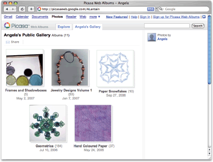
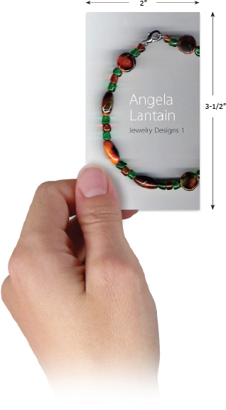
I also thought you might be interested in seeing photos of my completed projects. You can find them in my public Web albums on Picasa.Angela

[Posted at 5:40 pm on August 21, 2008 by Angela]

Hello John, An idea occurred to me this weekend. Would you be interested in a project to build the identity of a crafting business right from the ground floor? I’m sure that I’m not the only artist/crafter who is confused about how to convey a creative yet professional identity. I’d love to see what a designer could come up with. Except for my logo, I don’t really have a design in mind, so it’s a “catch as catch can” sort of project.

[Posted at 1:02 pm on August 25, 2008 by Angela]

Hi Angela, Thanks, but no, I have a magazine to publish. That said, I spent some time on your Web gallery, and I must say that your stuff is beautiful! I mean really. So my question — somewhat rhetorical — is, why do you think you need a logotype?Why would you need this . . .

. . . when you have this? . . .

I can’t think of one reason.

Your art pieces are beautiful. They’re imaginative, professional, and—especially valuable—yours alone. No logo can give you all that. A logo will only put distance between you and your customer that’s not there now.

On top of that, what’s your goal? It’s to get your name—that is, your work and reputation—out there and make sales.

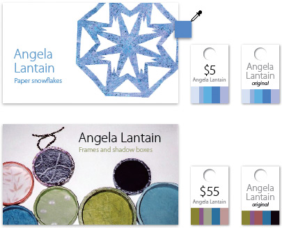
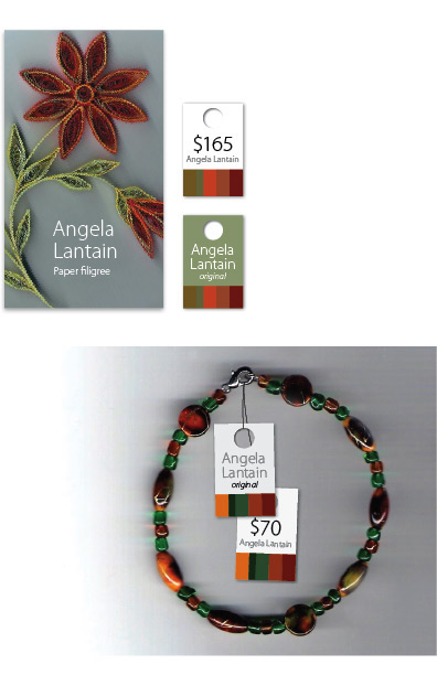
So if I were you, I’d put my art pieces right on my business cards.

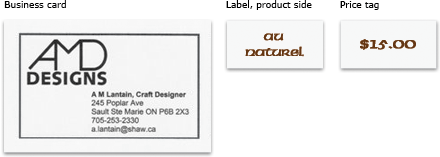
Here are four business cards . . .

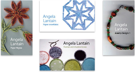
The cards are easy to make. Each has a photo of a product, plus your name in a clear typeface (Myriad), plus in smaller type the name of the product line. On the back would be your contact information. They would be easy to print on your desktop in small, gift-shop quantities. More conveniently, have moo.com print some card packs for you, and leave a pack on display for shoppers to take.

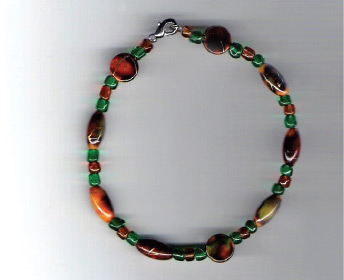
When I showed these mockups around the office, the response was, “Ooooohh, those [pieces] are beautiful. Whose are they?” (or some variation of this) And people instinctively reached towards them. I mean they physically reached out.

No logo will do that. When your stuff is so appealing that strangers want to touch a mere image, well, I’d say you’re pretty close to business-card perfection!

Try it.

John

P.S.: You need better photos. It says a lot about your pieces that their beauty shows through anyway.

[Posted at 5:48 pm on August 26, 2008 by John]

Hello John, I think that would be a great idea! I can’t believe that I never thought of that myself, though I did give some thought to putting my artwork on my cheques.I’m so grateful for your opinion about my work and the image I’m trying to project; without a formal education in graphic design or fine arts, I have to rely on my pieces to speak for themselves. I agree that I’m going to need better photos – especially if they’re going to be published. A digital camera is a definitely a must-have for artists and crafters, and it’s currently on my wish list.Angela Lantain

[Posted at 5:35 pm on August 27, 2008 by Angela]

Hi Angela, For Web work and desktop output, a $200 point-and-shoot camera is just fine. Two or three megapixels are plenty. For book-quality photos, you should have an SLR camera. I can recommend the Nikon D40, which on Amazon is about $500 with its standard lens. It’s excellent.Buy a small tripod. You can probably find one for $25 at Target.Turn off the flash.

Shoot against a solid, not patterned, background. White or neutral is best. I suggest shooting an entire collection on the same background. This can vary. Your artistic eye will know best.

Whenever possible, shoot in soft, ambient outdoor light, the kind you’d get through a north-facing window. Avoid direct sun, which makes harsh shadows. Avoid artificial light if you can.

If you must shoot in artificial light, set your camera to “fluorescent” or “incandescent” or whatever you’re using. This will help keep the colors true.

Pose your piece against its background. Set your camera on its tripod. Make sure it’s focusing on your piece. Steady finger, then shoot. If you’re indoors at night, the no-flash exposure will be too long to hold your finger steady, so set the camera’s automatic timer, and let it take its own picture. An SLR camera will come with a remote shutter release.

You’ll do great.

John

[Posted at 6:18 pm on August 27, 2008 by John]

Hi Angela, You still need the price tags and labels that your retailer wanted, so here’s a suggestion that’s easy to do. Each art piece gets two tags—one price and one label. Size is 3/4″ x 1-1/4″, give or take. The tag with the price gets removed. The other says “Angela Lantain original” and remains with the piece when it’s sold.Along the edge of each tag is a tiny palette of colors that are eyedroppered from the art piece. The colors are unique to the individual piece. If two dozen pieces are on display, the customer will see two dozen different color palettes, but otherwise the tags look alike. It makes a distinctive Lantain “brand,” and you can print them yourself—at least until you’re rich and famous!See what you think.

John


[Posted at 4:46 pm on September 12, 2008 by John]

Hi John, The pictures look just great! I especially like the colour palette idea; customers would be better able to choose suitable colours for frames and mats to display the pieces. Thanks for all your help!Angela

[Posted at 5:41 pm on September 12, 2008 by Angela]

For more on logo and business card design, we recommend the following print issues:

This entry was posted in Question & answer and tagged Branding, Design, logo. Bookmark the permalink.
← Real estate logo gets a makeover
Design a boring book! →
  • Let's talk

    Do you have a project
    you’d like to talk about?
    Contact us

  • About

    • John McWade
  • Recent posts

    • An idea made successful by design
    • Design, in context
    • Similarity: the simple visual connector
    • The silent witnesses
    • The unexpected typestyle of Ikea
    • Aspiration
    • The art of photo cropping
    • If only!
    • Don’t fence me in!
    • You’re not the only ones!
    • Logo? Think simple. Simpler than that.
    • A few minutes with Glamour magazine
    • The unexpected design of electronic music
    • Don’t do what I say, do what I want!
    • NASA calendar
    • Mockups and whatnot
    • Separated at birth?
    • Room for notes
    • Comfort in the details
    • Simplify
    • How to size a run-in head
    • What’s in a name?
    • How would you improve it?
    • Hey, who’s the designer here?
    • Typesetting: Better is not always better
    • Flat is cool, but be consistent
    • But how does it work?
    • A brief ode to the power of type
    • What’s a good typeface for books?
    • Strolling through the mall one day . . .
    • Who is your logo for?
    • Two logos with touch
    • Why I still love paper
    • A card for a one-man business
    • Good design, wrong-ish look
    • Is the right design the right design?
    • Your logo as a design element
    • Some articles are like that
    • Put some Gestalt into your design
    • Is this design?
    • Ordinary typeface, smart logo
    • Design on a square grid
    • How many squares?
    • Does the client know best? Part 2
    • Does the client know best?
    • The elusive pixel
    • Are inches or picas better?
    • The meddling client
    • Don’t festoon your brand!
    • The vanishing master
    • Consistency
    • But it’s already been done
    • How many slaves work for you?
    • What I like best about graphic design
    • Are you too old to get hired?
    • It’s complicated
    • Lookalike letters make a daring logo
    • Designing under the influence . . .
    • The most important rule of logo design
    • Tell me a story
    • Does this need a logo?
    • How simple is too simple?
    • The best colors for a logo?
    • A little more Zen . . .
    • The perfect book cover?
    • Should I design my résumé?
    • Color type in three easy steps, followup
    • Color type in three easy steps
    • Fun with glyphs
    • Isomorphism: Have you read it? Let’s talk.
    • Logos of Le Tour de France
    • Has your design job gone overseas?
    • Designing (or not) a non-profit brochure
    • Design is all we’ve got!
    • Name that decade!
    • Nobody tells this to beginners
    • Eight things we’ve learned about video
    • Color logo, black & white fax . . .
    • Once I had a secret love
    • Oh, the logo by committee!
    • Art. Design. What’s the difference?
    • Let’s talk
    • Color: Why close enough is good enough
    • Where did album art begin?
    • The best ad I’ve ever seen
    • An eraser of dynamite
    • Too many messages
    • Two cool fonts
    • Hiring a designer? Eight things to look for
    • Famous logo links past and present?
    • I learned about design from that!
    • How to quiz your client
    • Possibilities
    • Tips for a Web designer’s first logo
    • Verizon logo: One graphic too many
    • How long should your story be?
    • Letters, the round parts
    • Can you design without limits?
    • Eight design tips for the Web
    • What do you know that you don’t know you know?
    • The soul of the Empire
    • Does Sochi’s Olympic logo work?
    • A light Christmas typeface
    • Which polish would you buy?
    • Tweaks, variations, concepts
    • Critique our cover!
    • Career Day
    • What is graphic design?
    • Which ad sold the Jeep?
    • The non-design design
    • Why we design
    • The skill designers lack and other small tips
    • So how do you design for a client?
    • Ode to the amateur logo
    • Does Pepsi’s new logo work?
  • Subscribe today!


    Before & After Master Collection DVD

    Before & After Master Collection

    52 issues in PDF on DVD. $219 Learn more


    Before & After Master Books

    How to design cool stuff

    If you love Before & After, you’ll love our books! Three volumes are compilations from the magazine in handy, at-your-fingertips form. Print and Kindle editions.

    Bestsellers

    Single article bestsellers

    1. Our color wheel
    2. How to design motion
    3. Gestalt: Isomorphism
    4. Gestalt: Continuation
    5. Gestalt: Equilibrium

© 2017 Before & After | Design Talk | Subscribe | Contact | FAQs | Privacy | RSS  | Log in