
John, I have been a subscriber since the early 90’s and have all issues. As a matter of fact, I think the article you wrote on designing a report in your first two years of your publication was responsible for at least a 1 pt increase in my GPA since I used your format for all my papers.
Anyway, I have a logo I’m working on and was wondering if you could put your spin on it. How much would you charge for your services?
Thanks,
Bill Petrey
[Posted at 10:10 am on July 2, 2008 by Bill]
—————
Thanks for the funny note. Happy to help get you through school! ;-)
About your logo, the short answer is that everything here is about the magazine. If we are able (and you are willing) to use your logo in an article, it costs you nothing. If we can’t use it, we can’t do it.
Why don’t we start by taking a look at it, and we’ll let you know.
[Posted at 11:25 pm on July 3, 2008 by John]
—————
Would be honored to have you rip into my work and make all the readers feel sorry for me. Keep in mind that my only background in graphic art is being a loyal Before & After reader. The colors may be off a bit, but I was trying to simulate the colors in an ear of corn. Colorblindness is awkward when picking color schemes, but thank heavens for RGB %, hex codes and a wife. Okay, enough excuses.
The logo is for a blog/real-estate agent referral site that I call AgentHarvest.com. The site will be an expression of my real-estate opinions (believe me, I have many) and will market my service of finding the perfect real-estate agent to sell your house. I use MLS data to research an agent’s track record to find the best agents in your neighborhood.
The logo is trying to connect a farming harvest theme with real-estate agents. Except for the domain name, everything is fair game for you to play with or remove. The phrase at the bottom is sort of sloppy, but I haven’t come up with anything better yet. It’s all still pretty new. I’ll also be using the theme on the Web site, too.
Thanks, and I look forward to seeing the results of your work.
![]()
[Posted at 12:05 pm on July 3, 2008 by Bill]
—————
[viewing the logo] First question: Does Agent Harvest have anything to do with agriculture?
[Posted at 12:21 pm on July 3, 2008 by John]
—————
No, Agent Harvest is purely about residential real estate (harvesting of ideas and opinions, and picking only the best agents from the entire crop of agents).
[Posted at 1:20 pm on July 3, 2008 by Bill]
—————
Graphically speaking, this is well-drawn and cheery. Thing is, it looks really farm-like. Iowa. Corn. All that. That impression is very strong. Since your business has nothing to do with any of that, your logo is sending viewers down the wrong path. So before you can tell them who you actually are — already a tough-enough task — you FIRST have to reel them back from the misdirection. You won’t be able to do that, and even if you could, you’ve made extra work for yourself.
So you made a nice graphic, but it’s the wrong graphic.
My advice would be to rethink your approach. Rather than key on the word “harvest,” think instead from the point of view of the customer. I (the customer) have never heard of an agent “harvester.” All I want is to buy or sell my house. It’s a tough market. You come along and say hey, I can do X for you. So unspoken questions come to mind: 1) Who are you? 2) Do I understand what you do? 3) Do I need what you do? 4) Can I trust you? 5) What’s it cost? 6) How complicated is it? And so on.
You term yourself an agent harvester. What would the customer term you?
Can you take those issues and roll them into a word or an image?
[Posted at 2:16 pm on July 3, 2008 by John]
—————
I knew something about it was off. Now, I’m thinking more about how to do a knowledge exploding head idea, similar to Godin’s Ideavirus. We’ll scrap the farm and go with the head.
How can the answers to your questions be graphically expressed? One approach would be to have ideas flying out of the head that would touch on each answer.
1) Who are you?
A real-estate investor who got a Realtor’s license to buy and sell my own properties, and found a fountain of useful info that non-agents don’t know about. I want to share the knowledge based on selecting Realtors and making sure they perform as expected. Also, beneficial advice for For-Sale-By-Owner sellers.
2) Do I understand what you do?
No, besides offering advice and tips, the find-an-agent service is based off the basic agent-to-agent referral, except that I’m finding qualified agents, not just someone I know to get the referral. As a matter of fact, up to three agents will get the referral and compete for your listing — like LendingTree.com does with loans.
3) Do I need what you do?
Yes, the right agent makes all the difference. I find that right set of agents for you to select your favorite from.
4) Can I trust you?
Maybe. I can build credibility through publishing articles on the AgentHarvest.com site and by testimonials, but ultimately all of my agent recommendations are based solely off provable, raw MLS data that can be given to the client. I’ll be on their side while they select their favorite agent.
5) What’s it cost?
It costs the client nothing. I get paid as a real-estate agent referral. In other words, I get my cut from the cut that goes to the listing agent when and if the house sells. It doesn’t increase your price of the real-estate commission, but it decreases the amount the listing agent would receive. After all, I did his/her marketing and client search for him/her. That part is an industry standard practice, except that it benefits only agents. My way benefits the client (by selecting best agents) and the agent.
6) How complicated is it?
If anything, I make the process of finding an agent easier.
Thanks for your insight. It’s like reading my very own personalized issue of Before & After.
[Posted at 2:44 pm on July 3, 2008 by Bill]
—————
Now we’ll see if I interpreted your advice correctly. No more farm graphics, Hee Haw type fonts or corn-colored pod people. I also rejected the open head approach mentioned in my last e-mail, thinking it is more appropriate for the blog part of the site but not the actual logo or Agent Harvest identity by itself. With the logo, I tried to represent the theme of “Finding the best agents for free.” After all, that’s what the core business is structured around.
The graphic hopefully represents a rating scale focusing on the fact that we find the best agents.
![]()
[Posted at 1:36 pm on July 5, 2008 by Bill]
—————
I wish I had more than a few minutes, but let’s see what we can do.
At Before & After we have a mantra: Beauty. Simplicity. Clarity.
Your new images miss all three.
I don’t say this to be harsh, just to move us along.
Before you start drawing, think more about the communication part.
You are a unique business. You are “Agent Harvest.”
What’s that? asks the mystified customer.
It’s “A free real-estate agent finder service.”
Hmmmm, that’s interesting. Maybe I could use that. Let me give this guy a call.
See what’s happened? Your name and tagline got you a phone call.
That’s good.
In fact, that’s great.
So the question is, do you need a logo at all?
I think you don’t.
Buying and selling a house isn’t like buying a Coke. How often do you do it? Once? Twice?
So your customer deals with you one time.
You don’t need a logo for that. Just your name and that good tagline.
Think about it, and get back to me.
[Posted at 12:29 pm on July 7, 2008 by John]
—————
Hi Bill. A few free minutes. You explained that your service is to pick the right person(s) out of a field of many. One of your logos had people in it. Expanding on that . . .
![]()
If you showed this image plus your tagline, “A free real-estate agent finder service” to someone in your office, would they get it?
Try it.
Strictly conceptual. We’re not talking about a logo. Just an image.
[Posted at 12:17 pm on July 8, 2008 by John]
—————
I was hoping you’d like the people concept. Your peeps line was a great idea. Here’s what I did with it. What about using a different slogan, one that makes it more personal? However, I can’t figure out how to put the “free” concept in there without making the slogan into a manifesto. Is the fact that it’s free to the seller important enough for the logo to convey it?
Does the idea of the “v” as a pointer come across? What type of fonts would be appropriate?
![]()
[Posted at 1:21 pm on July 9, 2008 by Bill]
—————
Hi Bill. “Free” is vital. I (the customer) probably wouldn’t phone you if I didn’t know it was free. Your original tagline says it all.
Let’s get back to concepting, not logo-making. Logo-making is the last step in the process. In fact, you probably don’t need a logo.
The question was, if you showed someone the peeps line with the tag, “A free real-estate agent finder service,” would he get it?
If the answer is yes, you’re home free. It’s clean, it’s clear, it’s simple, and — especially important — it’s complete. ANYTHING you add will muddy the message.
If the answer is no and you have to explain your service further, pay attention to what’s said. What did you have to explain? What didn’t the viewer understand? Then get back to me.
You can use the peeps line (or a better version of it) as a blog header, but you don’t need a logo.
Example on a biz card:
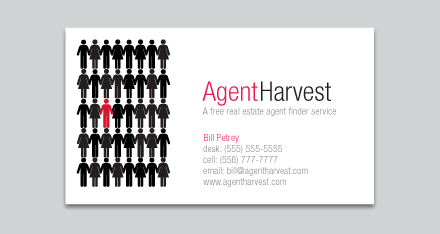
No logotype. Works with or without the graphic.
[Posted at 5:09 pm on July 9, 2008 by John]
—————
Just saw your business card idea. It’s perfect!!! Wouldn’t change a thing. Yes, they WOULD get it. And now, I finally get what you’re saying. What font did you use? That looks great!
No logo for me. The name and tagline work and simplicity rules the day! Thanks for the work you did and the many years of advice through Before & After.
[Posted at 7:26 pm on July 10, 2008 by Bill]
—————
The typeface is Helvetica Neue 47 Light Condensed.
[Posted at 11:19 pm on July 10, 2008 by John]
For more on logo design, we recommend the following print issues:


