
![]()
Okay, you swamped us with book covers and gave us a lot to think about and talk about and smile about! Turns out this was an instructive assignment.
Let’s review.
The assignment was to “Design the cover of a book that you’d keep near your bed to read and fall asleep. It must not arouse the reader in any way. No thought-provoking titles, no glorious colors, no gripping images, no edgy layouts.”
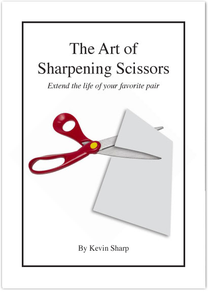
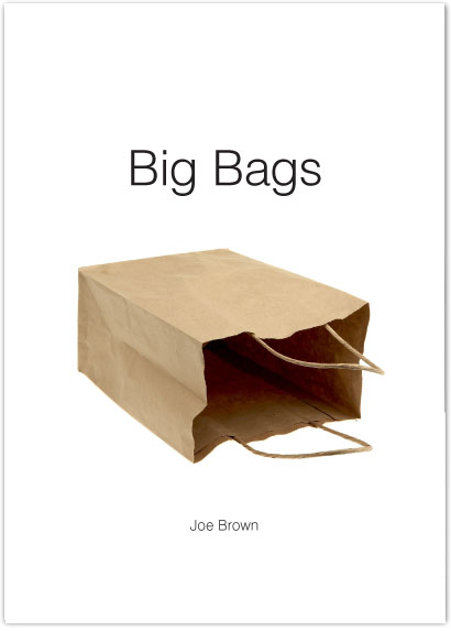
The cover was required to have:
1) A title. Subtitle optional.
2) Photo or illustration
3) “Author’s” name
[rssless]A number of you noted with surprise the difficulty of designing something bland. I hope working on the assignment illustrated for you that “bland” is not different from, say, “tension” or “power.” It’s a matter of putting this line in that place the right distance from over there. Small things matter.
The titles you chose had a big effect on your designs (and the somnolence of the results), which brings up an interesting point: A designer normally works with other people’s words, to translate/interpret/express them in imagery. This, as you know, can be frustrating. In this case, however, the words and the images were all yours. How well did you integrate the two when you were in total control?
Many covers had us laughing out loud. This, of course, disqualified them immediately (much too arousing!), but it doesn’t mean we didn’t enjoy them.
We’ve sorted your submissions into four broad categories:
1) Covers that keep us awake (fail)
2) Covers that wake us up! (fail with caffeine!)
3) Covers that are beautiful but keep us awake (fail)
4) Covers that put us to sleep (pass).
And one or two submissions rose to a fifth category: covers that are attractive and also put us to sleep (pass with excellence). Just so you know, the first category five came from a 78-year-old reader. There’s always someone to mess up the curve.
We’re busy making crits of every cover and will be cherry-picking the best examples in each category for a new Before & After PDF article.
In the meantime, here are a few of the 150+ covers you sent in:
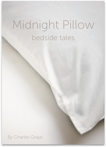
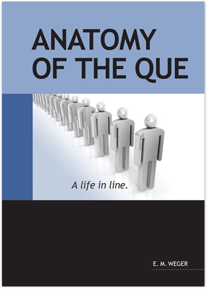
Category 3
A cover that’s beautiful but keeps us awake (fail)
Cover by Misha Van Tol
Midnight. Pillow. Bedside. Slumberous words. Soft, comfy linen in calm, neutral colors. What could be more sleep inducing? Even the author’s name is, well, gray. But there are some culprits here that mess up the somnolent mood. One is the word “tales,” which suggests intrigue, mystery, suspense, especially since it involves a bed—at midnight. Another is the pillow’s rakish angle, which is extremely active and suggestive, too, in a Hitchcock kind of way. And Mr. Graye? His bland countenance is betrayed by that rogue, ending e, which suggests, if not an exotic lineage, at least a British one, á la Sherlock Holmes.
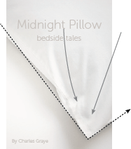
Watch those lines
The pillow’s not moving, but your eye sure is! All lines create motion. Angled lines create fast motion, which is great for skateboarding but not for sleeping.
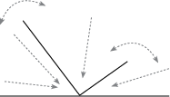
It does, however, bring up a useful technique . . .
Angles are active
. . . To generate tension, followed by excitement, all you have to do is make an angle. It’s unsteady — will it tip? — and all those triangles create converging lines, which move the eye rapidly from wide to narrow. Need more excitement? Add more angles!
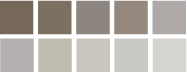
Neutral colors
Neutral palette is all soft edges and quiet colors, beautiful without being arousing. An A for this part.
Click the covers for comments:

[Posted at 9:05 am on October 31, 2008 by John]
[/rssless]


