 Five minutes on the Ultra Music Festival site is enough to convince you that logos can sometimes be made just for the fun of playing with type . . . and that they’ll work just as well as those made with lots of painful nuance and “deeper meanings.”
Below are screen shots from the festival’s 2014 trailer. Each is the logotype of an artist, centered against a desaturated, electronic-beat video. Note in every case that the logo has been simplified to flat white (no colors, gradients, shadows, etc.).
What I like is the “who-cares-what-this-means?” way that many of the images have been developed. This is play. Some are beautifully refined, others are mashups of typographic affectations, unexpected lines, arbitrary angles. All work within the genre. More on this in a minute.
———-
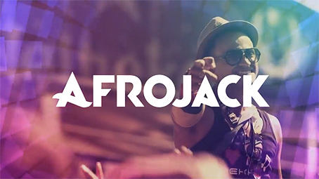
Afrojack Appears modded from a geometric face similar to (but not) Futura Bold. Why the fiesta of changes — cuts here, angles there, even a swash? My guess: hey, it was fun . . .
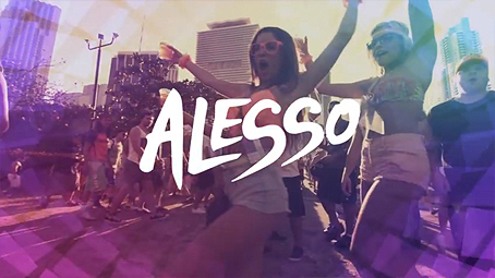
Alesso Dragging a paintbrush . . .
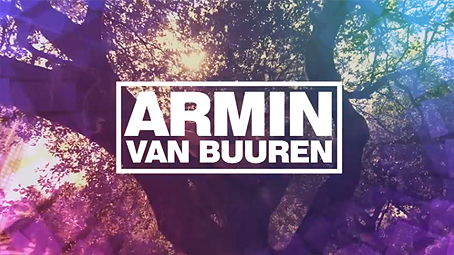
Armin Van Buuren Helvetica bold caps, boxed. Would you associate this with music? Not normally, but . . .
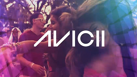
Avicii Based on Avant-Garde. Straight lines and a circle with truncated A and V terminals. Exactly the same space between each letter, measured at the bounding box. Never do this at a type conference. In real life, it looks like pieces of an alien language . . .
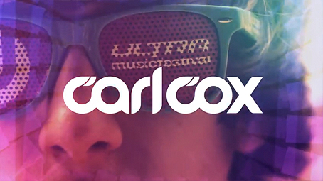
Carl Cox Round, refined letterforms. I like the curving line in the c’s. Why’s it there? Don’t know, but it adds a focal point of detail. Also works without the lines . . .
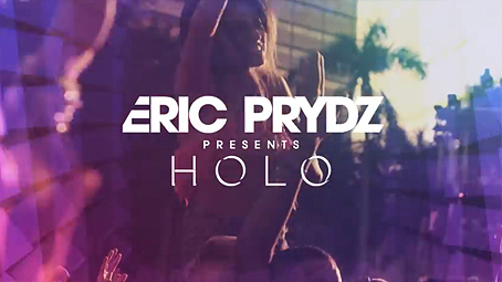
Eric Prydz Another Avant-Garde-based logotype, this one with tight, excellent letterspacing. Thirty-degree angle truncates both E and Z. Meaning? Who knows, but it adds an edge . . .
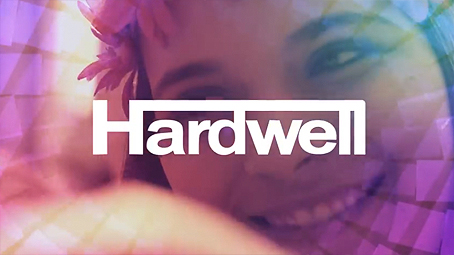
Hardwell Oddly industrial, but like the others, they’re playing with the letters they have, in this case connecting straight verticals with a horizontal bar . . .
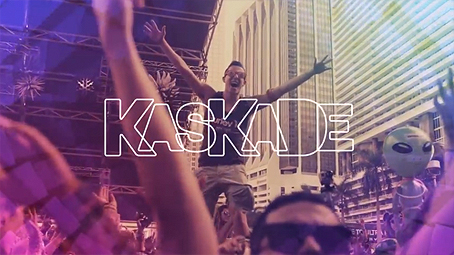
Kaskade Unique in this group. One typeface minus its counters, two letter sizes, outlined and overlapped. Party down! . . .
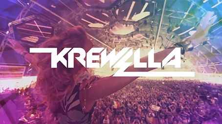
Krewella All angly and slashy, probably drawn from scratch or almost . . .
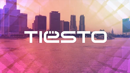
Tiësto My favorite. At first I thought the lines were purely decorative, like Carl Cox. Then I realized they formed the umlaut. Functional fun . . .
One might argue that this is not “real” life, and that these images work only because of their young, high-energy context, within which everyone understands what they are. But I’d disagree. Plenty of mainstream logos have been created in exactly this way.
What I like is their authenticity; none is over-thought, overwrought, or pretentious. Being new to the genre, I will say that I’m surprised by the prevalence of geometric faces Avant Garde and Futura, plus Helvetica. Clean, pure, not classically associated with music. I like.
Seeing these took me back to college, when the first Moog synthesizer was opening the doors to electronic music. In those formative years, I’d happily experiment with type (endlessly!) for the sake of just watching things form. That delight has not gone away. The fun (and reality) of design is that you can imagine but can’t know what a combination of lines and shapes will do until you see them together, in context. So mix away!
The takeaway from this excursion, for me at least, is to spend more time playing. I love playing with type! Your years of experience and discipline come in later, when you evaluate what you’ve made, modify it intelligently, and meld it into a unified, branded look.


KREWELLA is Slant from Dafont with minor modifications. The execution is brilliant and seamless.
Thanks for finding that!
Yeah. Beautifully unencumbered design. These guys don’t labor under the misapprehension that meaning and identity are design features. I’m sure the musicians told the designers to make something that looked cool, not to capture the essence of their brand (or whatever other marketing jargon is current these days).
The idea that a logo or logotype could look the way a certain artist’s music sounds is ludicrous. You can’t look at the Afrojack logotype and know what the music sounds like, or how it sounds different from Armin Van Buuren. Same as I can’t look at a bank’s logo and know what their customer service is like or what their debt-to-asset ratio is. The company’s identity comes from customer experiences and word-of-mouth advertising; the logo is just a mark that identifies the product/service with the reputation they have established through action over time. No matter how many times Burger King updates their logo, it will always stand for greasy fast food.
But, I guess if you are in the business of selling design services you have to make your product as attractive as possible. Promising to “revolutionize the brand through a thoughtful design-centered approach” to “drive sales growth” sounds great — but then you end up with the complaint I see over and over on B&A: the clients have insane expectations. The over-hype of design is another topic, though.
If people could just remember the first goal of design is to make the beautiful useful and the useful beautiful, and the second one is to have fun, then you’d see a lot more of this kind of clean, straightforward, un-pretentious stuff.
It’s not all that surprising that there’s a tendency toward Avant Garde, Futura, and Helvetica; this genre of music is definitively international, but it has deep roots (and important influencers) in northern Europe.
Of the logotypes you pulled, John, five of the artists are Dutch, two are Swedish, and two are American (with roots in Chicago). There is a good chance they were all surrounded by and influenced by these kinds of sans-serifs, right?
The choice of font fits the music, as well: this is, of course, electronic music, which is incredibly geometric in form — it’s all hard edges and mathematically beautiful curves, and also simple and repetitive.
The scene in a club is often pure chaos, but the music itself is a whole lot like a geometric sans-serif—complex, but not complicated.
Type manipulation has never been my strong point, but I’m often amazed at those ‘type’ logos where the designer has come up with some clever trick that seems to be on the brief when taken in context with what the client does, and you think — this designer’s a genius.
The logos in this post along with John’s explanation expose all of that. They are what I suspect many designers dress up as talent — simple playing around until something clicks.
As an aside point, I actually love what has been done with the backgrounds to the logos. The designer has taken a seemingly random selection of images and tied them together with his own set of rules created just for this project — white logotype, same geometric graphic overlay, and same colour treatment over (I think) desaturated images, creating a brand all of its own. A great example of how a good branding system can be applied to disparate elements to tie them together.
Love this post. Thanks John.
Cheers
Jon
The best part of this article is John’s comment, “Party down!” If you plan on attending the festival, you might want to avoid saying that to the kids — you’ll get pelted with glow sticks. Also, if you are familiar with the artists and the electronic music culture, these typefaces have more meaning. For example, the A and V in Avicii are his logo — they are featured prominently in his videos — but appear as solid triangles.
I’d love to see a comparison with some logos from bands that fall within the metal genre, both here in America and with popular European metal bands.
I’m willing to bet that what you’ll find in metal logos is a lot of misdirection, sharp angles, and words that border on complete illegibility. But that works for metal. It describes the music (intricate, syncopated, complex, aggressive), just as these absolutely do describe electronic music. As Jeremy Varo-Haub pointed out above, EDM is all about math/geometry, and many in that space consider EDM to literally be the avant garde of music.