
I’ve now had a few weeks with Apple’s iOS7 on my iPhone 5, and I like it more than I did at first. At first it was a shock; I liked my old one. I like the new “flat” look and minimal Helvetica aesthetic — back to those in a moment — but what I like most is how it works, which manifests itself in many small ways: a “Control Center” that swipes up from anywhere, barely-there animations, new organization, faster speed. It’s funny that saving one second, or a tap, or a moment’s thought actually matters, but it does. Not the literal time — how lame does saving one second sound? — but that it makes the device transparent; it becomes less a machine and more an extension of the mind and hand. Just kind of wish, whoosh, and stuff happens, like it’s alive, almost like it’s breathing. To me, this is brilliant.
But the brilliance is not uniformly implemented.
Visually, iOS7 has three things going: “flat” design, Helvetica, and minimalism. Each can exist without the other, although Helvetica and minimal have long been linked.
Minimalism is about doing the most with the least. Strictly applied, each object or function is reduced to its essence — anything less will weaken it, anything more is incorrect or unnecessary. In its classic form, minimalism can be barren, pure utility; it leaves no room for delight. Apple has added in plenty of delight, like the barely moving clouds on its Weather app (below) that serve no other purpose.

Helvetica’s role is harder to say. Helvetica is a basic typeface with beautiful curves that are especially evident in its super-light weights (note the temperature, above). It has no decorative elements. Decorative lines and shapes, no matter how subtle, can be thought of as non-essential add-ons, at least in the case of an interactive product. Other typefaces qualify as minimal (Futura, Avenir, Gotham, Google’s Roboto), but Helvetica is the classic.
(That said, Apple has been so successful with Myriad, which is more readable than Helvetica, especially at small sizes, that I’m surprised they didn’t stick with it. A guess: Helvetica’s rectangular construction [below, left], unlike Myriad [below, right], corresponds better to the rectangular device.)

The aesthetic can be taken too far. A few words in a field of white can be beautiful on a page or poster, but these objects are static. A mobile device requires interaction, and all-the-same type gives no visual clues what to do; it must be read. This is not easy for everyone, and making effort is opposite the wish-whoosh ideal. Similarly, the nearly empty white screen, especially at night, is just glaring.
Flat is an interesting trend. The theory is that we’ve now lived long enough with digital devices that we no longer need the “crutch” of real-world analogies. (Never mind that my Mac still has “folders” and “pages,” which look suspiciously like paper, on a “desktop.”) So instead of a Notepad with pretend handwriting and yellow lined faux pages, or a Calendar wrapped in cyber leather, the new versions are largely bare screens with small Helvetica type.
Almost every app has been pared down this way. Instead of the warm, familiar look of a physical Compass, the new digital version has neither surface nor shadow; it’s simply white on black, with easier-to-read headings, on what appears to be a bigger screen because the bars are gone. Although the look is not familiar, in use it feels better. Why? Because it’s pure information, which releases almost magically (wish! whoosh!) without the drag that visual fakery (shadows! bevels! borders!) adds.

The new Calculator (below) is a favorite. Simple, handsome, big touch points, super easy to use. It resembles a physical calculator only because of its layout, but otherwise it has no real-world counterpart. It’s flat.

But I can’t explain the keyboard that pops up whenever there’s some typing to do. It is most decidedly not flat . . .

In fact, it looks just like Apple’s physical keyboards . . .

. . . with rounded chiclet “keys” and shadows and all the rest, which fit neither the ideal nor the aesthetic. Why would Apple not have made it flat, too, perhaps like this . . .

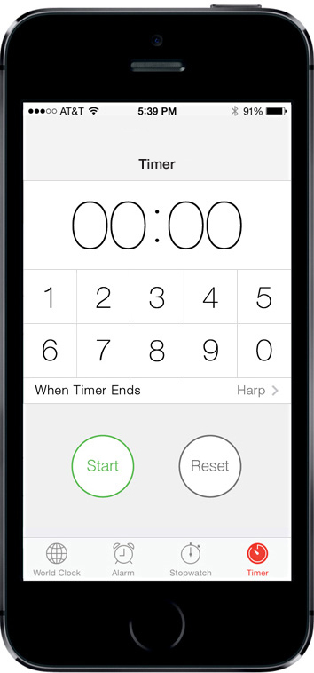
Similar, but worse because they’re hard to use, are the fiddly, fake thumbwheels that spin numbers for the Calendar and Clock apps. They’re not flat, either, and the Timer screen (below), well, someone just forgot to finish it . . .

Tiny, same-size type floats here and there, each bit with a different function but no visual differentiation; Start and Pause buttons hang in too-much leftover space; and that hour-minute thumbwheel is not only not flat, your finger obscures the numbers that you’re trying to see. Apple obviously knows about focal points, but on this screen there’s not one to be found.
So we redesigned the Timer to be more like the Stopwatch . . .
. . . with touch points that look like the Calculator and work like your microwave — just tap in the time you want and press Start. It’s more like their other apps — flat, simple, easy to read, and the countdown bar is a nice (and correct) focal point. It’s the first time ever that we’ve felt the need to fix something Apple has made.
All in all, the new OS is great, but with a few loose ends. If there’s a moral here, it’s be consistent with your theme. There’s pressure to cut corners, get the project out the door, let the “committee” (which means no one) take responsibility. I don’t know if that happened here, and it doesn’t matter. The new OS will only get better, and, unlike print, which is forever, updates to an OS can be made on the fly and uploaded as they’re finished.
Other parts of the OS can be questioned too, of course — there are a few oddball, clip-arty icons, for example, in and among the beauties — but hey. I’m still astonished that this technology exists. I read not long ago that if, in 1990, you were to buy the capabilities that are standard in your phone — GPS navigation, artificial intelligence, cameras, books, music, video conferencing, and all the rest — you’d spend over a million dollars. My guess is that they underestimated.


I do understand what you are saying with the minimalist design, but I think that’s what I looked forward to most with Apple —the style, and like Steve Jobs always said, the “sexiness” of it. It was never the same as others, and now it just…is. Looks like Android, like everything else.
Question is, would Steve have wanted it this way?
Steve Jobs was great, but I don’t think “What Would Jobs Do?” is the important question. The important question is “What’s good?”, and this IS a step in the right direction. Remember, Steve Jobs also once seriously considered having some mysterious cartoon character pop up randomly, and he was adamant against allowing users the ability to alter his “perfect” OS.
The fact is, getting bogged down in real-world metaphors, “buttons” and “sliders” and “windows”, it all keeps us from making computer interfaces to the maximum usability and power. If we throw off these shackles we’re able to do things like Ubuntu Unity’s Dash, or OS X’s Finder search, or Windows 8’s tablet interface.
Metaphors are clunky. The move to semantic HTML is the casting off of metaphors, and it makes code more readable. Windows 8’s Metro is the casting off of metaphors, and it has the potential to give users a more beautiful and powerful Windows experience. Search bars are the casting off of metaphors, and they’re everywhere because they’re great (OS X’s Finder search especially. You can look up Oxford dictionary entries fromt he desktop! So cool.). Gloss on buttons isn’t sexy, it’s… gaudy. It’s a substitute for good design. It’s faked beauty. And if we can stop pretending our phones and computers are windows into a physical space we can start advancing the way we use computers.
I signed up for Before & After about two years ago to learn more about design – I’m an accidental designer and totally untrained, but in my job function I have to be willing to learn and keep a brand consistent. This was a brilliant article! I appreciate the thorough commentary on consistent design throughout the OS on my iPhone. I love the way you took time to comment on applications and screens to make your point — again pointing out the consistencies and inconsistencies. That is helpful to me – a non-designer – to look at every part and ask, “is this design consistent throughout this piece.” Thank you. I always enjoy learning about the design details, but this went beyond the details to the brand.
As usual your work and ideas are beautiful. *swoon*
Break it down Mr. McWade! I think I’ll write broad this sentence — “Minimalism is about doing the most with the least.” I think that’s one of the most challenging things to do while designing in any space. Your retooling of the things that aren’t quite finished with the flat design of iOS7 was brilliant. Not to mention I now have a new ‘minimalist’ font set in my font explorer X pro to add! Sweet!
Can’t improve on your redesign of the timer. It’s a function I use all the “time”.
Please rework the calendar too. Setting an appointment on the half-hour is a pain in the thumb as I hunt for the 30 minute mark.
Finally, I found a surprising lapse in usage buried deep in Settings/Wi-Fi.
When you connect to certain Wi-Fi networks, this dialogue appears:
is Not Connected to the Internet. Are you sure you want to use this network?
Cancel | Join Anyways
I was miffed to see the inconsistent capitalization and then horrified by the word “anyways”. I hold Apple to a higher standard.
Love your analysis, and Apple really ought to be employing you! Wish I could like the new design as much as you do, though – I find the colours garish and it’s like using a child’s toy. I really am not a fan. I’d love the option of a subtle and more muted colour palette. I was wondering whether you might also do a little post on Apple’s colour choices to try and convince me!
I’m with you — at first the whole thing felt cartoony, too bright, too simplistic, lacking the elegance of the physical product. In fact, the first Preference I looked for was a way to desaturate the colors! (It’s not there.) This changed as I began seeing the OS work and its depth started revealing itself. So I found Lock- and Home-screen wallpapers that tone down the brightness, and now I’m happy with it. Do I love the look? Some parts yes, others not so much.
You might search for “iOS7 icons,” pull them into Photoshop and try the desaturation function. I think you’ll find that it doesn’t help much, because the issue is more than the colors; it’s the design of the icons, too — Camera, Music, Messages, iTunes Store, Mail, and Phone all look like clip-art. And some break the theme: the Phone — notice the old-style handset? and Mail — why a paper envelope? They work, but they’re old metaphors, no?
I, too, like a minimalist design and when word that the skeuomorphism would be absent in iOS7, I first thought that was a great idea.
What I’m surprised by, however, is how much that actually helped give me reference. When I glance at the screen and see that yellow background with brown lines, I immediately know I’m in the notes app. With iOS7 I have on more than one occasion been confused as to whether I was looking at the messages app or the mail app. They look nearly identical.
This symmetry was a physical annoyance with the iPhone 4: Both sides of the device were identical, so when you reached in your pocket to answer the phone, you had no tactile feedback as to which was the front and which the back. (I don’t like cases) This wasn’t a problem with the rounded back of prior iPhones and was solved with the aluminum back of the iPhone 5.
For me, the design either needs something *more*, or at least something *different* to provide more obvious guideposts as to where I am.
Speaking of less taps, I’m also not a fan of returning to a folder when exiting an app, instead of to the home screen. It’s an extra tap to get back “home” and typically when I exit an app, I’m not headed to an app in the same folder. Just because I drilled-down to get an app shouldn’t mean I also need to drill-up when I’m finished.
John, I enjoyed your usual no nonsense breakdown of iOS7’s aesthetic and functional changes. I am hoping that some of the inconsistencies will be corrected in future updates because they just had to manage to a deadline and with Apple quality.
It appears to me that they have almost completely rewritten the code for this huge and complex system… made it better, released it on time and essentially bug-free. Being from a software background, I would call that a near miracle. Unheard of, really.
Have you tried turning the calculator sideways? A whole new world opens up…
Woah! *eyes glazing over*
I wholeheartedly agree with you. This type of stuff has been bugging me a lot with iOS7. The timer isn’t the only area where the design feels rushed and not thought out. I find the balance of many elements just seem off, which is odd for Apple.
Unfortunately all of this stuff has been clouding my opinion of the OS, in a way that I’ve been mostly overlooking the good aspects of it. There are a number of good aspects, and I’m glad you mentioned those as well. Here’s hoping it continues to improve, although I have to admit I’m not as hopeful. There are some major eyesores and areas of regressed functionality. (I’m looking at you, GameCenter and Calendar, respectively.) The fact that they released an OS with parts of it that look and work that badly absolutely shocks me, and makes me worried that the level of quality control in design has significantly dropped at Apple.
Apple in my eyes can do no wrong, and I’m in love with Helvetica, so it’s all good in my eyes.
However, the ‘Boy McWade’ presents a persuasive case regarding the timer, and I couldn’t agree more. Like another subscriber said — do the calendar, too!
Like everyone here, I enjoy every piece of information I read from B&A.
As a software architect (former Desktop Publisher years ago) I appreciate UI/UX topics even more so.
I agree with just about everything you mentioned, save one point.
I want to call your attention to the keyboard comment. Apple did in fact change the keyboard. Take note when you swipe down on the home screen to perform a spotlight search. This keyboard is flat and now devoid of all the three-diminsional elements.
Since most apps have to perform some sort of update to be iOS7 compatible, I am guessing that most apps missed setting something to use the new keyboard.
The chiclets are still there, and the shadows are, too — just harder to see because of the background color.
I liked John’s redesign of the keyboard and I think he has a point that the current design could fit in better with the overall design concept.
I only wanted to make one suggestion – and that was to consider keeping the button spacing of the original design (or similar). My reason being that the keyboard has a lot of buttons and to fit them all on the screen requires them to be scaled down compared to their counterparts in the calculator.
I’d be concerned about typos on John’s current keyboard design. Although, I’m not sure with swipe typing whether that will be less of a consideration in the future, people with poor aim or thick fingers may struggle with the buttons being so close together.
Hi Rachel,
The flat keyboard characters are as widely spaced as those on the chiclet keyboard; they just look different. The live touchpoints don’t need to be closer together than they are now. In other words, each character’s full square does not need to be live.
Hi John,
I understand that, but the user may well ‘read’ the whole square to be live, regardless of what area you actually make live.
Having said that, the heat maps I’ve seen suggest that people are likely to aim (and mostly hit) the character in the middle of the button, but I’d want to do some testing to make sure!
My son has echoed what I’ve heard elsewhere: far from being unobtrusive, he found the animations annoying, dizzying, and battery-hogging.
As to the design inconsistencies, I’m kind of appalled. I see that kind of stuff all through the Android OS (especially when combined with TouchSense, Samsung’s overlay interface). Steve would have hunted down and shamed any designer or developer that didn’t toe the line on his design theme, and he used to ferret out every little flaw. Now it seems like they are doing things like their less-motivated Google competitors–in fact, it seems as if Microsoft is doing the real creative work nowadays. I hope they polish up the flaws or my Apple stock is going to be hurting.
Hard to know what’s happening inside of Apple. But Jobs, innovative as he was, made design mistakes of his own, most often in the area of “function following form.” That said, maintaining a consistent aesthetic on a mobile OS is extremely difficult and sometimes impossible to execute perfectly; there are just too many conflicting demands.
John, you call these Jobs’ “design mistakes” in the area of “form coming before function.” I disagree. Mostly.
You said that you are still astonished that you have a “million dollars” worth of capabilities on your phone. That is the point. The visual metaphors favoured by Jobs had a function: convince you that the iPhone was much more than a phone. That there was a world inside your phone. An iPhone was worth the money because it was not just a fancy phone but actually many devices (2007: What? There’s a compass in the phone? Wait. I get this cool glass and steel device but I also I get fancy stitched leather? Where do I queue?). That this was effective until now is self-evident. If only my “mistakes” were a tiny bit as successful!
Jobs’ ability to think a level above is still sorely needed. It seems everyone is saying “flat is good, shiny is bad”, “metaphor is bad design.” But metaphor at some level is still helpful in so many ways to many users, and given humans’ propensity to boredom, I suspect at some point this current trend will look as ridiculous as Steve’s green felt does now.
I agree with you, certainly about the big things of Steve Jobs’ vision. It has changed the world, and nothing less. Visual metaphor was correct for the time and need, and it still may be correct; it’s just that the current trend is the other way.
Interesting, John: I think you’ve hit the crux of the issue. If Apple is following current trends instead of leading through unanticipated (often breathtakingly bold) innovation and careful research into human interfaces, it’s due for a huge tumble.
Rightly said Paulie, original Mac came back to me when I read your words, “there was a world inside it!”
We cannot forget the primary reason why the app is called “Compass.” It is there in the first place because we’ve been using physical compasses for navigation. If it was invented “inside” the device, we might not need a metaphor for it.
Like David Kunkel has said here, on the very first look at iOS 7 we’re like, “this is like Android!” Has it ever been like this before for Apple? Mostly not. We used to look at Windows and say, “Haha! This is like Apple but way too dull.” Apparently it is not the case anymore. The Control Center, Notification Center, App switching… are we supposed to believe that this was the “only” perfect way to do it? Where is that vision that was always above all else? Well I think we know the answer.
It’s cool alright…. but my old eyes need high contrast if such a light font is used.
Thank you for mentioning “old eyes.” I love my iPhone, but this new look is difficult to read for those of us with visual impairment. I had to go into the settings and bold the type. Not nearly and neat and tidy, but now I can see it!
I agree with Ryan, I really dislike the new calendar. The option to see the entire month as a default seems impossible. And it’s just too minimalist — I prefer some gridding to separate the days, etc. It seems as if the redesign was an afterthought — incredibly rushed, sloppy, unintuitive. Surprising, as I would assume many other folks heavily rely on this app, too.
The battery-suck was typical new-Apple-OS-release. I never quite understand why every update appears to unleash this problem. Odd.
In general, I’m still not overly impressed with the flat theme. I suppose I’ll get used to its glarey, hard-to-read, overly-pared-down appearance, but honestly, it wasn’t worth the headaches I’ve encountered since install.
I normally wait a bit before applying upgrades — I really wish I had with this one. Sigh. Never again.
In my own opinion, making everything consistent would have made it almost a little too obvious that these UI ideas were essentially a copy from Android ICS and Windows 8. Now THAT’S consistent beauty.
Let’s face it. The most beautiful OS in terms of design (maybe not functionality) remains Windows Phone 7.
LOVELY article by the way, John.
I think your re-design of the Timer is brilliant! I am so tired of thumb wheels, which were cool in ’07 but are merely tiresome now. A Bible app I have uses a thumb wheel, so I am relegated to scrolling through 44 Books and up to 150 chapters (Psalms) on a thumb wheel that loves nothing better than to freeze up.
But you’re right, one has to wonder about Apple’s inconsistency…
The timer really bugs me too. They were supposed to be throwing away the mimicry of real-world controls, such as a thumbwheel, but the new timer keeps the idea of a “wheel of numbers” without the visual clues (shadows and gradations) that tell you it’s a wheel. It just looks bad. Your re-design is an improvement. Apple please take note!
On the issue of type, the ultra thin Helvetica is just too light on a bright white, luminous background. You need razor sharp vision to see it correctly. Otherwise your eyes are just overwhelmed by the bright light. Even when you change the font weight under “settings” to “bold”, it only gets a tiny bit bolder — we don’t even get Helvetica Regular, just a slightly less thin version. What’s the value in it being beautiful if you can’t read it?
I would much prefer to see light-on-dark interfaces in places rather than everything being this uniform bright white with spindly little letters floating on it.
Well said, Paul. I purposely try to avoid the timer now because it’s just so hard to use from a UX standpoint. Please, John, send your new design to Apple and beg them to replace the scroll wheel design with your much more elegant design.
Thank you for a great article. Your article, and the comments, have convinced me to keep my older 4S and not upgrade to the new 5S and the new iOS. Based on what I’ve seen here, I’ll have a difficult time seeing things on the screen clearly, and I’m not going to wear glasses just to see my iPhone when I don’t need them for anything else. I still long for the curved back of my old 3G — it felt great in my hand and looked great, too. Maybe it’s time to make the switch to Android or Windows.
To paraphrase . . . well, somebody: As a software designer, that Jony Ive is one hell of a hardware designer.
I find so much of iOS7 feels amateurish and unfinished that I simply can’t believe this came from Apple. Functionally, there’s a lot of great stuff going on here, but design-wise it’s a mess. Not only have visual cues/metaphors been largely eliminated in favor of stark type on ridiculously stark backgrounds, but then making so much of that type the same size as well — where’s the visual hierarchy? The more-important elements no longer call attention to themselves — instead, they blend in. Why does the background need to be so stark? Even some light gray shades to set functional areas off from each other would be a huge help in organizing the information on-screen.
I understand that the current fad is “flat,” but Apple really overshot the mark. Beyond flat, they’ve reached a boring, barely differentiated mess of a place. For every delightful and subtle “moving clouds” or parallax effect, there are a half-dozen bland, type-only-on-plain-white, visually uncentered . . . gah. It’s just appallingly unappealing in so many places.
Notice the clock actually works on the home screen now. Been waiting for that one. Nice redesign, John.
Someone submit the keyboard and timer to Apple and cut John McWade a big check. He hit consistency right on the head, and his Timer will surely work better. They are both nicer to look at. (The old keyboard is okay, but feels anachronistic.)
Interesting perspective and well presented. But I’m still no fan of iOS7. I would argue that Apple’s big problem in iOS7 isn’t the inconsistency with which “flat” design has been applied, but oversimplification of complex tools. Consider the calendar: There are 4 common views (day, agenda, week, month) that we have all been trained to view over a lifetime of using calendars. In the old skeuomorphic calendar app, it was intuitive and convenient to move back and forth between them, because the function was based on how we use printed calendars. With 2 weeks of practice using my new iOS7 calendar, I still find it unintuitive and scary to use — while standing in front of someone, I can get totally lost looking for the right event in the right view.
Some functions have been simplified to the point at which there is exactly one button to push. And when it doesn’t do exactly what you want or need on the first try, there is no other way to approach the task. It took several tries for me to get iTunes radio working, because there was only one button to push -– and when I pushed it, I got a message that told me I wasn’t connected to iTunes radio (duh). But the only option it offered to get connected was to push the same button. It felt more like an old Microsoft product than something from Apple.
Finally, Apple’s use of ultra-light Helvetica strikes me as a blatant example of form over function. They moved from a readable font to one that is particularly tough on people with aging eyes.
The thing Apple has always done best is apply excellent — even astounding — design to every aspect of the user experience. At that level, I given iOS7 a failing grade. They’ve made me think about it, relearn how to do routine tasks, and forced me to put on my reading glasses every time my phone makes a noise. There is very little about iOS7 that makes me feel like the phone has become an extension of my mind. I don’t think time alone is likely to change that.
The screen is too bright, the Helvetica Light is too light. Readability is key, essential. From a useability standpoint, it’s not that good. Good design supports useability while enhancing aesthetics; this does a halfway job.
Has anybody noticed that even the Apple logo that comes up during restart is flat?