“Say Pepsi, Please,” “For Those Who Think Young,” “The Pepsi Generation,” “Taste That Beats the Others Cold” — classic slogans from the world’s second most popular soft drink. For the last half century, Pepsi has projected an image of fresh, youthful energy. Its iconic circle logo began as a 1930’s-era bottle cap, acquired its red, white and blue color scheme in 1941 in support of the war effort, and in 1962 made the leap to the bold, sans-serif typeface that it has used, more or less, ever since.
It was the 1962 typeface change that visually separated Pepsi-Cola from Coca-Cola, which until then had shared a swashy, Spencerian script, at least in the uppercase letters. Pepsi’s clean, modern look was in sync with 1960s design, in which sans-serif type was acquiring huge popularity, and for a time it left Coca-Cola’s 19th-century logo looking rather old.

Above, left to right, 1930s, 1951, 1962, 1987. Note the Coca-Cola-style script, and that the Pepsi wave has remained almost unchanged for 75 years.
Pepsi’s makeover and high-octane advertising paid dividends in sales. Outsold by Coke five to one in the the early 1960s, by the mid-1980s the gap was two to one, close enough that nervous Coca-Cola introduced “New Coke,” reformulated, it was said, to taste more like Pepsi! (a misadventure that lasted only three months)
While Pepsi’s look has been modified many times, its wavy red, white and blue circle has remained basically the same and is Pepsi’s real icon. The 2008 iteration retains the circle and colors but distorts the wave; and it replaces the bold, full-blast typeface with a light, low-key version — airy, minimal, quiet.

This is not unwelcome. In a world pounded by relentless visual noise (thank you, Internet), Pepsi is joining a move to simplicity and silence characterized by spare, pure design (thank you, Apple). It prevails over the noise not by outshouting it but by erasing it; as in an art gallery, the product alone on a clear field is the only thing you see.
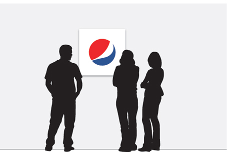
As it was in the 60s, Pepsi’s new design is in sync with the times. This time, however, it has some company. Coca-Cola has gotten synched up, too, ditching its shadows, metallics and fake water drops for a crisp, white-on-red presentation that is simpler, clearer, stronger.
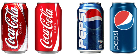
Above, the busy old cans and the quiet new ones.
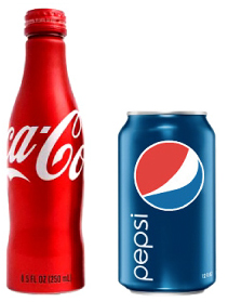
Side by side, Coke’s new aluminum bottle and Pepsi’s new can make it obvious that we’re in a new era of ultra-clean brand design. These products stand out on cluttered shelves by virtue of their white space — or, in this case, red and blue space.
The question, though, was what do you think of it? Does Pepsi’s new logo work? I asked last week, and you had many bright, perceptive things to say.
For my part, I’m a big fan of the new simplicity. Simple design means that lines, shapes and colors are applied only after asking, “Does this element strengthen or weaken the visual message?” Nothing is plopped down arbitrarily; simple design is characterized by intentional, to-the-point clarity, and it’s always beautiful.
That said, had I been on Pepsi’s board, I would have given the new design a thumbs down. It’s technically adequate (if unimaginative), but the sum of its parts, as many of you pointed out, is static, empty, vaguely bland. It conveys no energy, no motion, no effervescence, and, well, it’s not young. Its styling cues — the round letters, the wavy e, the swashy circle — will please Pepsi insiders, and consumers will recognize it, but that’s the end of the good news. It really could, as others said, pass for an oil can or a tissue box or an airline logo.

Above, Pepsi, Korean Air Lines
So what’s happening? The problem starts with the wavy circle. By disconnecting it from the type and floating it in space, it becomes a singular design element that must stand on its own, which it really cannot do. It’s not a bottle cap, as it once was. It’s not an object. It has no meaning in real life.
Pepsi’s circle and name used to interact — one overlaid the other or was contained within it . . .

. . . so the two functioned as one. The wave added motion and vigor to the name. Alone, however, the Gestalt law of equilibrium takes over and brings all that to a stop . . .
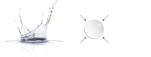 Equilibrium Above, an object in nature tends toward a stable, resting state, as seen in a water droplet. Splashed water beads up — draws inward — and comes to rest in a circle, the shape of greatest equilibrium.
In logo design, a circle is used to convey stability and stasis. It’s the reassuring shape that says, “we’re here, we’re settled, we’re steady, you can trust us.”

Above, left to right, BMW, Target, ABC, AT&T, General Electric, Starbucks
Pepsi, of course, is “here, settled, steady and trustworthy,” but that message is for its shareholders. Its public image is Fun! Carefree! And young!
You’d think the wave would help. It’s active, for sure. I don’t see the “smile” unless I try hard, but it does remind me of sailboarding. Problem is, it’s stuck inside that circle, where it’s too small to overcome the effect of equilibrium and the stasis of the large, empty field around it.
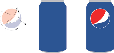
(Above, left to right) Full of motion, no motion, slow motion
The thin typeface doesn’t help, either. Thin type is mostly air. Because of that, it can convey quietness, sophistication, authority, the kind that comes with understatement. But these qualities also require a conventional, grown-up typeface, not Pepsi’s quirky round one.

It’s an awkward setting. Three round forms are followed by an abrupt si. There’s a tiny wave in the e. All is lowercase. The single stroke weight is mechanical, meaning it required machines to draw it, so it lacks the warmth of a human hand. It’s not people.
But why is it here? Understatement is not Pepsi. Pepsi is about bubble and fizz — cheery, exuberant, bursting. This typeface is slow; it’s upright and mostly circles, and you know what they do. Better would be bold type that’s italicized or swoopy or in other ways put in motion. The tiny e wave is moving, but it’s too small to have any effect.
The can slows things further. It’s mostly white space, which is used in graphic design to convey silence. White space in an art gallery is a good thing; it allows the eye to settle undisturbed on the artwork. But here it’s out of place, because there’s nothing to “settle” on except that ball, which is static. Worse, the layout of typeface and ball form not a straight line, which would be fast, but an inert “L,” all of which gives the design its sense of inactivity.
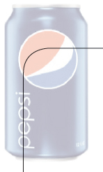
None of this means that the design will fail. It may do just fine — it’s only one part of a program, after all, that Pepsi can power with rhythm and drive. Advertising can be bold and fast — tilted, flashing, spinning, with multiple logos or HUGE logos — but alone, this tepid design will not help them.
Back to Coke
Before I leave the topic, it may be instructive to look again at Coca-Cola’s logotype, which is everything Pepsi’s is not . . .
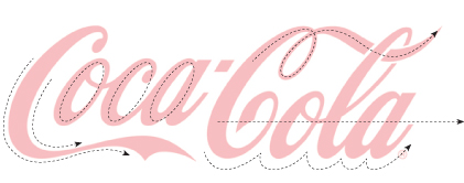
Coca-Cola’s famous, hand-drawn script is full of human warmth. Circular letters are vigorous and rhythmic, and those swashy Cs have exuberant, carefree flair. Thick-to-thin strokes are visually engaging and fast, because the eye follows converging lines. The name has the strength of aural alliteration, too; Coca-Cola’s repetitive, hard “c” sound is visually expressed in the flowing loops. Best of all, the name is the logo . . .
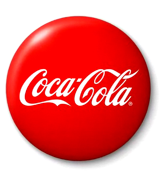
. . . so no matter how much white (red) space it’s in, no interpretation is necessary. High-contrast red and white could not be stronger, an effect amplified, above, by the high contrast of elaborate script and simple circle, one smooth and plain, the other high texture and high touch. And the logo runs in a single, straight line, which is direct and very fast.
So what do you think? Does Pepsi’s new logo have what it takes? Or should it go back to the drawing board?

Let me know.
———————————————
For more on logo design, we recommend the following print issues:


