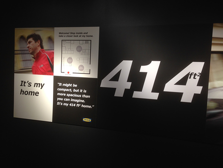
Catching my eye recently at our local Ikea was the typestyle used throughout the store. You should recognize the face — you probably own it — although it’s unusual to see it in print. A mashup of humanist, grotesque, and gothic classifications, it’s not known for its fetching looks. Yet when conscientiously applied, as it is here, it makes a coherent, easy-to-read design program with a purposeful, no-frills air.

The typeface is Verdana, a web standard. It was designed specifically for the web, which means readability at small sizes and (in 1996!) very low resolution. Its clarity comes in part from its tall x-height (the height of the lowercase letters) and large, open counters (the spaces inside the characters). Technically a sans-serif, it nevertheless has serifs on the cap I and numeral 1, which keep the 1, I, and lowercase l from being confused.
Because long distance is functionally the same as small, Verdana can be read across the store, yet it works equally well up close, so you’re free to design with high contrast of scale (above).
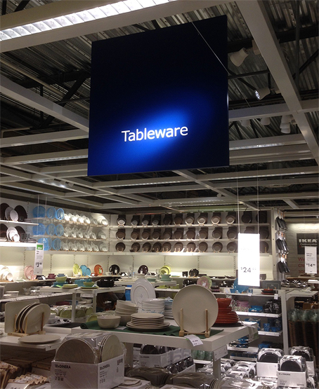
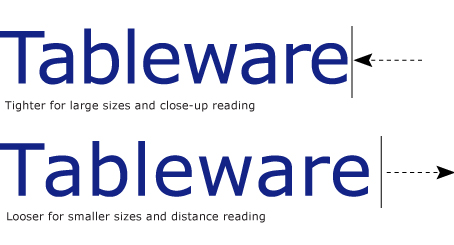
The ceiling sign below is less successful because the letterspacing is too tight for its viewing distance; this spacing would be used for closeup reading on a screen or printed page. I do like the spotlight.


Verdana is one of the most ubiquitous typefaces on the web. The benefit, of course, to using it in print is that it’s super easy to get your entire program looking consistent. Its serif counterpart is Georgia, which looks equally good on the web and in print.
—————
A heads-up: After this Friday, October 17, physical copies of our two videos, Design Essentials and Graphic Design Techniques, will no longer be available for general purchase.
![]() Both videos in streaming form are a permanent part of lynda.com’s online training library. Search for my name.
Both videos in streaming form are a permanent part of lynda.com’s online training library. Search for my name.


Pingback: The unexpected typestyle of Ikea | Before &...
Always excellent.
I do, however, like the tighter letter fit of “Tableware” in this instance. It just looks right. I can read it just fine, and I think it has more design style than the more open “freeway-style” letterspacing.
Of course, I haven’t tried reading the sign from across the room.
Verdana was a bit of typographic genius when it was first created. It was hard to craft a readable typeface for the low resolution monitors of ca. 1995.
There was quite the furor when Ikea announced they would make the switch, but with Matthew Carter’s additions and OpenType extensions it’s become a very versatile family. There are five weights, Latin, Cyrillic and Greek support, a condensed width in all the same weights, true Small Caps, and a generous set of OpenType Pro features.
The intention on Ikea’s side was to unify their branding across all media, so from a marketing and branding perspective Verdana was quite a reasonable choice.
You must have missed the kerfuffle a few years back when IKEA switched its brand identity font from Futura to Verdana. There was all kinds of kvetching and moaning in design circles.
The ironic thing is, if IKEA had waited a year or so, they wouldn’t have had to switch to Verdana because WebFonts made their way into our lives. (The main reason why IKEA switched was that at the time, there was no way to make Futura show up on their web sites, whereas Verdana is ubiquitous on the web, IIRC…)
I like Verdana. I find that I’m drawn, too, to Georgia. Maybe their ubiquity in my everyday life has honed my preferences? Or corrupted them — but regardless, from inside the head I live in the two do what they need to do without fanfare.
As an aside, I love your work on lyndaDotCom John. It makes my membership there so much more rewarding. More coming soon, I hope!
I really agree with this.